I have a complex love/hate relationship with the TV. Netflix and of course, The Bachelor, are integral parts of the simple American life we lead, but that black hole of a rectangle throws a big 'ol wrench in making your media console area look good, am I right? For years, while watching TV at night with my husband, I've secretly also been analyzing our media console trying to figure out the best configuration and way to style it out.
Since we all have TV's, and they're probably not going any where anytime soon, why not make the most of this area? Today, I'm teaming up with interior designer and vintage curator, Tasha Schultz, of Tchotchkes Design Studio to demystify the process and share concrete tips for creating a balanced composition around the TV.
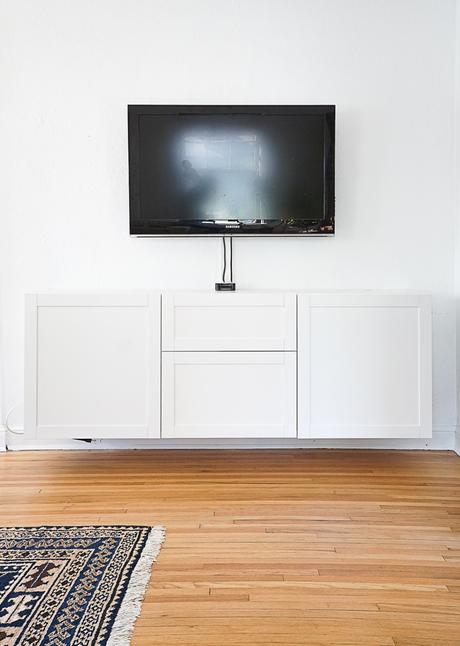
Let's take it from the top, shall we? Here's bare-bones look at my TV area. So sad and cold feeling. The media console is a two piece Besta cabinet from IKEA that we've mounted to the wall with a finished height of 31″. The TV is attached to the wall with a pivoting arm mount 11″ above the console. The designer in me wants the TV placed higher on the wall than it is, but the TV watcher in me (and my chiropractor too) want it placed at sitting eye level. We've mounted it about 6″ higher than "sitting eye level" as a compromise.
Since this 1936 house of ours has plaster walls in all it's crumbly glory, we decided not to run the cables behind the wall and instead, run them down through a grommet on the top of the cabinet.
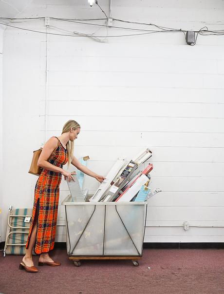

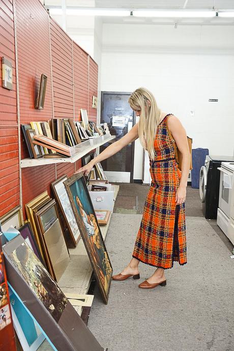
Adding visual interest to your TV area doesn't have to run you the big bucks. If you follow along on Instagram, you may remember Tasha and I venturing out to one of our favorite thrift stores in Minneapolis, The Salvation Army (North Loop) to look for accessories. With thrifting, you don't always know what you're going to find, so we didn't have specific pieces we were necessarily looking for, we just knew we wanted to add height and texture on either side of the TV and something low slung to hide the Apple TV.
P.S. Are you not dying over Tasha's vintage plaid dress?! BECAUSE I AM!
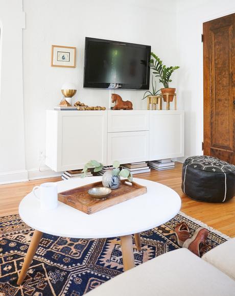
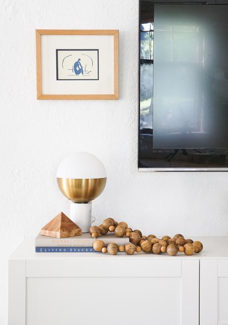
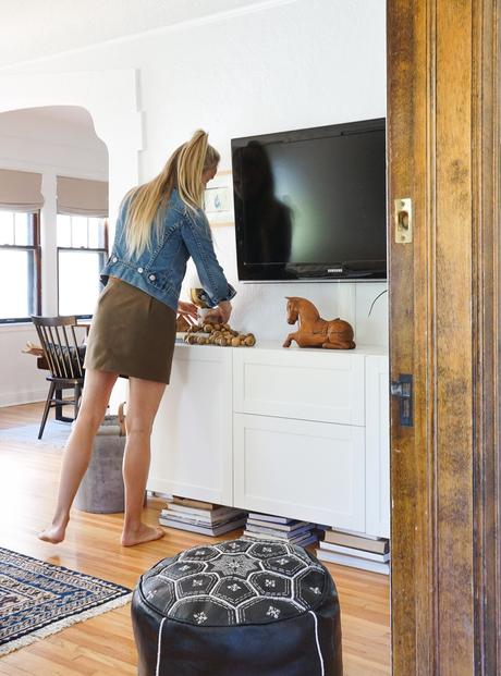
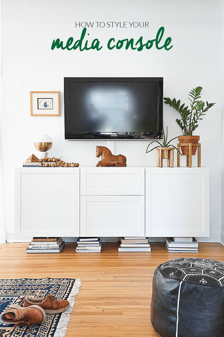
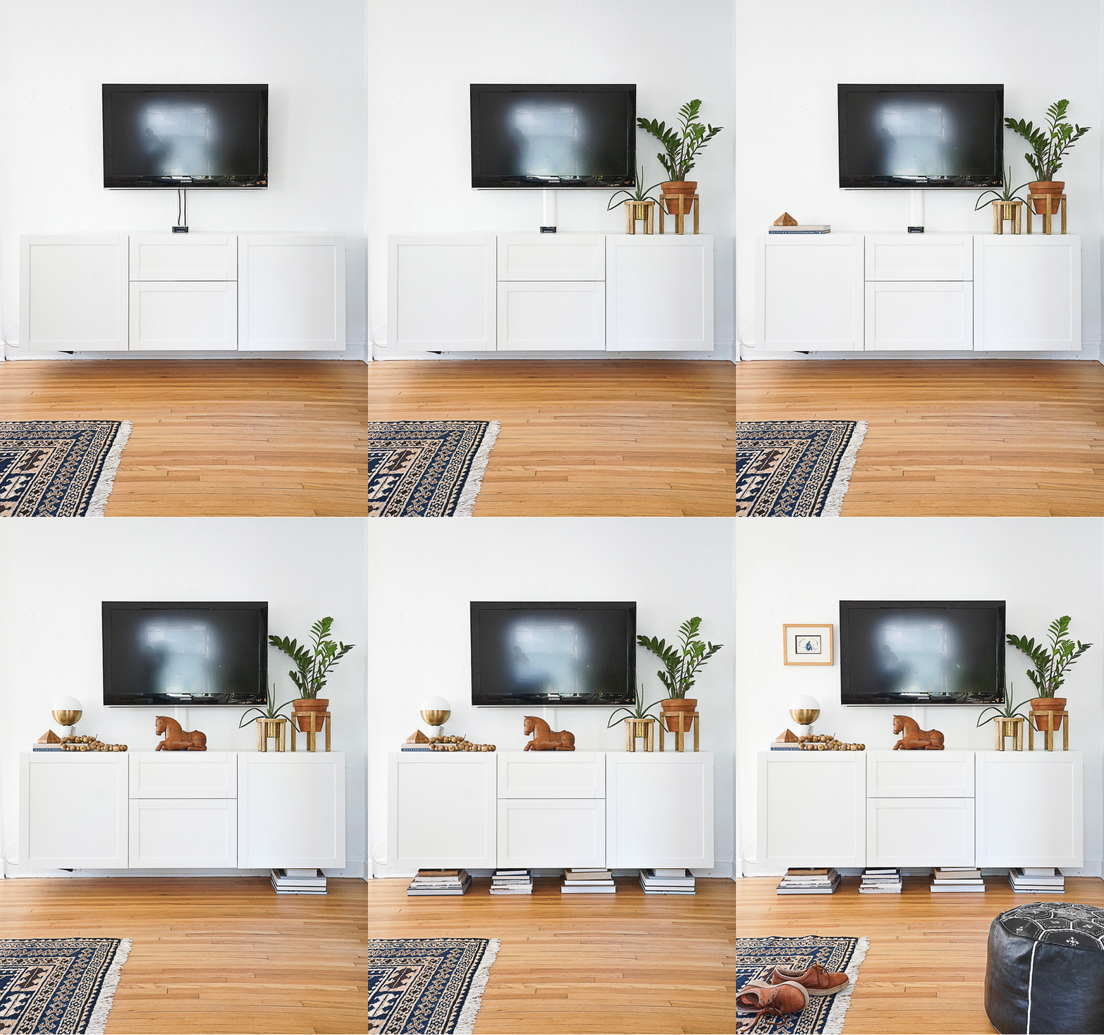
Back at my house, we used a combination of our thrifted finds, vintage pieces from Tasha's Chairish shop, and a few new, store bought elements to turn this sad, naked TV corner into a happily dressed media center. Here are Tasha's fast and friendly tips to pull everything together:
- Start with Greenery for Height and Texture - On the right of the TV, we've used two low maintenance plants in matching plant stands that we found thifting. Plants add a wonderful organic texture and stands give the plants a nice height boost.
- Use a Low Slung Piece Below the Mounted TV - If you have small electronics like an Apple TV that can't be hidden within a cabinet, use a long and low decorative piece like our wooden horse to keep it out of plain sight.
- Conceal Electronic Cords - Ikea cord covers are less than $10 and can be painted to match your wall cover. Done and done.
- Stack Pretty Books for Height and Layering - To the left of the TV we've used 2 hardcover books as a platform for grouping accessories.
- Use a Range of Materials and Textures - Marble, wood, brass, terra cotta and greenery all work together to create visual interest and draw your attention away from the TV.
- Get Creative with Unlikely Storage - If your media console is wall mounted or up on legs, capitalize on the space underneath with book storage. They don't need to be "cool" design books either. Here we're using a mix of Erin's college textbooks and new mama books!
See a piece you likey? Wooden Horse Box | Marble & Brass Lamp | Matisse Print | Mala Beads | Pyramid Object | Embroidered Pouf | Media Console | TV Wall Mount
