Once you have addressed the obvious issues on your website, it is time to develop a process for long-term optimisation.
Many websites reach a stage of maturity where you have already overcome the obvious usability hurdles and applied the most common conversion optimisation techniques.
Although this is an excellent place to be in, it does represent a challenge when seeking to improve conversion further.
The danger is that those responsible for the website will start implementing changes to the site without having a clear idea of whether those changes will have a positive impact or potentially make things worse.
Each change will take time and money to implement, without anything other than a gut feeling about whether it will help.
See Also — Conversion Rate Optimization: A How-To Guide for Better ResultsTo avoid wasted effort and the chance of lowering the conversion rate, I would recommend implementing a process to identify, assess and trial possible site improvements.
This process will need to combine an analysis of the data with some intuition to identify and fix problems. However, with experience, you will become better at it.
That approach should begin by identifying problem areas.
Identify Problem Areas
Websites provide us with unprecedented amounts of data about user behaviour, and we can use that to identify potential problems with a website.
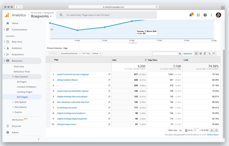
An excellent place to start is with Google Analytics (or whatever analytics package you use). In particular, you want to pay attention to the top exit pages. These are likely to indicate where things might be going wrong.

Be careful, though. You are interested in the top exit pages as a percentage of total visits to that page. Some pages will get a lot more traffic and so will naturally have a high dropout rate. You are interested in pages that have a high dropout for the number of visitors it receives and is an important page in the user’s journey towards taking action.
In most cases, there may be something on those pages which are putting people off, or they are lacking something that people need to make a decision.
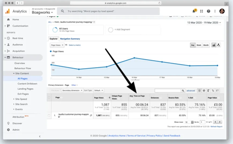
Two things to pay attention to with these pages is “average time on page” and the journey that leads to the page.
“Average time on page” will give you an indication of whether there is something on the page that is putting them off or something missing. If the “average time on page” is high when related to other pages, it might be that the user was searching for some piece of information they could not find. If the “average time on page” is low, it could indicate that something on the page put them off as soon as they spotted it.

By paying attention to the previous pages the user looked at before exiting the site, you may also be able to pick up trends. These trends might indicate that the journey is broken in some way.
This approach is not an exact science. It takes intuition to see where a problem might be. However, paying attention to where people drop out of the site will prove insightful.
Once you have identified a problem page, the next step is to establish what exactly is going wrong on that page.
Read how to diagnose the problem, learn how to perform usability testing, A/B testing and use the data to create a website which is setup for conversion on the Boagworld Blog. Keep Learning
