Posted By on
7 min read (average read time)
It is just under 2 weeks to Christmas and you can bring the feeling of Christmas to your website or blog visitors by creating making it snow.
If you are reading this article on my blog, then I am pretty sure that you can see some snow on your screen right now.
Even on mobile browser you will be able to see the snow falling.
Would you love to put this snow on your blog as well?
It is pretty simple to add this snow effect on your blog.
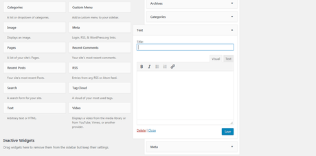
Go to your WordPress dashboard. Next go to Appearance > Widgets.
Add a new Text Widget to your sidebar or where ever you want.

Copy the code below, paste it in the Text tab section (not the Visual tab) and click save.
<style> /* customizable snowflake styling */ .snowflake { color: #fff; font-size: 1em; font-family: Arial, sans-serif; text-shadow: 0 0 5px #000; } @-webkit-keyframes snowflakes-fall{0%{top:-10%}100%{top:100%}} @-webkit-keyframes snowflakes-shake{0%,100%{-webkit-transform:translateX(0);transform:translateX(0)}50%{-webkit-transform:translateX(80px);transform:translateX(80px)}} @keyframes snowflakes-fall{0%{top:-10%}100%{top:100%}}@keyframes snowflakes-shake{0%,100%{transform:translateX(0)}50%{transform:translateX(80px)}} .snowflake{position:fixed;top:-10%;z-index:9999;-webkit-user-select:none;-moz-user-select:none;-ms-user-select:none;user-select:none;cursor:default;-webkit-animation-name:snowflakes-fall,snowflakes-shake;-webkit-animation-duration:10s,3s;-webkit-animation-timing-function:linear,ease-in-out;-webkit-animation-iteration-count:infinite,infinite;-webkit-animation-play-state:running,running;animation-name:snowflakes-fall,snowflakes-shake;animation-duration:10s,3s;animation-timing-function:linear,ease-in-out;animation-iteration-count:infinite,infinite;animation-play-state:running,running} .snowflake:nth-of-type(0){left:1%;-webkit-animation-delay:0s,0s;animation-delay:0s,0s} .snowflake:nth-of-type(1){left:10%;-webkit-animation-delay:1s,1s;animation-delay:1s,1s} .snowflake:nth-of-type(2){left:20%;-webkit-animation-delay:6s,.5s;animation-delay:6s,.5s} .snowflake:nth-of-type(3){left:30%;-webkit-animation-delay:4s,2s;animation-delay:4s,2s} .snowflake:nth-of-type(4){left:40%;-webkit-animation-delay:2s,2s;animation-delay:2s,2s} .snowflake:nth-of-type(5){left:50%;-webkit-animation-delay:8s,3s;animation-delay:8s,3s} .snowflake:nth-of-type(6){left:60%;-webkit-animation-delay:6s,2s;animation-delay:6s,2s} .snowflake:nth-of-type(7){left:70%;-webkit-animation-delay:2.5s,1s;animation-delay:2.5s,1s} .snowflake:nth-of-type(8){left:80%;-webkit-animation-delay:1s,0s;animation-delay:1s,0s} .snowflake:nth-of-type(9){left:90%;-webkit-animation-delay:3s,1.5s;animation-delay:3s,1.5s} .snowflake:nth-of-type(10){left:25%;-webkit-animation-delay:2s,0s;animation-delay:2s,0s} .snowflake:nth-of-type(11){left:35%;-webkit-animation-delay:4s,2.5s;animation-delay:4s,2.5s} .snowflake:nth-of-type(12){left:45%;-webkit-animation-delay:5s,3.5s;animation-delay:5s,3.5s} .snowflake:nth-of-type(13){left:55%;-webkit-animation-delay:6s,2.5s;animation-delay:6s,2.5s} .snowflake:nth-of-type(14){left:15%;-webkit-animation-delay:7s,1.5s;animation-delay:7s,1.5s} .snowflake:nth-of-type(15){left:75%;-webkit-animation-delay:8s,2.5s;animation-delay:8s,2.5s} .snowflake:nth-of-type(16){left:33%;-webkit-animation-delay:9s,9.5s;animation-delay:9s,9.5s} .snowflake:nth-of-type(17){left:53%;-webkit-animation-delay:10s,4.5s;animation-delay:4s,4.5s} .snowflake:nth-of-type(18){left:7%;-webkit-animation-delay:11s,2.5s;animation-delay:11s,2.5s} .snowflake:nth-of-type(19){left:3%;-webkit-animation-delay:5.5s,2.0s;animation-delay:4s,2.0s} .snowflake:nth-of-type(20){left:88%;-webkit-animation-delay:4.5s,3.5s;animation-delay:4.5s,3.5s} </style> <div class="snowflakes" aria-hidden="true"> <div class="snowflake">❅</div> <div class="snowflake">❆</div> <div class="snowflake">❅</div> <div class="snowflake">❆</div> <div class="snowflake">❅</div> <div class="snowflake">❆</div> <div class="snowflake">❅</div> <div class="snowflake">❆</div> <div class="snowflake">❅</div> <div class="snowflake">❆</div> <div class="snowflake">❅</div> <div class="snowflake">❆</div> <div class="snowflake">*</div> <div class="snowflake">*</div> <div class="snowflake">*</div> <div class="snowflake">*</div> <div class="snowflake">*</div> <div class="snowflake">*</div> <div class="snowflake">*</div> <div class="snowflake">*</div> <div class="snowflake">*</div> </div> Here is another snow effect code below. You can do the same. Copy the code below, paste it in the Text tab section (not the Visual tab) and click save.
<style> .editor-stage .snow { height:50px; background: #fff; } .snow{ position:fixed; pointer-events:none; top:0; left:0; right:0; bottom:0; height:100vh; background: none; background-image: url('https://s3-eu-west-1.amazonaws.com/static-ressources/s1.png'), url('https://s3-eu-west-1.amazonaws.com/static-ressources/s2.png'), url('https://s3-eu-west-1.amazonaws.com/static-ressources/s3.png'); z-index:100; -webkit-animation: snow 10s linear infinite; -moz-animation: snow 10s linear infinite; -ms-animation: snow 10s linear infinite; animation: snow 10s linear infinite; } @keyframes snow { 0% {background-position: 0px 0px, 0px 0px, 0px 0px;} 50% {background-position: 500px 500px, 100px 200px, -100px 150px;} 100% {background-position: 500px 1000px, 200px 400px, -100px 300px;} } @-moz-keyframes snow { 0% {background-position: 0px 0px, 0px 0px, 0px 0px;} 50% {background-position: 500px 500px, 100px 200px, -100px 150px;} 100% {background-position: 400px 1000px, 200px 400px, 100px 300px;} } @-webkit-keyframes snow { 0% {background-position: 0px 0px, 0px 0px, 0px 0px;} 50% {background-position: 500px 500px, 100px 200px, -100px 150px;} 100% {background-position: 500px 1000px, 200px 400px, -100px 300px;} } @-ms-keyframes snow { 0% {background-position: 0px 0px, 0px 0px, 0px 0px;} 50% {background-position: 500px 500px, 100px 200px, -100px 150px;} 100% {background-position: 500px 1000px, 200px 400px, -100px 300px;} } </style> <div class="snow"></div>If you want to use both of the codes on your blog then you can.
Copy the first code and paste it, hit enter 2 times on your keyboard then copy the second code and paste it below the first code and then hit save.
Go to your blog and refresh the page and abracadabra! Snow will be falling on your blog.
You can also modify the code to add more snow falling on your blog (if not then just use it as it is).
How To Make It Snow On Your Website?Copy the code above just the same and paste it on your website after the opening of the <body> tag.
Pros and Cons of making it snow on your blogPros:
- Both of the codes are light weight so they won't cause your blog or website to load slow
- It brings the feeling or winter & Christmas on your site
- It can cause visitors to stay longer on your blog and decrease your bounce rate
- It will also show that your blog/website was recently updated
Cons:
- It may cause some distraction while reading blog posts or website
Try this out on your blog. If this is something that you like then share it with your blog visitors and ask their feedback on it.
