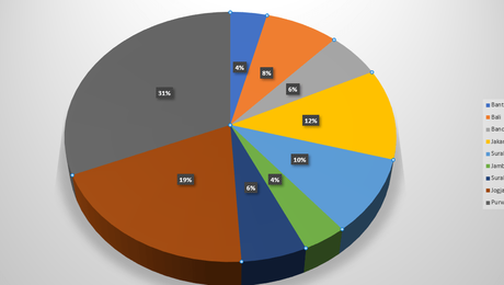
Have you ever thought about creating pie chart percentages in Excel? Microsoft Excel does have its own features and advantages as a data processing application, one of which is that we can make pie charts or pie charts.
More than that, we can also make pie charts in Excel with a wide selection of models or types of pie charts such as Pie, 3-D Pie, Donutout, Pie of pie, and Bar of pie.
In addition, there is convenience when we make a pie chart in Microsoft Excel with a lot of data, one of which we can present it more clearly in the form of a percentage.
So, for those of you who want to make a pie chart (circle graph), here's a short tutorial that you can do on your computer or laptop.
How to Make a Pie Chart in Microsoft Excel
You can practice this guide on making pie charts for all versions of MS Excel starting from 2007, 2010, 2013 and 2016.
So, as an illustration, we will make a pie chart for the number of married couples in an area.
Another interesting guide on how to easily create a background in Word with your own image.
As for the first stage, we will start by presenting it in tabular form in Microsoft Excel.
After that we will create a pie chart from the table.
So, the steps are as follows.
1. Please select all the existing data, you can select it via the cursor or use the Shift + Down key.
Selection from top to bottom to the lowest city itself, namely Purworejo. Now, the Total row is not selected because it will make the pie chart display ambiguous.
2. After that you enter the Insert menu tab to open the Charts or Tables category, please select Insert Pie and Donut Chart.
In this example I use a 3-D Pie type pie chart, you can choose other models such as 2-D Pie or Donut.
Well, to display all kinds of Excel pie charts. You can open More Pie Charts at the bottom, where there are other options such as Pie, Pie of pie and Bar of pie.
3. If you want to change the style or style of the Pie chart, you can enter the Design menu tab then select the chart style you want in Chart Styles.
Furthermore, if you intend to edit the pie chart you can select the button on the right side of the diagram.
4. Additional tips for those of you who want to change the title of a pie chart in Excel. You can do it very easily.
Immediately you double click on the title of the diagram to rename or replace it according to your wishes.
As for the continuation, you can enter the Chart Title Format, where there is a complete settings menu such as changing the background color and others.
Another tutorial that you must see about how to make a bar chart in Excel more easily and quickly.
5. If you want to change the size of the pie chart in Excel, you can simply click on the points in each corner and side of the chart box.
You press and hold then drag to enlarge or reduce the size.
For those of you who want to use another type of pie chart, you can select it in the Design menu tab.
In the menu tab you can change the color along with the layout and other settings.
It's finished how to make a percent pie chart in Ms Excel easily and quickly.
Also follow the tips on how to make a table in PowerPoint complete with supporting images so that it's easy for you to practice.
We have successfully reviewed the explanation along with the steps on how to make a pie chart in Microsoft Excel with various interesting models and types of diagrams or graphs such as 3-D Pie, Pie, Pie of pie, Bar of pie, and Doughnout.

