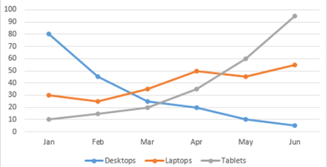
We’re back with another one of our existing Excel Tutorials. Previously we have published another detailed guide on various Excel features, and we’re going to continue the tradition today with the article on “How to create a line graph in excel?”
Today we have brought you a step-by-step guide on How To Make A Graph in Excel. Line Graphs are some of the most basic and most useful functions of Excel.
Knowing how to graph on excel will enhance your skill a bit more. So, make sure to learn it asap:

Uses of Line Graph.
A line graph is an illustration of lines in a paper that has identical boxes. In maths, an A-line graph helps to understand the data from different times of the various objects in the same place so you can see and understand each one of them related to the other objects.
For example, let’s say a company makes five types of mobile phones and every year, each one of the cell phones is sold in a different quantity.
Now, if at the end of 5 years the head of the company wants to know which mobile phone has dominated which year and how many phones they have sold each year, then making a line graph for all of these is the best solution.
Because even when we choose year as our parameter, we’ll have more than 25 large numbers on the display, and processing all those numbers in your head would be almost impossible.
But at the same time if we put it on a line graph, then anybody will be able to understand the growth and reduction in any product’s selling easily.
Another common use of Line Graph is to monitor the change of any data with time. Such as tracking the rise of temperature year by year due to global warming.
You can collect the data from each day of the year for five years and then compare them using line graphs and see which year had the highest temperature on the same day.
That’s why line graphs are one of the most used features of Excel.
How to make a line graph in excel?
As now you have understood the concept of line graphs, we’ll move to the next step which is learning How to make a line graph in excel?
Microsoft has changed the UI of Excel with the latest version of MS Excel, but lots of people still use the older version with older UI.
Still, the steps for creating a line graph are more or less the same. Follow the following steps for entering a line graph in an excel spreadsheet –
Creating a Line Graph in Excel
Follow the following steps to know how to make graphs in Excel–
Step 1: Entering the data.
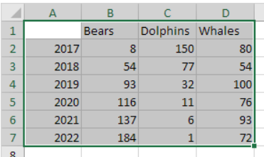
Entering the data in an Excel spreadsheet is one of the most necessary steps in excel. For creating a line graph first, we will enter the data which we want to display using the graph.
For example, we are entering values from 1 to 10. obviously, it will generate a linear graph as on a 2D surface.
Note- if you have numeric labels, leave the cell A1 Cell empty before you create the line chart. By doing this, Excel will not recognize the numbers in column A as a data series. So it will automatically place these figures on the horizontal (category) axis. After creating the chart, you can enter the numerical data cell A1 if you like.
Step 2: Selecting the data.
Once you have entered the data in the spreadsheet, you need to select it. You can hover your mouse over the data while pressing the right click to do so.

Make sure that there is no empty cell between the data. If you leave any cell empty then you’ll have a problem in creating a line graph.
Step 3: Adding the line graph.
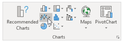
Once you have selected the required data, then it’s time to add a line graph. First, go to the insert tab and click on the ‘Line’ option.

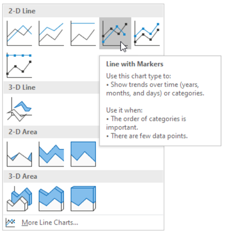
Now select your preferred graph type. For this tutorial, we are choosing a simple 2D Line Graph. After you click on the selected line graph, it will automatically appear on the spreadsheet.

If you are using Excel version 2013 or higher then Click on the Insert tab of the ribbon, then In the Charts box of the ribbon menu, click on the Insert Line Chart icon.
It will open the drop-down list of available graph/chart types. When you hover your mouse pointer over a graph type it will read the description of that graph. For this example, we will select the first 2-d line graph.
With this, we are done with how to make a line graph in excel?
Formatting Options for Excel Line Graph.
When we were going through how to make a graph on excel you would have noticed that the line graph which you have just created was a very basic one.
Relax, you can format the line graph according to what you like. Here are steps to change some basic things to make your Excel line graph better-
*. Choosing a style for the line graph
1. First, Click on the line graph.
2. Click on the Design tab. You’ll only see the design tab after you have added a line graph in excel.
3. Choose Style 4 of the Chart Styles.

*. Adding a title to the line graph
1. Click on the Layout tab.
2. Click on the Chart Title under the section of labels.
3. Select the third option -The above Chart.
4. Type in the title you will like to appear.
*. Changing the font color of the graph title
1. Click once on graph Title to select it.
2. Click on the Home tab on the menu with the ribbon.
3. Click on the down arrow of the Font Color option to open the drop-down menu.
4. ChooseDark Red from under the Standard Colors section of the menu.
Changing the color of the font of axis labels
1. Click one time on the month’s labels below the horizontal X-axis to select them.
2. Repeat steps 2 – 4 as given above.
3. Click one time on numbers beside the vertical Y-axis to select them.
4. Repeat steps 2 – 4 above.
Quick Links –
- How to Get Rid of Syntpenh .exe Error?
- Duda Website Builder Review | Should You Use It?
- Top Android Apps That Help Manage Your Life
Conclusion | How to Make a Line Graph in Excel 2023?
So this is the end of another one of our Excel tutorials. We hope that this post on “how to create a graph in excel?” must have entertained your needs.
Which tutorial would you like us to write next? Have any questions regarding Excel? Tell us all in the comment box.

