Recently I did a personal colour analysis for two women who ended up with the same palette, even though they would never have guessed that their colouring fit the same palette. One was a dark blonde with golden skin and brown eyes. The other was a light golden blonde with green eyes and fair skin. To look at them side-by-side you wouldn't immediately think they fit the same palette, yet when I draped them, it became obvious that there were more similar than different.
Here I've found a couple of celebrity examples to give you an idea of their colouring, Amanda Seyfried and Hilary Swank (as a blonde). You can see that their colouring looks quite different at first glance.
What was different is how they would wear their palette. This is why it's so important when you get your personal colour analysis to also find your signature colours, ideal value, your colour and value contrasts as this gives you YOUR plan of how to wear your colours so they harmonise with you in a really flattering way that makes you shine (and why if you haven't got this information, you can wonder why a colour or colour combination you are wearing, which is all in your paletted, doesn't make you look awesome).
When doing a personal colour analysis, one of the key steps is finding each client's signature colours. These are the colours from a generic palette (I have 18 palettes in my Absolute Colour System to select from) and then selecting the very best colours from within that generic palette which harmonise with hair, eyes, skin, lips etc. This creates your individual palette. But even with this signature selection of colours, you still need to figure out how to wear your signatures in a way that is in harmony with your colouring.
Let's go over some key colour concepts that will help you individualise how you put your outfits together from your signature colour selection (or just a generic colour palette).
Ideal Value - The overall lightness or darkness of your outfits
Your ideal value relates to the value (value is just the fancy word for how light or dark a colour is) of your hair. To create the most harmony and resonance in your outfit, think about repeating more of the value of your hair in your outfit (that's the 60% in the 60/30/10 ratio that I talk about here).
You want to ensure that this value colour is also worn close to your face in a larger proportion, as this way you are repeating your appearance in your outfit which creates that beautiful harmony.
You can see that Amanda (above left) has lighter hair than Hilary (above right) and so her ideal value is lighter than Hilary's, even though they are both overall lighter rather than darker.
What's Your Ideal Value and How it Creates Balance in Outfits
Value Contrast - the difference between the lightest and darkest parts of your colouring
Amanda has a low value contrast, when you remove the colour and look at the values in a greyscale - you can see there is not a lot of difference between the value of her hair, eyes and skin.
While Hilary has a medium-high value contrast as she has medium-light skin and hair and then darker eyes.
So Hilary needs to wear more medium-light colours with pops of dark colours. While Amanda is best in overall light outfits without much value contrast.
The Value of Value Contrast and Using it to Create Stunning Outfits
Colour Contrast - the difference and relationship between the colours in your colouring
This is where you notice a big difference in how Amanda and Hilary would wear the same palette of colours.
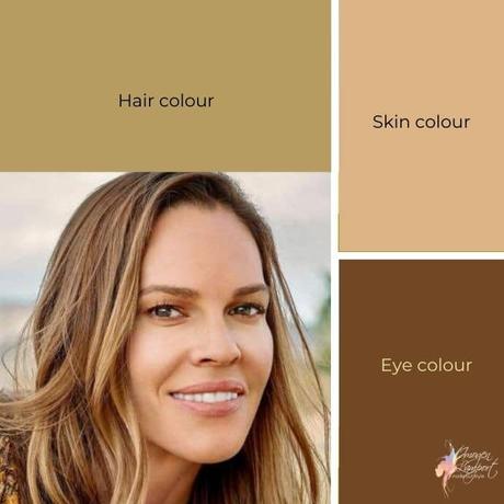
Hilary has a low colour contrast as illustrated below.

She is shades of beige and brown, so would ideally look best in monochromatic colour schemes or neutrals with just one colour at a time.
While Amanda has a high colour contrast as illustrated below.
She has golden blonde hair, with green eyes and pink skin and so needs to wear more colours in every outfit, those colours need to be in a more similar value (rather than different value) to each other. Either triads or complementary colour schemes are going to work well for Amanda.
What you choose from your colour palette will come down to your unique colouring, think about finding colours that resonate with the colours in your face and hair, just as I've shown here for Amanda and Hilary.
Understanding Colour Contrast and Putting Outfits Together
Choosing Outfits for Your Colour and Value Contrast
Once you have your ideal palette of colours and know your particulars you can start to put flattering outfits together.
Here are examples of two outfits - one for Amanda (left) and one for Hilary (right), which reflect their colouring, ideal value, colour and value contrasts. Both come from the same generic palette of warm/soft/light (Intriguing) colours. To create these outfits I've chosen to replicate, hair, eye and skin/lip colour in the outfits, which is truly the easiest way to select a truly flattering colour combination.
You can see how it's important to know which are your best colours, and how to put those colours together from a generic palette of colours, into delightful colour combinations that harmonise with your unique colouring.
If you want to get your ideal palette of colours, signature colours, and discover your ideal value, colour and value contrasts, all this is part of my online personal colour analysis (or as part of my 7 Steps to Style program, which also includes body shape analysis, personality, wardrobing and so much more).
Further Reading on Colour, Contrast and Ideal Value
9 Ways Knowing Your Best Colours Will Change Your Life as Well as Your Wardrobe
5 Colour Concept Essentials You Need to Understand To Create Harmonious Outfits
How to Use a Colour Wheel to Create Outfits
Value Contrast and Your Value

