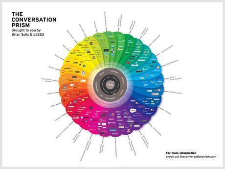
This infographic – the Conversation Prism by Brian Solis — is a social media classic.
Filled with everything. Organized by color.
Still, everytime I look at it, I get overwhelmed. (Click here for the full graphic.)
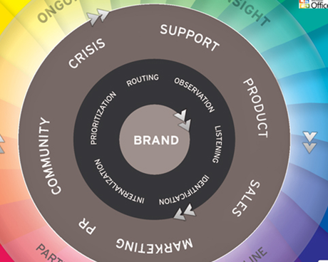
And I’d say I’m one of those individuals who embraces all the new websites and technology. To me, the key to this marketing infographic is the center… The names will change on the edges, but the strategy will remain core.
Because this info is shown in grey, it’s easy to overlook it. The peacock feathers of the prism distract the eye from the important reason to be.

If you’re overwhelmed by all the social media opportunities, take a moment to study the grey parts: the brand strategy rather than the individual social media tactics.

