Looks bring multiple advantages. Adding the perfect design template for your checkout page will be an eye treat for the customers.
ThriveCart.com has all in the box for you with looks to kill and will be your good luck charm. The super brains of ThriveCart have put an end to those silly hacking techniques to convert a check out page. Check our detailed ThriveCart review to get detailed insights into the ThriveCart platform.
Checkout pages have the power of bringing back your customers again and again. It also can keep a record of those who leave the cart without further purchase for sending a mail to communicate with them.
ThriveCart provides you with 4 stylish templates of checkout pages with custom options.
Skim the rest to get a brief idea to design a checkout page.
Steps To Add Styles To Your Checkout Pages In 2020
#Step 1:
Amongst the 5 tabs on top, you will find the checkout tab, click on it. Following are the 4 design templates provided by the ThriveCart.com:
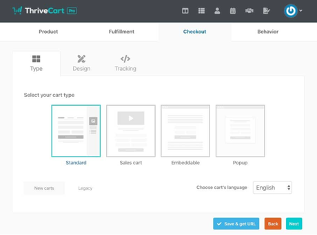
#Step 2:
1. Tall one step checkout or standard
Tall one step checkout is another name for the standard type of the cart and is the most used and preferred one amongst the four templates. This one is quite attractive with the options well organized and simple to fill. Your company logo can be inserted on the top with the contact information, product picture, price quoted, coupon code and the payment information settled below. All the information is just basic and simple to fill showing clearly the product and price. It is the most used since it is user friendly.
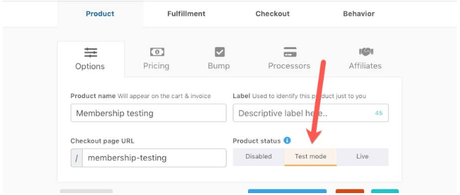
Customers can see the picture of the product with a clear description.
2. Two-step Checkout or Sales Cart
This template was designed smartly pushing the customers to fill the contact information first so that they don't miss out anything or fill in any incorrect details.
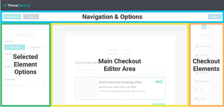
You can also write a catchy line below the logo to create a sense of scarcity to the customer. The second step will appear when the first one is done right. After clicking on the complete order button, the transaction ends.
3. Embeddable checkout:
Just add the code below in the box onto your site where you would like your cart to appear and the checkout page will be embedded.
You can also choose whether to embed it with a button or with an image.
Click on the HTML button, and drag to space
A blank big space shall appear as follows after you drag the HTML button where you can embed the code.
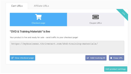
Insert the HTML code in the given space and click the save button. Your code will be embedded.
4. Popup checkout:
As the name speaks, the checkout page pops up after the customer chooses to check out. Similar to the two-step checkout, Popup checkout goes to the next page only after the contact details are filled correctly.
So, click on any type or design of the cart of your choice to proceed to the further step.
#Step 3:
The story does not end here. ThriveCart has also provided you the option of customizing the templates as you wish. Let's see how that's done.
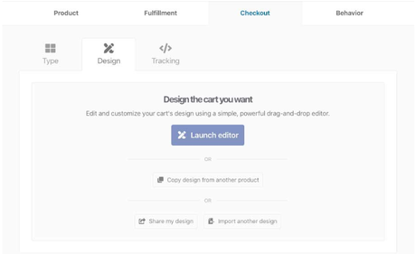
So, firstly click on the design beside the templates tab and click on launch editor
Here, you are provided with many options to choose from. You can edit the card header, countdown timer, guarantee seals, requested fields, custom fields, etc. Use your creativity and style the checkout page to make it the most attractive one. You can pick the cart's language, background color, and layout. ThriveCart has literally thrown a space to spit out your artistic ideas, so make it look vibrant and elegant. With so many options, you probably can't stick for one!
Click on the edit card header and select an image to display in the header
Add an artistic touch to the checkout pages and reflect your style quotient. Customers will tend to remember those beautiful ones for a longer period of time, and share them with others too.
Go design your checkout page with ThriveCart and make transactions colorful!

