When was the last time you subscribed for an online magazine though you were not planning to do so? Yes, it happens with most of us. The reason behind it is the original content and the Call to Action buttons that compel us to move ahead to the next level with our search. A call to action button is an interactive button on websites for the users. The primary purpose of putting CTAs on the website is to help the user, to improve communication and most importantly increase conversion. It is a vital part of marketing. However, have you ever noticed the way websites place these buttons?
When placing a CTA or Call to Action button on your website, factors such as colour, text, website design, space are considered to be very important. One more that adds to this list is the placement of the CTA buttons on the webpages. How and where to place the CTA so that it will help to improve your website land more traffic requires logic, planning and strategy.
The placing should be specific to the website and strategic in a manner that it should generate a response. Placement should be so prominent that the reader is compelled to click the button before moving ahead.
CTA Buttons on the Top Page
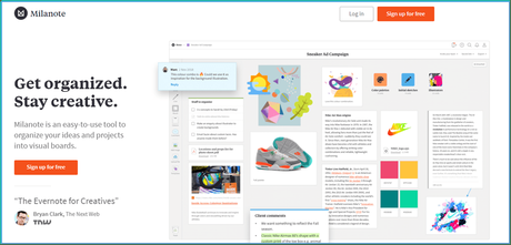
Most of the companies display a CTA button on the top page, which is a good strategy for conversion. Some websites provide a clear Call to Action button on their top page of the websites. For instance, Milanote, a project organising platform, displays its CTA button right on the top page. It shows a clear communication to join the platform for free and two CTAs given on the top left for members who have already signed up.

Source: https://milanote.com/
The central positioning of the CTAs is observed on the top pages. Mostly it depends on the kind of content you show up on the website. The placement of CTA will be according to it. In many cases, the audience does not require in-depth information on the first page of the website. Then, you might provide fresh content to describe your service, then a CTA at the top page is best to get conversions.
CTA Buttons that need not be on Top Page
If the content you are providing is complex and needs an explanation, then it is better to place the CTA buttons after you have completed the necessary communication. As, CTA must be the next step for the user, getting full information is vital. Moreover, on mobile-friendly websites, users scroll through the pages and then click the CTA buttons.
Where CTA is your Next Step
Many websites have interactive content where steps are to be followed to complete the interaction. For instance, e-commerce websites, such as Amazon, eBay, Flipkart. Submit buttons are necessary CTA buttons provided when filling up a form or making payments.
In case of blogs or lengthy texts shared on the website, people do not display the whole chunk at one go. So, the Read More or Know More buttons at the end of the text guide the reader to the next page. Moreover, it helps to raise curiosity and interest in the article. Also, the home page remains free of clutter and drives traffic to the blog page. For instance, the homepage of Philips India.

Source: https://www.philips.co.in/
Avoid CTA Overloading
It is essential to get conversions and thus you might end up giving a bag full of CTAs on your website. Too many CTAs on one page can create clutter and confuse the audience. It might affect the decision-making process of the audience. Secondary CTAs should be placed in a way so that they do not overpower your primary CTAs.
CTAs in Empty White Spaces
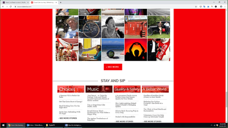
If you want a high-converting CTA button on your website, you can use the white spaces to put CTA buttons strategically. Spaces in between the paragraphs, columns, images are generally known as white spaces. The website designers use these spaces in a way that create an impact on the reader's mind. For instance, look at the CTA button on the Coca Cola website.

Source: https://www.coca-colaindia.com/
CTAs in white spaces catches the attention of the reader quickly, especially in the case of mobile phones. These spaces are also known as negative spaces.
It is true if your content is not attractive enough to catch the reader's attention, then the CTA buttons also are of no use. Every CTA is interconnected with the content. Readability is a significant factor that helps in getting conversion through CTA. Thus, next time, when you are designing the website, keep in mind where to place the CTA buttons.
Author By-line: Shaista MujeebShaista Mujeeb is a Copywriter expertise in online advertising guide at Wolftain. Having expertise in digital marketing and social media management, she is at par with writing both technical and non-technical content. She is also a foodie with an avid interest in the art of Makeup and Cosmetology.
