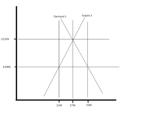
In the top graph we have a snapshot of the UK housing market, with 27 million dwellings being supplied at an average of £220K each. At £100K this represents the capital only constituent of that average home.
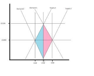
The bottom graph shows the results of two different ways to bring down average house prices (and rental incomes).
The most popular option is to increase the supply of housing. Demand 1 stays the same, while supply is shifted to the right to position 2. The pink area shows the added costs resulting from this.
The unpopular option is to reduce demand by a recurring tax on the rental value of land(location). Supply 1 stays the same, while demand is shifted to the left to position 2. The blue area shows the reduced costs resulting from this.
Of course in my graphs I've made all sorts of assumptions/guesses about supply/demand elasticity which gives the following results.The difference in the number of houses is 12 million x average capital cost £100K = £1.2trn
The numbers don't really matter, but the principle does. Given economic policy should be about reducing costs, why on earth do so many economists recommend policies that increase them?


