To brighten up your lockdown life, and herald the arrival of spring and all the wonderful colours springing up everywhere, we tour the home of Anna Jacobs. Anna is a British artist and designer living in a rented home in London with her 2 young children, Zachary and Coco Rose. In a way it’s often more inspiring to see what can be done with a rental property as there are so many limitations to creativity. But nothing has limited Anna’s quest for an original and visionary home, so prepare to be inspired and stunned, with its color saturated interiors and colourful wall murals.
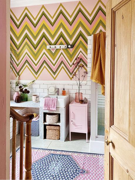
How would you sum up your style?
I would say my style is like living inside a piece of art that is saturated with fresh color to make your heart leap with joy. That’s my aim, anyway!
What sort of condition did you rent the house in?
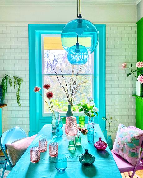
When we moved in, the property was completely neutral, with a mix of white and greige walls. The landlord had left two coffee tables and the kitchen table, plus cupboards full of crockery and old food (some of which was 10 years out of date!). He said we could keep, chuck or do what we liked with all of it. So far, I’ve just painted the two coffee tables, covered the orange pine kitchen table with a cloth and stored much of the crockery.
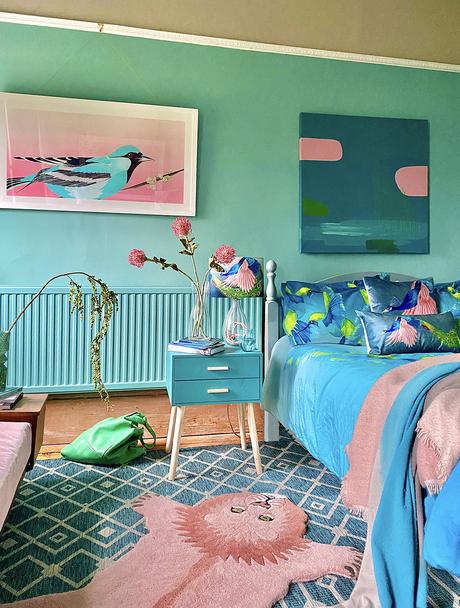
What are your top tips for making a rental property your own?
– Cover the floors with rugs, these immediately make it your own home, are removable and protect rental carpets and wooden floors
– Paint walls that are cheap and easy to paint back (with landlord permission!)
– Start small, by just painting door frames, or even the edge of a door!
– Paint just part of a wall, or paint a giant shape on a wall
– Replace door handles on kitchen units, using the same size handles as the rental ones.
– Use self-adhesive removable wallpaper on walls, uncarpeted stair risers and even furniture
– Use self adhesive removable splashbacks on tiles in the kitchen and bathroom.
– Accessorise, accessorise, accessorise!
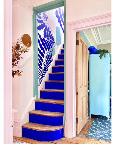
Your hand painted mural on the stairway is incredible. How did you come up with the idea for this? How long did it take you?
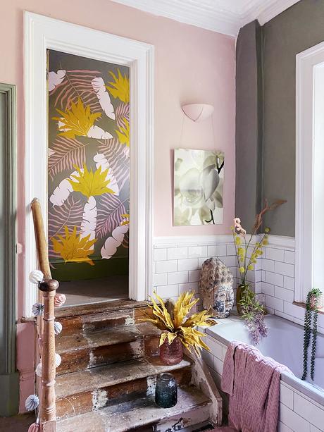
Well, I knew broadly what I wanted and I knew I wanted to use these colours, because they reflect the colours of the surrounding rooms and the staircase sits right in the middle of the flat, connecting all the spaces. However, I then spent weeks and weeks staring at the staircase, looking through pinterest, insta and online art galleries, sketching ideas, staring at it again, etc etc, but still couldn’t nail the perfect design.
Eventually, I came across this fabulous Swedish artist called Linnea Andersson and as soon as I saw her work, I knew that’s what I had been trying to create – and it was already in the same blue I was using! I messaged her on insta to ask permission for using her art as inspiration and to my delight, she said she’d be honoured!
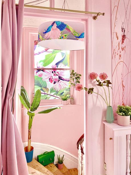
I painted the green and pink shapes in the background by instinct, then drew the main meandering branch in pencil first to make sure it covered the wall properly. After that I just painted everything free-hand on instinct as I went, occasionally drawing the leaves in pencil first if I needed to work out a tricky shape.
I started on the Friday evening and finished on the Sunday evening!
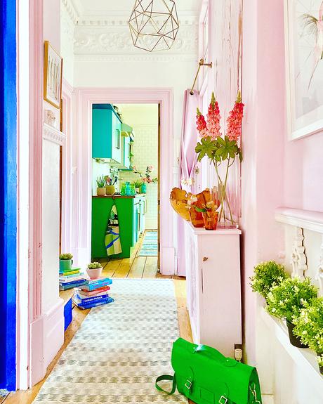
Do you design your home with color psychology in mind?
Absolutely! I use a mix of color psychology and color theory, but you have to listen very closely to your own personal reaction to color too, which might contradict and take precedent over these.
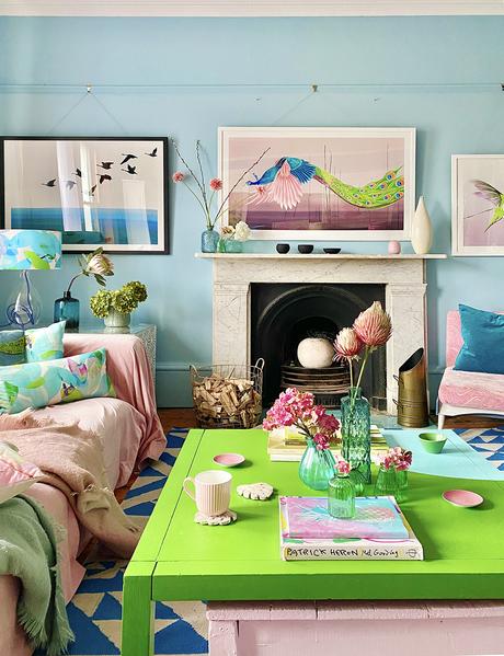
As a single parent running my own business, I live with fairly constant stress, so I have surrounded myself with a lot of blues and greens, because they are calming and nourishing colours, but I add pink highlights to warm them up and create a welcoming feel. I’ve also just changed the very warm and quite dark greige in our living room to a gorgeous duck egg blue, because as a West facing room, it just felt too heavy and cloying in the very warm afternoon light. The blue literally makes me feel as though I can breathe again!
Have you made any decorating mistakes over the years which others could learn from?
Of course!
My 13yr old boy is very physical in his reactions and is unusually strong, so without a dad around to help tame him, I thought I would paint our entrance hallway pale pink, as pink is proven to physically reduce muscle strength and calm violent men. Unfortunately, when my boy first walked in he was furious, shouted that he refused to live in a house with a pink hall, stamped loudly all the way up the stairs and slammed his door shut! Lol. I promptly painted the walls back white, but left the door surrounds pink – which he accepted, thank goodness.
You manage to use lots of different colours within one room, whilst still making it look considered and edited. What’s your top tip for pulling this off?
Aaah, well that really is color theory! There are about 7 classic color structures you can use, which will always work and then you can dial these up or down, depending on how calm or energetic you want a room to be and on how warm or cool you want it to be.
In general, I find that the two easiest to use are a ‘harmonious’ structure, which uses 3 to 5 colours next to each other on the color wheel, and a ‘split complementary’ structure, which uses two colours almost next to each other on the color wheel, plus one directly opposite them. I use both of these a lot!
Then remember to use CONTRAST in your scheme! Dark and light, dull and bright, large area v. small area.
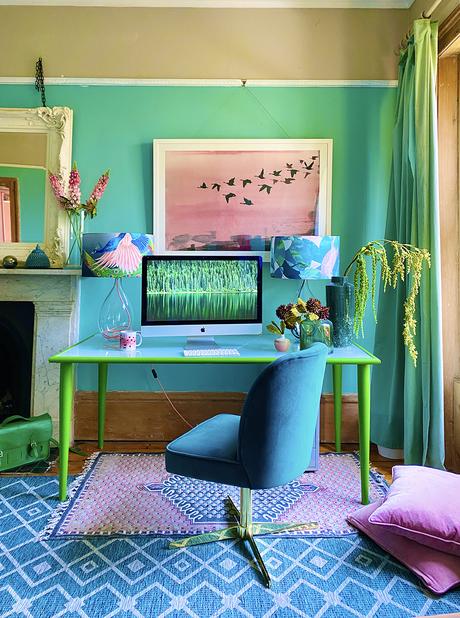
If you want to see more, check out her instagram. Anna also has a website where she sells her own designed products and is about to launch an online course on how to choose color for your home that will help to improve your well being. So, if you are a fan of saturated colour, and want to know more about how to use it and the science behind color theory, Anna is your go to girl. What do you think to Anna’s home? I love it but I’m not sure if I could live with that much color in every room. I think I prefer more muted colours – not sure what that says about me! I have just bought a set of the Chinese Tree Blush bedlinen for Amelia from Anna’s website as we both really love the pink and yellow color combination.
Never miss a post: follow us on Bloglovin’!
Image credits: Anna Jacobs
