On Thursday I was walking up Holloway Road and as I turned into Tufnell Park Road I looked up and and exclaimed "Wow" out loud as I saw the gleaming façade finally revealed.
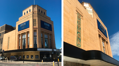
Holloway Odeon, 2020, main tower and entrance a Tufnell Park Road side
A man heard me and stopped and stared at me, grinning. I thought that he thought the 'wow' was directed at him, but no. I spoke to him and he introduced himself as David Latter, the architect of the building. I wondered if Howard Crane the actual architect of the building back in 1938 would have been pleased to hear someone taking the credit, but nevertheless engaged David in conversation and we chatted about the renovation which he was clearly very pleased about. I commended him on the removal of the blue paint on the metal windows which have been stripped and painted black and the reinstatement of the restaurant area there. I made mention of my knowledge of the history of the building and I also made comment about those nasty logo panels, but it was clear from his expression he didn't really get my point. He told me his company works on lots of revamped cinemas round the country and he gave me his business card. I also briefly met his assistant who was unchaining his bike from a nearby lamp post. David urged me to go inside to view the interior.I crossed the road to take a closer look. I couldn't get inside as it's not yet open to the public, but the interior does indeed look better designed. That can wait for another day. Instead I wandered around the outside at studied the renovation at street level.
Oh dear, what a disappointment.
From a distance it looks marvellous, but get up close and it's slapdash, shoddy workmanship. I cannnot believe with all the products and processes available today that better results cannot have been achieved. Most of the lovely original faience tiles have been painted. I think on the upper sections shown above that a layer of varnish has been added as no way way was it ever that shiny before. However, other areas at ground level have been overpainted in a strange yellow tone that is not the same as the pale terracotta originals that have stood the test of time for over 80 years. That might have been Ok had the paintwork not been so messy – wires have been painted over without any idea of realigning them, edges are not straight, there are patches of overpainting, holes and defects have not been repaired. Yet the original tiles are still filthy, hinting that this new paint has been applied over years of dirt. New additions such as the canopy are mis-aligned and far from curved with cut and breaks and gaps where they bend and abut other areas.
Basically, if they could achieve an impressive, or even just adequate, standard of workmanship in the 1930s, why is it not possible today? Quality control or pride in one's work does not seem to be important these days.
See the evidence below.
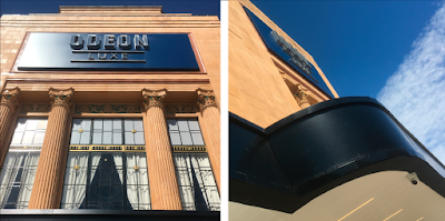
The new window frames look marvelous but the black-edged canopy above street level has frilled edges
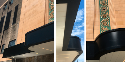
More views of the canopy along the Tufnell park Road side – juddery curves and wobbly straights
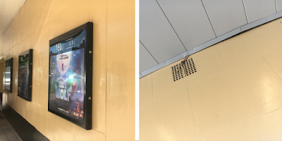
Silky reflective paintwork over the tiles along the TufPkRd side already has has patches of repair. And under the canopy by the main door at the corner a strip has been cut to go round old wires that feed through an air brick. These wires are probably not even functional any longer. Note also how the thin strip veers away from the wall and has been snipped to make it bend back again. Was this really the most effective way to do this?!
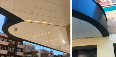
Canopy at the corner over the main entrance. The two curved sections have a gap between them and where the white ceiling panels meet the wall they are not cut at the correct angle, leaving thin triangular holes. Also note other bits of wire that could have been tidied up, plus dodgy curved [black] edges and filthy original tiles etc.
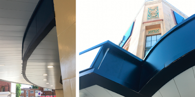
Canopy at main door. The curve on the underneath is not a curve – surely there are products available that can achieve a soft arc? Are there no artisans who can produce better quality results with the materials at hand? And, on the front on the right hand side of the main canopy, there is vertical gap, though strangely not parallel, where the panels do not meet. And again, more of those snips in the curves. Is this a literal/visual example of "cutting corners"?
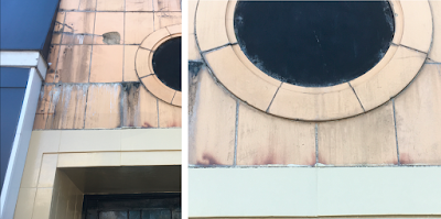
Along the Holloway Road side it appears the renovation proper ends as all that is is in evidence is a bit of shoddily applied paint at ground level and some new panels that I had assumed were temporary but now fear are permanent seeing as the cinema opens up next week. Couldn't they at least have cleaned the original tiles and sympathetically repaired all the damage caused by previous panels and fixings?
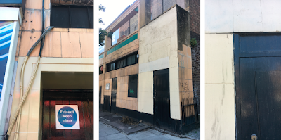
The northern section of the building on Holloway Road. Some bits painted, some bits not, more painted wires, more dirty tiles and unrepaired defects, ends of bits of newly-applied wood, and at the very end, a horrible patchwork corner. This side of the building was originally designed as shops interspersed with doors that provided access to cinema waiting areas below. This negated people having to queue in the rain and reduced congestion on the busy pavement. The area above the green line was a terrace that provided alfreco seating for the restaurant. It really seems like this part of the building has been deemed by Odeon to be of little imporatnce, yet it is a long swathe facing an important A-road – now the messiest part of the building is seen by the most people.
