I can't be the only one who finds Transport for London's safety posters rather ill-conceived. Their design team seem to have overlooked that many people who use the tube do not have english as first language and might not understand what a handrail is in the first instance. TfL's graphics do not enhance their messages, instead they are confusing.
For instance, it's no good mentioning a handrail in big bold capital letters if the handrail mentioned is not clearly indicated in the image, especially as many people who use the tube networks are visitors and tourists from other countries for whom english is not their fist language.
A depiction of a hand actually holding the handrail might be a nice idea, with the words placed in such a way they they highlight/enhance the handrail in the graphic. I'm also surprised that none of the posters include a pleasantry or an explanation, such as 'For your safety, please hold the handrail'.
I'll start with the buses – signs like these can be found at the top of the stairs on many routes:
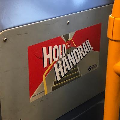
At first glance, it appears to say, HOLD HANDRAIL. Ah, but no, there's a tiny little THE at the end of the stairs, looking like an afterthought. The message might make better sense if the 'designers' had aligned the words with the handrail(s) and, for clarity, added a hand holding the handrail at bottom left. Note the handrail is here depicted in yellow, but on this bus the rails are orange. A similar version of this can be found on the underground where the handrail is coloured black as per the moving handrails on escalators yet, but they've painted the side walls blue when, in reality, they are are actually silver color.
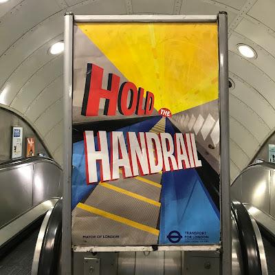
The handrails in the graphic are barely noticeable at all. The poster seems to be luring us into a golden sunset where a little white 'the' is waiting to take us down a fiery tunnel (to hell?).
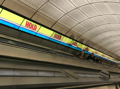
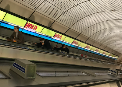
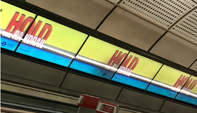
Travelling down the long Elizabeth Line escalators at Farringdon, I spotted this animated version which starts with the world HOLD in roman, then it becomes italicised as HANDRAIL appears across it in white. It wasn't until I looked at these pics that I noticed the word 'the' again hiding in there.
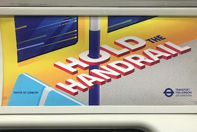
These signs are bonkers. Someone took the time to design this. And someone else approved it. It beggars belief. I think at some point they realised that these posters make scant sense, so someone had the bright idea to link the word HOLD with the visual depiction of the handrail, thus we see a series of posters where the O of hold appears like a ring on a curtain rail as per here on the carriages, though, call me pedantic(!) but I am not sure many of us refer to a vertical pole as a handrail. :
They also created a series of alternative poster designs on this theme, as shown here below at Holborn station. These dispense with the chunky drop shadow letters, as shown above, instead using TfL's Johnston typeface:
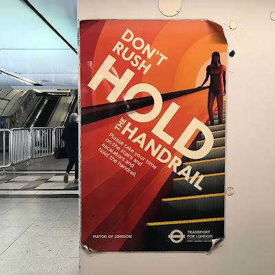
These posters depict a mysterious androgynous figure, almost silhouetted at top right, who has speared a big Polo mint and is about to spin it around. Holborn station is slathered in signs of this design – on the platforms, in the tunnels that connect the Central and Piccadilly lines, before the escalators and pasted into the gaps between the escalators, as shown here, viewed from the bottom, the top and mid-journey (ascending):
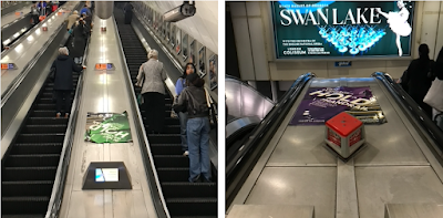
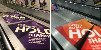
Heading up towards street level, I struggled to snap the second two pics above. It's almost impossible to read these things as you glide past – you'd need to be at least 8ft tall to be able focus on them, let alone be able to read the content. The message is therefore lost in transit. At street-level, on the concourse, three of them are pasted on the wall:
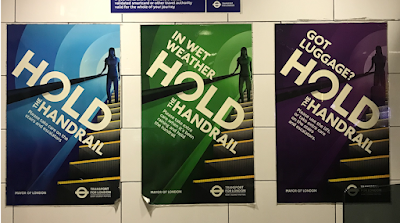
I'd love to have been a fly on the wall during the creative brief for this. I think the design department was first tasked to create the blue poster and, when someone slipped over on a wet floor, they adapted it for the green version and then realised that people with bags are an issue and so the purple poster was made. Somewhere in the middle of all this, the orange Don't Rush version was created.If you read the smaller text here, you'll see that some of these posters advise us to use the lift which, here at Holborn, is misleading in two respects; 1) you might already be half way up an escalator at this point, and 2) there are no lifts at this station. Or stairs for that matter. The purple poster irks me the most and I wonder what message do they think they have conveyed here? Considering how foreboding this is, what with the color scheme of black and purple and that shady figure, it looks more like they are telling us to watch out for luggage thieves who might steal our suitcases. Or, perhaps that dark figure is supposed to be you/me, suggesting that we should hold the handrail whilst we slide our luggage ahead of us down the pole?! Hmm, letting go of the bag is not a good idea and this is why I think another poster was created on this subject (see further down).Got Luggage? Eurgh! This kind of short question-heading is everywhere these days and I really don't like it. It requires us to do an upward inflection at the end when we notice the question mark! Add to that, the use of 'got/get' which is lazy and can always be replaced with something better.
On the subject of luggage, this next one is sublime, for all the wrong reasons...
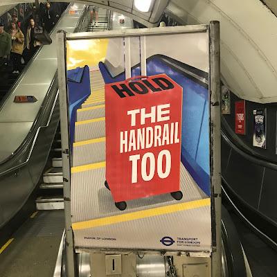
The design style here is quite similar to the one on the buses. However, here, the two words that have been given the most visual emphasis are 'the' and 'too' – leaving the instruction to 'hold the handrail' lost within a red wheelie bag that seems to tell us that we should place our luggage sideways across the footplate, thus blocking up the space for anyone who wants to walk past. It certainly doesn't show us to hold the bag and the handrail which is what they are trying to say here.
Ah, but, hold on, (see what I did there?!) this wheelie bag seems have made the journey up the escalator all by itself. Note that the handle is depicted as being away from us, suggesting that this is not our bag but the property of some poor soul who has let go of their luggage but is now out of view somewhere on the concourse at the bottom!
As regards the typography on this one, the message to 'hold the handrail' is completely muddled. It's as if someone recalled Katherine Hamnett's T-shirts back in the 1980s but didn't grasp that they work because the largest words in those statements were the ones that were the most important. Instead, here we see HOLD, the most important word, in italics on across the top of the bag, black on red (and vice-versa) being the worst pairing of colours for legibility. Instead, 'the handrail too' in white letters stands out as some kind of cryptic puzzle.
I was going to continue here and address some of TfL's other posters of this type but I think I will save them for another day.
In the meantime, please hold onto your hats and bags and handrails, in anticipation.
