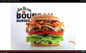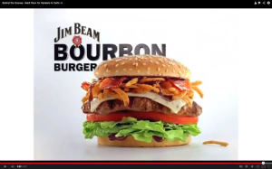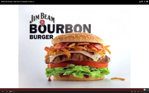


1. I LOVE HOW THE FOOD BOUNCES AT THE END. Always have. That’s something Carl’s Jr./Hardee’s owns. It’s just terrific food photography—it not only makes the food look good (I think there’s some kind of rule about the food being in motion that food photographers tend to obey), but it also makes the following branded statement:
“We don’t give a flying F, and in fact, we’re casual and macho and care-free, so we’re just going to drop the food, which confidently speaks for itself. Let other restaurants be all fussy. Know what? Let the GD burger just do whatever it does, just drop it, while we smirk at you with a scornful, condemning sneer for not being MAN enough to just going ahead and say ‘flying fuck.’”
2. I LOVE HOW THEY MAKE ALL ADVERTISING AND FOOD-RELATED JOURNALISTS TYPE THE VERY-DIFFICULT-TO-TYPE “Hardee’s/Carl’s Jr.”. It’s really hard to type. But they just say “F you! Carpal tunnel it up, Mother Effers. Both words represent established regional brands and we don’t give an F about you. We’re not going to buckle to your pressure. We don’t have to decide? We’re not going to decide.” No comma after Carl’s, for the record. I looked it up.
3. I LOVE WHAT MIKE NICHOLS DID WITH BUCK HENRY’S SCREENPLAY. Here’s an interesting discussion of The Graduate. I always enjoy being reminded of that movie.
4. I LOVE THE CLARITY OF THIS BRAND. They have identified their target, they have decided that they’re comfortable aiming only at that target, and they virtually never swerve from the path that will lead them to the young, horny dude who will eat a burger the size of the calf of the cow it came from.
1. I DON’T LOVE FAINTLY (OR NOT-EVEN-FAINTLY) MISOGYNISTIC AD PLATFORMS. I mean, that’s what this is, right? I’m sure the people who work on this have a well-worded rationale for aiming Hardee’s/Carl’s Jr. at young men who watch pornography. But let’s not be coy: The fantasy curves. The salacious licking and sultry eyes. The poses, the make-up, the total comfort with the juicy nature of the big burger—I suppose there are women who are empowered by pornography, but there are a whole lot more who are uncomfortable with the idea that they are mostly “about” their bodies. I think Hardee’s/Carl’s Jr. is/are [see #2 in the previous list, dammit] perpetuating the idea that women are a Wonderland, as it were, and that’s about it. Plus these incredible BABES even eat sloppy, like the young men they were put here to please. It’s the punchline of an as-yet-unwritten dirty joke.
2. I DON’T LOVE FEELING LIKE I’VE BEEN HERE ABOUT A MILLION TIMES. I do believe in brand consistency. I do believe in setting up expectations and then meeting them. I don’t know if I believe Hardee’s/Carl’s Jr. ads are anything more than ‘on a rail.’ There are plenty of consistent campaigns out there that continue to find ways to surprise me.
Hardee’s/Carl’s Jr. is not one of those campains. It never surprises me. It makes me uncomfortable when I’m watching TV with my daughter. It maintains my grudging respect for understanding how the brand would handle any given situation. But it’s starting to wear thin. I get it. Sexy girls will pretend they like your burgers for money, and your audience will show its appreciation by driving up and handing money through a hole in the side of your restaurant.
But I don’t love it if you’re just doing it out of habit, night after night, and the fire is out.
