First published at The Valve in 2007.Even as Tim Burke had been calling for explicit and focused aesthetic commentary on popular culture, I was thinking of making a few aesthetic observations about the graffiti which I've been documenting since 2006 (cf. Shrine of the Triceratops). As some of you know, this kind of graffiti is based on the name; the graffiti writer paints his or her name, sometimes simply as a tag, sometimes a bit more elaborately as a throw-up or throwie, and sometimes in an often highly elaborated form known as a piece (for “masterpiece”). When the so-called Wild Style emerged in the late seventies, the letters became elaborated in such a way that it was very difficult to read the name unless you already knew what it was. At this point the name seems to function primarily as an abstract framework upon which the writer crafts a design, much as blues musicians work endless variations on the same basic chord progression.
Let's begin with a very simple, and readable, piece by Ceaze:
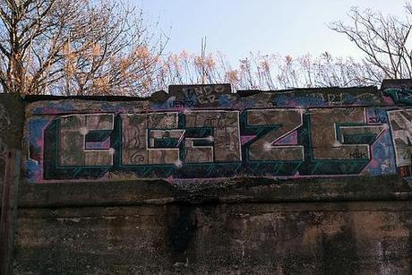
Note: If you want to see a larger image, you can click on the image and thus be taken to my Flickr site, where I store these images online.The letters are simple bold block letters with 3D extensions. The faces of the letters are lightly painted in patterns which do not follow the logic of the letter forms, but rather “cut across” it in visual counterpoint (look at the first “E” and the “a”). The letter forms are outlined in hot pink and a light blue that contrast nicely with the neutral tones of the letters themselves. Finally, notice the “sparkles” and the reference to his girlfriend Jen (at the top) and his crew, MSK, at the lower right.
This piece has been weathered for a few years, which probably has dulled the colors a bit. I don't know how it would have looked when freshly painted. A few months after I took that photo Ceaze painted over it with another piece, in a more elaborated style.
But not as elaborate as we see here:
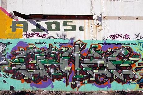
This was painted in 2005 (look at the lower right) and seems to me an example of the kind of baroque over-elaboration to which the style is prone. If you know the name, you should have relatively little trouble making it out, otherwise you may be mystified. But that is, at best, a secondary or tertiary issue. What I find bothersome is that the image lacks an overall visual form or focus. It is just a fussy mass of detail: grey, green, red, blue, and yellow. I'm sure there's a logic to it all, that it took care and skill to work it out, but I do not find the result very compelling.
By way of contrast, consider this piece:
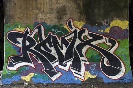
Here we see boldly stated letters in black and white set against a brightly colored background of clouds accented with bubbles. While some letterforms seem clear and obvious - R M S, perhaps a 7 - I can't read the name. But, as I said with the previous example, that's irrelevant. These letters, though stretched, twisted, and connected so that the forms are difficult to parse, nonetheless the forms themselves are clear and compelling. The black-faces are set-off by white 3D extension with the whole letter-block outlined in red. Notice the use of yellow and a purplish-grey to see off the greens and blue of the clouds.
The overall effect is one of deceptive simplicity. There aren't a lot of pieces here, as there are in the previous Ceaze, but they work against one another in subtle ways. Notice, for example, how the letter forms point toward the middle bottom - the pointed right leg of the initial “R,” the legs of the “M” and especially its 7-like extension. They don't all meet at a point, but they seem to be moving in the same direction. This contrasts with the left-moving extension on the other leg of the “R” and the rightward swope of the lower curve of the “S” - but just where is the top of that “S”? These letter forms have a wonderful organic liveliness that contrasts with the almost mechanical fussiness of the second Ceaze.
Now let's take a walk in the woods, not a large wooded area, just the trees around the stanchions supporting a major highway as a comes down off the Jersey Palisades and into the Holland Tunnel. As we approach the base of one of these stanchions we see white forms cantilevered across the base from the right:
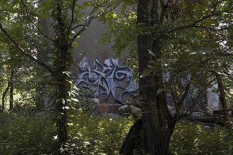
Once we're through the trees and standing directly in front of the stanchion we can see the forms quite clearly:
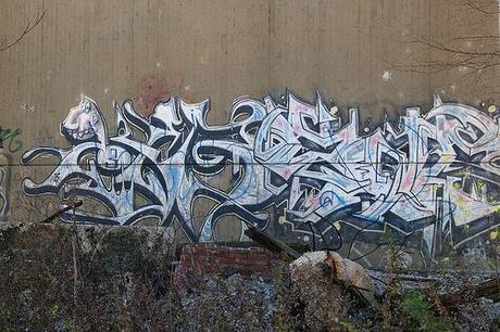
Whatever name is hidden in those forms is an utter mystery to me. But the forms themselves are quite attractive. They're dense and heavy on the right and then become sparer and springier as we move to the left, where we see this odd big-toothed creature at the upper left. These forms seem to echo those of the surrounding leaves, branches, and trees. Whether this effect is deliberate - consciously so or not - I do not know, but I find it striking, and pleasing.
Notice that there is some blue scribbling on the surface of this piece. That is probably a later addition, perhaps a critical commentary as well. I don't know what to make of the white and yellow paintball marks, whether they're commentary or just collateral damage.
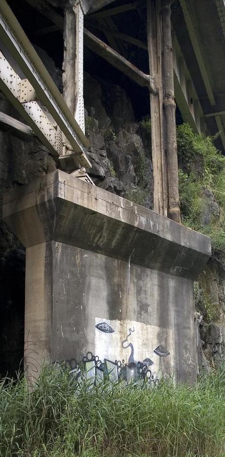
Finally, let's consider this elegant piece:
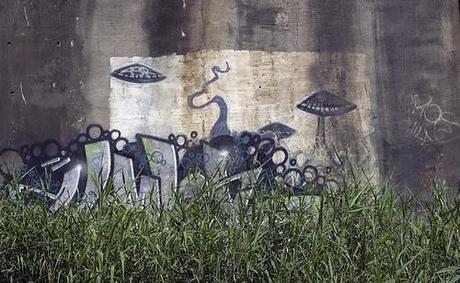
What is it? Those rock-like forms coming up from the bottom may well be the tops of letter-forms, but I've not yet walked through the grass to investigate. As it is, they're just large rectilinear forms topped by bubbles. And then there is that snaky tentacle and those clamshell-mushroom-saucers. And the odd composition; there is a clearly “framed” area in the center - well, it's the center because that's how I framed the photo - but those odd landforms move off to the left.
Whatever it is, it is not at all clear to me that it is by a single hand. We may be looking at the accumulated effect of two layers - or perhaps more - of activity arranged so that the most recent layer does not completely obliterate the older ones. I note further that the piece has an overall weathered look, suggesting it's been around for awhile. That, in turn, implies that it has the approval of the writers who paint there, as there is considerable, and recent activity in that area. If people didn't like it, they'd paint over it, and thoroughly.
Will I like it in the late Fall, when that grass has died and the images stand fully revealed? I don't know. Is that relevant to the aesthetic assessment of these images? I don't know. Do people talk about the various appearances of cliff art at different times of day, in different kinds of weather, in different seasons of the year? How do such things affect the artists?
I do not know.
