Today is the big day! We've been working hard to renovate the nursery and after several weeks I'm excited and relieved to say it's done. And just in the nick of time might I add: our due date is less than 2 weeks away! At the beginning of this process, I had no idea what I wanted this space to look like, only that I wanted it to feel Nordic, fun and playful, a space that might spark imagination and foster creativity.
When we found out we were having a girl, I have to admit my mind immediately went towards the color pink: girly pink with white and neutrals. But the more visual research I did on Pinterest, the more I came to the realization that Ken and I don't even really like the color pink. And we all know the baby doesn't have a preference what her room looks like yet, so why not create a space that we'll enjoy spending long hours rocking our little one to sleep in. Let's kick things off with what this room looked like BEFORE, shall we?
For the full renovation diary check out these Francois Renovates posts: The Before || The Concept Board || Wrath of the Ice Dams || Board & Batten/Wallcovering Progress
AND NOW FOR THE GOOD STUFF:
If you like this video, head over and subscribe to my new YouTube Channel. I'm hoping to create a lot more video content like this one in the coming year!
Take one look at the rest of our home and it's not hard to see that we're pretty neutral people when it comes to home decor and design, but I'd recently caught the itch to wallpaper some thing, some where, some how and we agreed that if there was one spot we in the house to do it, it would be in the baby's room.
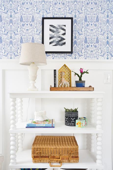
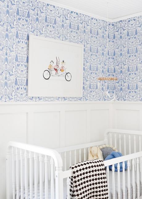
When it came to the wallcovering, I scoured the interwebs looking for Nordic-esque wallcoverings. Seriously, it was an embarrassing amount of time that I spent looking for papers, but I wanted to make sure I made an educated decision. After much discussion, Ken and I narrowed it down to two colors of Nethercote from Hygge & West. Should we do light grey or blue? If it were anywhere else in the house, no doubt we would have chosen the more neutral option, but going back to the original intent of creating a playful, creative space, we pulled the trigger on the blue. When the paper arrived I was having second thoughts like, 'Are we crazy for picking blue for a girl's room?' But as the paper went up it was clear we make the right choice. The intricate design is beautifully delicate and feminine and such a fun backdrop in the room. I can just imagine us pointing out and teaching her about all the different animals and creatures within the paper as she gets older.
A project that you'll soon see coming up on the blog is the lace applique pillow inspired by an Ox Eyed Baby swimsuit that's no longer available. The delicate lace shapes add the sweetest feminine touch to the rocker while also providing lumbar support for all those long nights up ahead in here.
Because we chose not to pull up the carpet and refinish the floors, we needed to create warmth in another way. My first thought was sisal: it's warm, natural, and textural. Let's be honest though, sisal can be kind of scratchy on crawling knees and hands, so I was happy to find a chenille/jute blend rug that still very much looks like sisal, but is much softer on crawling hands and knees.

I love incorporating vintage pieces in a space whenever possible because I think they add soul and and a sense of grounding. This mirror was one that we picked up at Les Puces Flea Market in Paris a few years back, and in a way the ornamented gilt frame reminds me of Sleeping Beauty. The marble lamp is another vintage piece I scored on Craigslist recently. It was in pretty rough shape when we got it, but a good scrubbing, new wiring and lampshade later, and it's the perfect reading light in this small room.

And there you have it! I hope you've enjoyed the look around. On Monday I'll be sharing the full "Get the Look" Guide, but in the meantime, here are a few sources:
Wallpaper | Board & Batten | Cocoon Light Fixture | Bicycle Print | Framing | Geo Art | Dresser | Crib | Glider | Changing Pad Cover | Rug | Bookshelf | Throw | Sheepskin | Handmade Ballerina Rag Doll (made by Seams Sew Cool) | Mudcloth Planter | Lattice House Shelf
Like this room? Give it a share and don't forget to pin for later!
