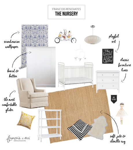
Okay guys, you've seen the before photos, and now you're probably wondering what the heck we have planned for this space! Here's a breakdown of the scope of the project:
- Address bowing ceiling and ice damage by replacing rotted studs, insulating, and re-drywalling
- Add bead board substrate to ceiling
- Create white board and batten paneling around the lower 1/2 of the wall
- Un-bury original hardwood floors to address water damage // decide if we should refinish them or leave the existing carpet as is.
- Wallpaper upper half of the wall with playful Scandinavian inspired paper.
- Update ceiling light fixture.
- Furnish the room with classic pieces that hopefully can continue to work for us as our family grows
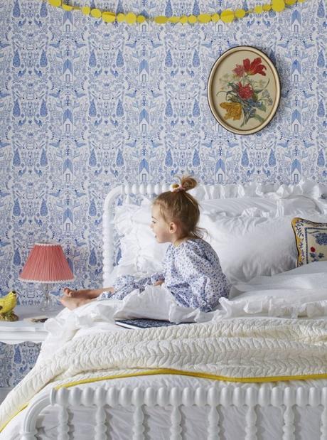
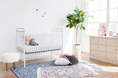
You may be looking at the material selections for the room and thinking 'I thought they said they were having a girl. Where's the pink?!' And you did hear right; we are indeed having a girl, but since neither Ken nor I are particularly keen on the color pink, we chose colors and materials that we're drawn to, while making an effort to bring in girly accents in ways other than with pink. Of course every design starts with lots of visual research, below are two spaces that stood out to me:


The design style is decidedly Nordic, playful and subtly girly. Check out the concept board sources below:
This this post is worth a read? Please share!
