I often let new paintings sit for a while and then give them another look. Today I worked on two abstract paintings that had been hanging around the studio. I liked them both, but felt they might still need something more.
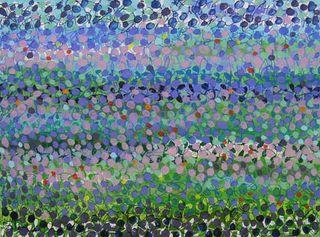
In this first one, I added just a few more spots of color--a bright orange and a pale yellow--which made a big difference, I thought. Then I played with it some more, mixing a light blue with white to make an even paler shade, and using it throughout the canvas where I thought it might do some good. Check out the original painting, and see if you can see the difference here:

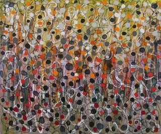
While fine tuning the next painting, I made more drastic changes. I had been focusing on black and white and grays in recent painting sessions, but this time I went back to the colors in the underpainting: yellow, orange and red.
I began with a cadmium red deep, adding circles of this color interspersed among the dark gray and black circles toward the bottom of the canvas. I continued the layers of circles, working my way toward the top of the canvas, with cadmium red medium and red light, a medium orange, and finally cadmium orange.


