I finally got a copy of the new(ish) design book, Emily Henderson Styled I’ve actually never seen Emily Henderson on HGTV, but I am a huge fan of her Instagram feed and I love her blog. She’s super cute, seems like she’d be really nice, and most importantly, her aesthetic is so fresh, clean, and functional. I would be incredibly happy from here to eternity to live in any one of the rooms she features in this book.
Styled: Secrets for Arranging Rooms, from Tabletops to Bookshelves (October 2016, Potter Style), with photos by David Tsay, is Henderson’s first book. It starts with the premise of figuring out what your style is. Although I’m able to define my style pretty well, I took the quiz for fun. (Side note: she also suggests looking into your closet for clues, but I found that method completely contrary for myself. My clothes are all black and grey, but I love to live with color!)
I found the questions somewhat limiting, forcing you to pigeonhole yourself into one style or another, but for the purposes of the book, that’s the point. You need to settle on a style, so she can help you achieve it. The results were pretty accurate. If you don’t go for quizzes, you can simply read about each of the 12 styles (Scandinavian, Minimalist, Bohemian, Rustic, Industrial, etc.) she puts forth, which she defines quite well, one per page.
The important thing to note about the book is that focuses on styling, which is different than decorating. Emily Henderson is a prop stylist. She knows how to make anything look good. That means you don’t have to swap out your furniture, which in most cases is too pricey an enterprise. Instead, you can tweak the space with accessories, using Henderson’s little bits of magic. And, for those of you also obsessed with Instagram, she offers specific photo styling tips too.
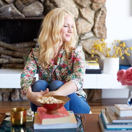
She’s adorable. Girl crush.
I’m not going to go through the whole book for you (you’ll definitely want to do that yourself), but I’ll share some highlights.
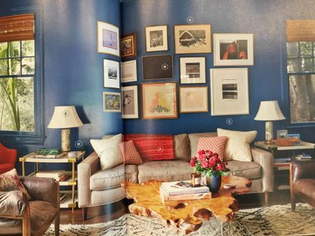
Henderson talks about balancing the colors of the accessories in this deeply saturated blue walled living room, offers tips for hanging a gallery wall above a sofa, counsels us on the best height of side tables and lamps, and comments on the room’s symmetry.
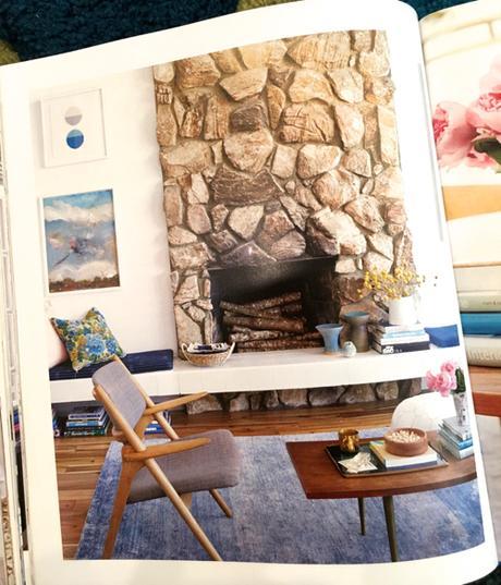
I love how she uses Danish modern furnishings here, but adds in touches of other aesthetics, like the almost granny floral pillow, the contemporary art, and subtly striated rug.
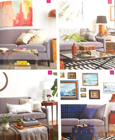
Here we’ve got the one sofa four ways trick: Pop Contemporary; Black, White & Wood; Boho Traditional; Americana. You can totally do this. Especially when she breaks it down for you.
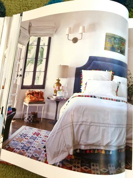
This photo opens the chapter on color. Henderson gives some interesting advice here, saying, “If you love color, don’t paint your walls.” She reasons that if you have color on your walls and then you mix in a zillion different colorful accessories, things could get a wee bit crazy. She advises keeping the foundation of the room quite, then layer on the chaos, which should result in lively color rather than chaos. I love this advice. I think it really sums up the basis of how Henderson creates such fresh looking spaces.
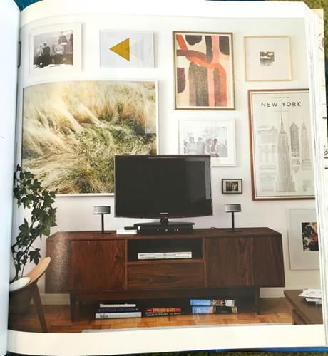
Another gallery wall, in the context of designing around the television. Mostly I included this image because I’ve been obsessed with that grass photograph ever since I first saw it. (Emily please tell me who that photographer is.)
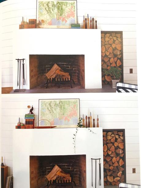
This may be my favorite lesson in Styled. The vignettes are very similar, yes, but Henderson tweaked many elements to get it to look just right. I love that she tells us exactly what she altered and why.
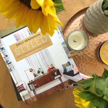
Emily Henderson Styled on my coffee table.
S H O P the L O O K

• • •

