 When launching a new product, service or business, creating a brand to present to your potential customers helps you organize your marketing effort, develop a stronger positioning, and an easier sale.
There are many steps to creating a brand — defining the market, understanding how they think, applying the features of your product to the demographic to position it, brainstorm names, develop an identity and more! Just to name a few.
When creating an identity, please don’t forget to consider color.
Subtle shades and tones can communicate completely different things. Blood red compared to orange brown red or fire engine red makes a completely different statement in toy design and development for example.
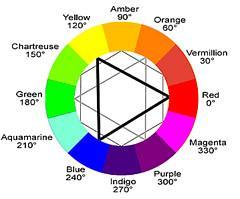
The basic color wheel or rainbow has many feelings associated with the colors that should be considered when marketing a brand.
Here are a few links that can help guide you with basic color choices:
- Color offers an instantaneous method for conveying meaning and message in your logo design
- Use certain colors in your logo design to convey a specific message
- A good color selection can help make an identity system more effective, while a poor color selection can actually damage your company’s image in the eyes of the public.
What brands or causes come to mind when you think of a color?
- Blue
- Green
- Red
- Pink
- Orange
- Yellow
- Purple
These are the ones that popped into my mind as I’m writing. I’m curious what pops into your mind about the colors. Please leave your answers in the comments area below. I’m curious to see what you think.
Blue: IBM
Green: St. Patrick’s Day
Red: Red Cross
Pink: Breast Cancer
Orange: Tony the Tiger (why would I think of that?!)
Yellow: Raison Bran (Maybe I’m hungry because it’s before breakfast?)
Purple: Relay for Life (Maybe I’ve done too many fundraisers this year!)

