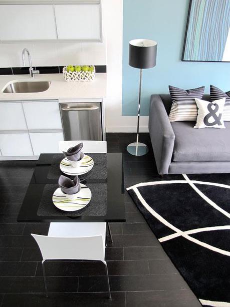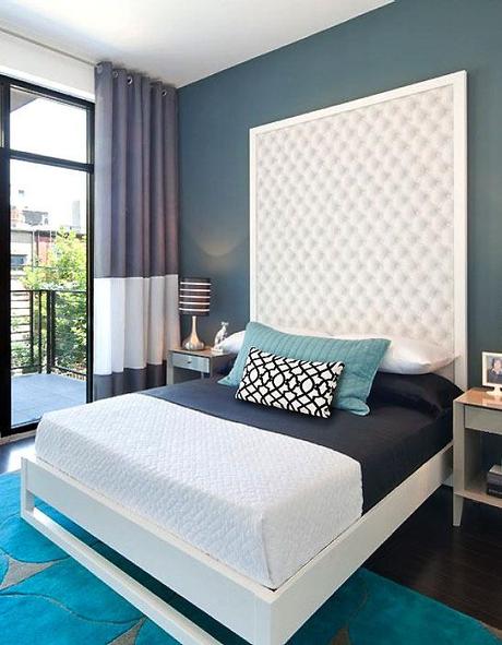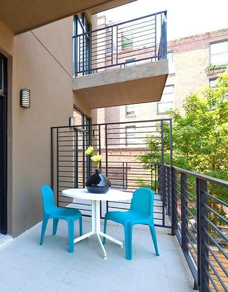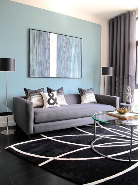
I'm not really feeling blue, but blue was the main color I chose when I started staging this apartment a couple of months age. It's important to narrow a color palette before starting any project, whether it's renovating, staging or simply sprucing up a room. The challenge here was to make a few square feet look larger and welcoming withing a tight budget. In this case, the living area was right next to the kitchen, so I needed to create a separation of both spaces. By painting the wall behind the couch but leaving a white border, I was able to create a visual separation for the living room—a trick that I often use and works wonders. I was lucky this place had somewhat high ceilings, which helped make the rooms appear larger. So I decided to take advantage of this and add some drama to the bedroom by using a tall tufted headboard. Since I couldn't find one tall enough, I created one by framing wallpaper with a tufted print to achieve the same look. It really came out great. Remember, keeping it simple and telling a visual story are two rules to keep in mind when working with smaller spaces.
