I've been working hard pulling together the design plan for our new upstairs family room, since our tenant moving on at the beginning of August, so let's start by walking through some of the spaces and elements that are inspiring the room's design direction. Then keep scrolling for the family room's floor plan and mood board!
Before I even got started, I was already stuck. I just couldn't decide what direction I wanted the design to move. Everything you see on social media seems to look the same: some variation of Earthy-Modern Farmhouse. While I like this look, sometimes I think I like it because I'm confronted with it daily on social media. Basically, it's trending, but is it really my authentic style? Does it suit this 1930's Tudor-style house?
Whenever I feel like I'm in a 'design identity crisis', I shut down Instagram, which can be distracting and overwhelming, and I take to my personal Pinterest boards, scrolling back through my images pinned over the course of a decade.
It helps connect-the-dots to common threads in my tastes and preferences, helping me to reconnect with my style. What have I pinned over and over-even as trends fade in and out? What do I love? What have I always been drawn to?
Answering these questions led me back to this image above of Sofia Coppola sitting on her rolled English arm sofa in her Manhattan apartment. (Image found via Kathy Kuo Home .) I pinned this image years ago, and though periwinkle isn't my color of choice, coming back across this pin reminded me just how much I love this sofa style.
Then once I found one element I was genuinely excited about, somehow more design choices began to flow-which I can only attribute to excitement and confidence in trusting my gut.
The family room itself is not large. It's 12′ x 16′, which makes furniture placement somewhat of a challenge. There's also the TV wall which is very long and bare. Rather than doing a media cabinet, we decided on an expansive floating ledge inspired by the above image from T he Design Files. I love the opportunity it provides for layering art around the tv, and basket storage underneath. (We don't need alot of storage as we have a closet and an adjacent play room for most of the toys storage.) It's also less than 12″ deep helping with the flow and traffic patterns in the room.
Floating ledge styling inspiration. (Image Credit: Stylizimo Blog)
We have a massive book collection that I want to display in the family room. There's something about a wall of books that gives a space an effortless, collected vibe.
We also have an old ladder in the garage that I want to use somehow as a library ladder. This living room image from Rue Mag above captures the idea perfectly!
Two more common threads I discovered while combing through my Pinterest boards: Mustard hues and Womb chairs. The chair in the above image from sfgirlbybay via Nicole Franzen isn't a womb chair, but it pulls together the delicious combination of moody mustard velvet on a high back statement chair (in an otherwise textural-rich, neutral space). YUM!
I think every room needs something quirky and a bit weird. For our family room, I fell in love with this pillar-style coffee table from Anthropologie for it's sculptural look-reminiscent of the 80's, and also it's round shape. Initially, I wanted to incorporate a game table in the family room, but quickly realized there wasn't room. A round table is great for game nights and crafts. The round shape foregoes sharp corners.
The only problem with the above coffee table is it's $1000 bones-a wee bit out of budget. And thus, I'll be making my own version.
The Design Plan:
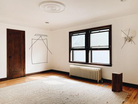
Now that you've seen the inspiration, here's a look at the space plan and design direction for the actual room! As you can see in the plan below, there are 3 door openings and one closet door in here, making furniture placement a challenge.
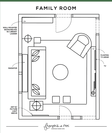
Both the sofa and chair will be upholstered in durable, stain resistant fabric. The sofa is a deeper linen color, draperies will be natural linen, the pillar coffee table and timber side table will be DIY projects (fingers crossed!), and the rest of decor will be a mix of new/thrifted, modern/antique, high/low.
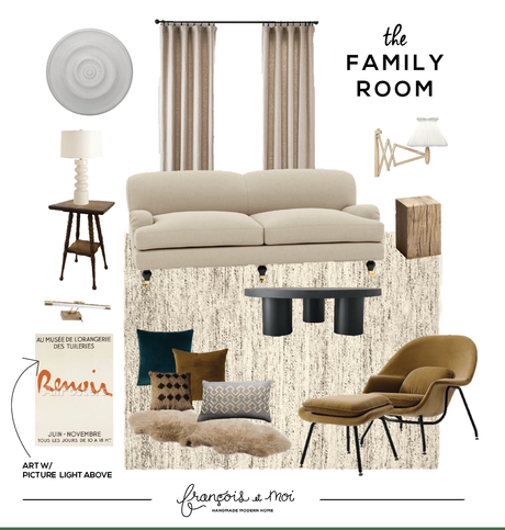
Sources:
Ceiling Medallion | Art Light | Mustard Womb Chair | Renoir Art | Le Klint Sconce | Pillar Table Lamp | Rolled English Arm Sofa | Linen Drapery | Stump Table | Coffee Table | Sheepskin | Lumbar Pillow | Green Velvet Pillow | Mustard Velvet Pillow | Diamond Pillow | Wall Paint | Rug | Spindle Side Table
Progress So Far:
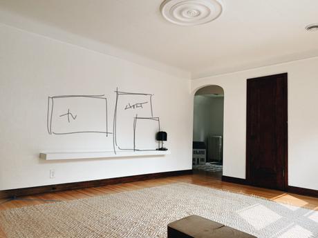
Walls are painted Behr/HDC Whisper White, and we are celebrating the home's original dark wood trim. The tv ledge and ceiling medallion have been installed.
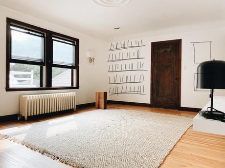
Wall-mounted bookshelves.
Large-scale art with picture light.
Thank you for checking in! I'm SO excited where we're headed in here. Stay tuned for more progress as it unfolds!
