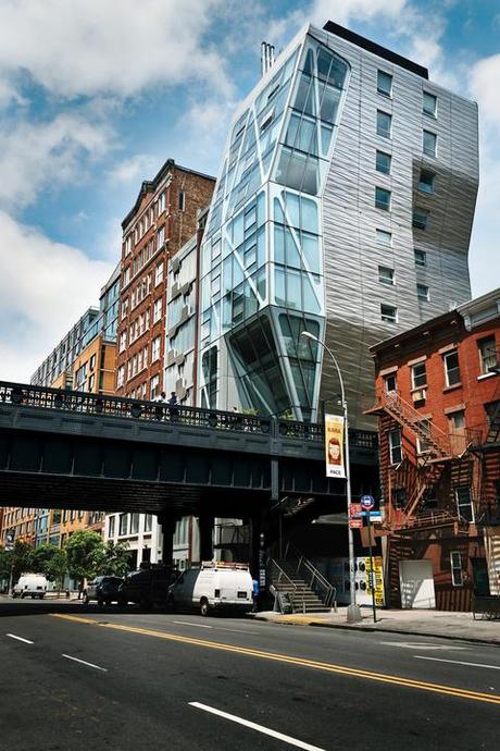
Geraldine and Kit Laybourne’s apartment is inside architect Neil Denari’s HL23 building in the Chelsea arts district of New York. It hovers above the High Line, a former elevated rail line now transformed into a public park.
Geraldine and Kit Laybourne watched with fascination as HL23, a building unlike any other in New York City, began to take shape. Architect Neil Denari of Los Angeles uses the word prism to describe his glass-and-stainless-steel condominium that rises, with a quite unexpected profile, right over the High Line in Chelsea. He explains, “It’s an object sculpted by the forces of the site.”
Graphic at a distance and geometric up close, HL23 is creative, daring, and at once fully serious and a bit playful—making it pitch-perfect for a couple who are likewise creative, daring, serious, and playful.
The Laybournes called upon Sandra Chamberlin, a former next-door neighbor and a sculptor with an astute eye for interior architecture and design, who at times also functions as a contractor, to help them scope it out. “We are construction junkies,” says Gerry Laybourne. “We love looking at buildings.”
The three of them scrutinized the plans, potential views, and square footage of at least five floors of HL23 before settling on one almost at the top of the building. “It was a chance to buy into a building that was architecturally significant,” says Kit Laybourne, a producer, educator, and painter.
Slideshow
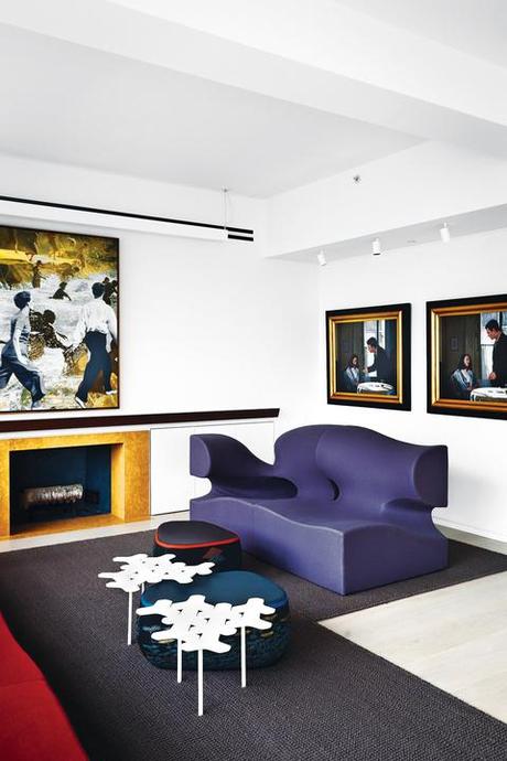
In a corner of the living room, a large work by Martin Mull and a pair of paintings by John Meyer join Moroso furnishings: a Misfits sofa by Ron Arad, a pair of white Nanook tables by Philippe Bestenheider, and Fjord tables by Patricia Urquiola covered in antique kimono fabric.
With the advice and consent of Denari, and after almost daily consultations with the senior designer, Rick Michod, the Laybournes decided to make some changes, all inspired by the powerful architecture of the building. They opened up the floor plan, moving the kitchen and eliminating one of the three bedrooms in the 2,300-square-foot space. “Sandra told us we would not be happy with the kitchen and sent us to Valcucine,” says Gerry, a television executive who headed up the Nickelodeon and Oxygen networks and is currently chairman of a marketing agency. “The very next day, we picked out our yellow-and-gray kitchen.”
The builder-designed fireplace was re-envisioned to be more horizontal and to sit off-center along the west living room wall. Made of Pierre de Cluny stone, it has a rosewood “eyebrow” made from a single piece of wood. A living wall was also added to the living room. Lighting designer Linnaea Tillett (the Laybournes met her through Maya Lin, a mutual friend) was brought on to figure out how best to illuminate the apartment, which has two window walls and a spectacular view, day or night, but still needs additional light, especially in its interior spaces.
The apartment itself looks straight down onto the High Line and out across the city, with panoramic views to the south from the living room and to the north from the master bedroom. Due to what Denari calls the “dynamics of its geometry,” no two apartments in the building are alike, but all offer what he terms “a unique optical experience.”
To enhance that, Chamberlin says, “I felt the walls should remain white to keep the interior much more in touch with what Neil’s vision was, his sense of structure. I wanted to honor the idea that it was a piece of art that related directly to the High Line.” From there, the challenge was to integrate the couple’s much darker art collection and invoke their sense of humor and play in the design. “I wanted a vivid color palette,” says Chamberlin, “and I thought of Gauguin’s paintings. It was helpful to imagine the rich colors of his work.”
Slideshow
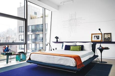
In the master bedroom, a sculpture by Maya Lin hangs above a Siena bed from B&B Italia.
Early on, as Chamberlin tells it, Kit Laybourne said, “We want to get this Ron Arad [Misfits] sofa, but you can decide which color.” At first, she admits, she thought Misfits was actually a misfit, “but then I saw how beautifully it worked with the architecture to create a kind of interior landscape.” In consultation with Keith Anderson, then of Moroso (but now national sales manager at Artek USA), the Laybournes chose four red modules (eventually an additional piece of the collection was added, in gray).
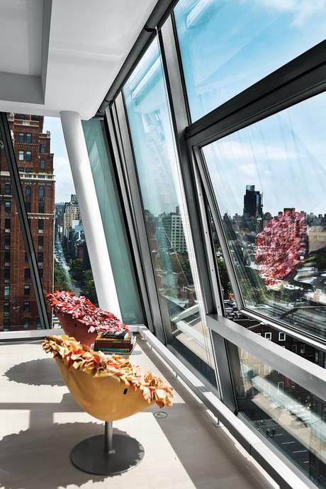
The Misfits also became an instant playscape, likely not part of Arad’s original intent. (“Your couches have holes in them!” announced grandson Rex, age six, when he first saw them.) “In terms of our family, it is always important to us that the places we live be appealing to children,” says Gerry. The Laybournes have two grown children (daughter Emmy writes young-adult novels, and son Sam writes for television) and four grandchildren, all of whom put HL23 to its highest and best uses by making forts with the furniture, playing hide-and-seek, standing in the windows to count passing taxis or wave at pedestrians on the High Line, or nestling into the two Tokujin Yoshioka Bouquet chairs that sit in one corner.
Slideshow
A pair of Bouquet chairs by Tokujin Yoshioka for Moroso are comfy perches from which to gaze down on the High Line.
The furniture includes a dining table and chairs that Kit Laybourne designed with Greg Talmont and the late John Petrarca for the couple’s previous, and almost polar opposite, apartment—in a staid Arts and Crafts period building on Central Park West—and Patricia Urquiola’s Fjord Stones small tables, to which Gerry added “slips” made of vintage Japanese silk made by Andra Gabrielle. “I felt like it was getting too masculine,” she says.
Tillett Lighting Design’s installation combines both the practical—in the form of a family of fixtures that utilize a linear ceiling channel and combine downlighting and uplighting—and the aesthetic. The latter comes in the hallway, where Tillett was given free rein to treat the space “as a blank canvas and populate it with light”; the result gives the sense that seeds from the High Line have blown in, “embedding themselves in the ceilings and walls and sprouting incandescent lightbulbs.”
Likewise, Laurent Corradi’s living green wall was treated as art, with the plants arranged as carefully as paint on canvas. The Laybournes’ art collection includes a piece by Maya Lin (which hangs in the master bedroom on a wall that subtly tilts outward), along with work from Cathy Choi, Craig Kucia, Martin Borowski, and Martin Mull.
It is all very mindful. “We proceeded with a philosophy and a vision,” says Chamberlin. “All of us understood that the poetry of what you look at is very important.”
