In their guide Perfumes, widely considered the bible on the subject, Luca Turin and Tania Sanchez answer some commonly asked questions about fragrances. One was whether scents change according to the wearer’s personal chemistry. “For a long time, Luca believed the answer to be absolutely no,” writes Sanchez. “And that all assertions to the contrary were marketing ploys designed to make the average person feel uniquely addressed and bonded to the product, as if perfume were like a mood ring or shrink-to-fit jeans, sensitive to the wearer’s medical history, soul, or waistline. There’s something to that; undoubtedly it makes us feel special to sigh and say, ‘I love this perfume because it works fantastically with my chemistry.’”
Their full answer is a bit more complicated than that – scents do change a little with the wearer’s chemistry, but not really – which is how I feel about the neverending debate about whether you should consider your skin tone when choosing colors. You hear this all the time, especially among men who use bespoke tailors. They, after all, have an infinite number of choices between the different shades of blue. Supposedly, earthy hues work on some men, while others are better off with something warmer.
Much of this actually comes from Carol Jackson’s 1987 book, Color for Men, which transported 1970s make-up theory for women into men’s wardrobes. For Jackson, people came in four seasonal colors. Wintery men are defined by their olive complexions, dark brown hair, and brown eyes. She said they should avoid lighter colored jackets, such as those in natural camelhair, since they give their skin a yellow cast. Instead, she encouraged them to wear dark suits, white shirts, and dark ties, which she claimed enliven their natural look.
Spring men, on the other hand, were encouraged to wear lighter colored jackets because they have peach-pink complexions, light reddish hair, and blue eyes. Navy suits and ivory white shirts, it was said, drained color from their faces. The book goes on like this for a while, and then tries to help the reader figure out his color type (I’m winter, I think).
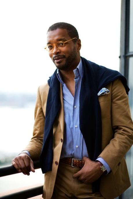

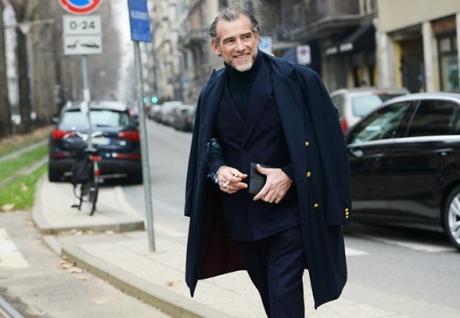
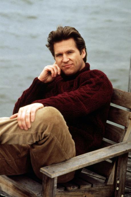
Jackson’s theories have been endlessly recycled, showing up in one form or another online and in books, but the proof is often dubious (although she does a better job than those who came after her). Many style writers rely on totally different photos to prove their points – two photos of two different men, set against two different backgrounds, wearing two completely different kinds of outfits. With so many moving variables, it’s hard to tell whether the difference in appeal is really about color at all.
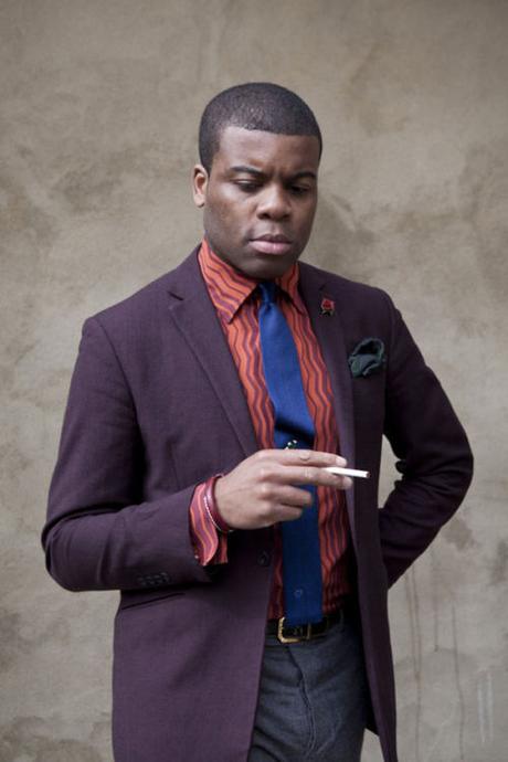
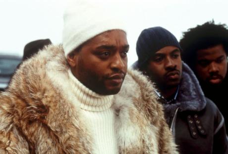
When you change just one variable – say, Photoshopping the color of a suit in a single photo, or comparing two very similar suits on two men with different complexions – it’s hard to notice any real effect. Do any of the corduroy suits above, for example, make the lighter skinned man look sallow? Or does the tobacco brown suit look better on one man than the other? (OK, the darker man looks better, but largely because he’s very handsome and my Photoshop skills are terrible).
A few years ago, I wrote a post for Put This On about how to think about color, which touched on the social, cultural, emotional, and creative ways colors are used in fashion. The most important dimensions are social and cultural. One of the biggest misconceptions about clothes is that dressing is like painting – you put shapes and colors together in a way that’s pleasing. Brown goes with navy; slim jackets go with slim pants. In reality, dressing is more akin to creative writing. Clothes are like words and you have to know how to put them together in a way that sends a certain message.
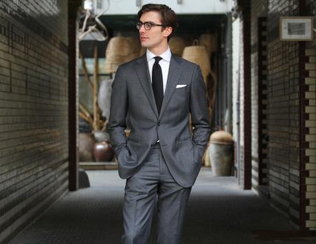

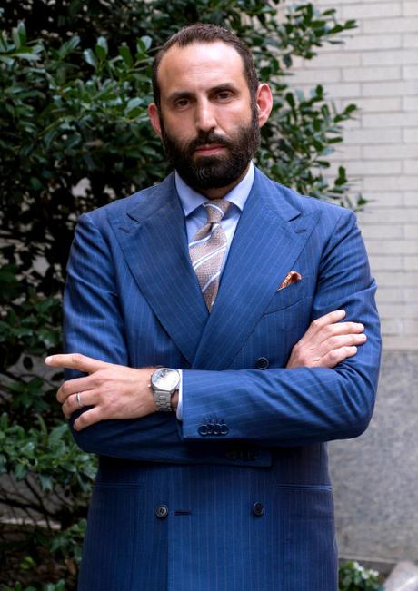
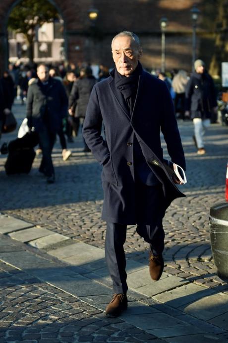
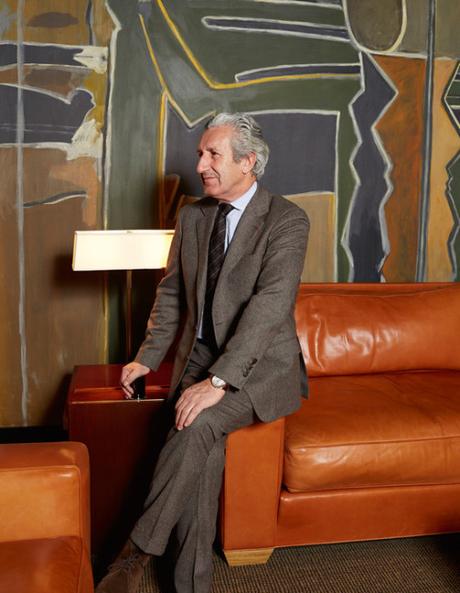
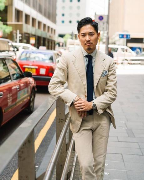
Take the most obvious example: the business uniform. In its most basic and serious form, it involves a dark suit, white shirt, dark tie, and neatly folded, white linen pocket square. Shoes can be either black or dark brown, although in some circles, black is really the only choice. There are ways to play around with this outfit, but if you want to send an unmistakable message that you’re here for business, you’ll stick to this formula. Substitute the white shirt for pink, and suddenly the suit means something different. Drop the white pocket square for yellow or navy, and the message isn’t the same. See Neil from Shibumi above. Spring men may or may not look better in lighter colored suits, but it’s navy or charcoal for them at work.
The same is true for a lot of casualwear. Faded blue jeans look great with dusty brown boots not because blue and brown go well together (although they do), but because they symbolize something very specific: the mythologized American cowboy and start of the American West, which is laden with romantic ideals about masculinity and independence. Likewise, military-inspired looks rely on colors such as olive green, tan, and black for no other reason than the fact they’re used in the military. Blue jeans and white tee shirts go well together because they remind us of the rebel look, as typified by James Dean and Marlon Brando.
In this sense, choosing colors for an outfit isn’t just about choosing things that look nice next to each other. It’s about understanding broader aesthetic traditions and knowing how to speak a language. Back in the 1950s, Noam Chomsky famously put forward “colorless green ideas sleep furiously” as an example of how a sentence can be grammatically correct, but semantically nonsensical. Much like words in a sentence, meaningfully combining colors in an outfit requires knowing how they’re socially used.
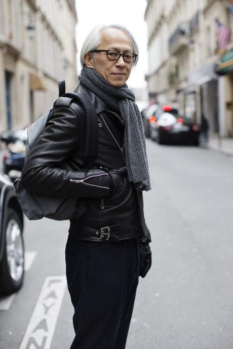
Of course, color also has an important emotional and creative dimension. Take black, for instance. It’s the color of seriousness and somberness, thanks to the Victorians, but also of humility and discretion, thanks to certain ascetic religious groups (e.g. Orthodox Jews and The Quakers). At the same time, black also symbolizes evil (think: witches and motorcycle gangs).
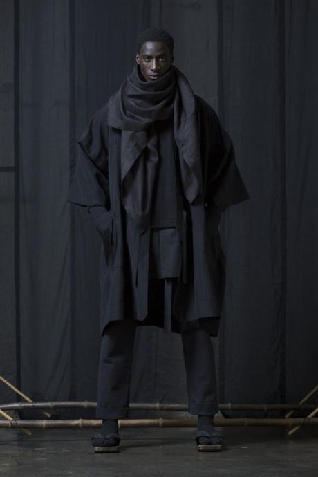
Fashion designers sometimes use black to communicate those emotional values. Rick Owens and Yohji Yamamoto, for example, are famous for how they use the color to create a sort of cold, stand-off-ish attitude. In an all-too-often cited quote, Yamamoto once summed it up nicely: “Black is modest and arrogant at the same time. Black is lazy and easy, but mysterious. But above all black says this: ‘I don’t bother you, don’t bother me.’” Guys who wear those lines rely on white and gray for their other pieces, but largely because they underscore the power of black.
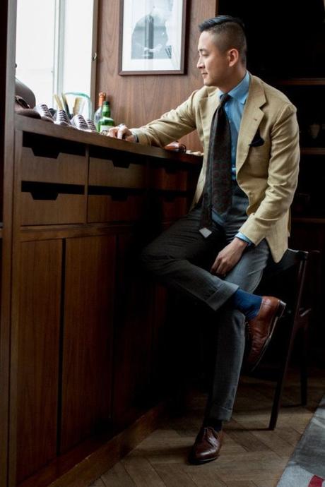
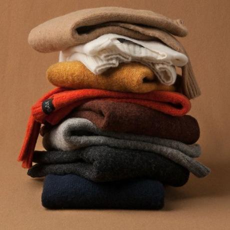
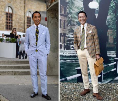
Almost every color has some emotional power. The easiest way to think about this is through seasons. Spring and summer wardrobes often rely on brighter, lighter colors to convey a cheerier mood. See Yasuto Kamoshita above in his sunflower yellows, bright whites, and spring blues. Similarly, autumnal outfits often rely on clay browns, mossy greens, and burnt ochres. Designers such as van Dries van Noten, Yohji Yamamoto, and Giorgio Armani have used colors for great effect – communicating a kind of maximalist or chic vibe. Or see how George Costanza chooses his shirts in the morning. For me, these cultural and emotional considerations override anything that can be said of how color plays against skin tone.
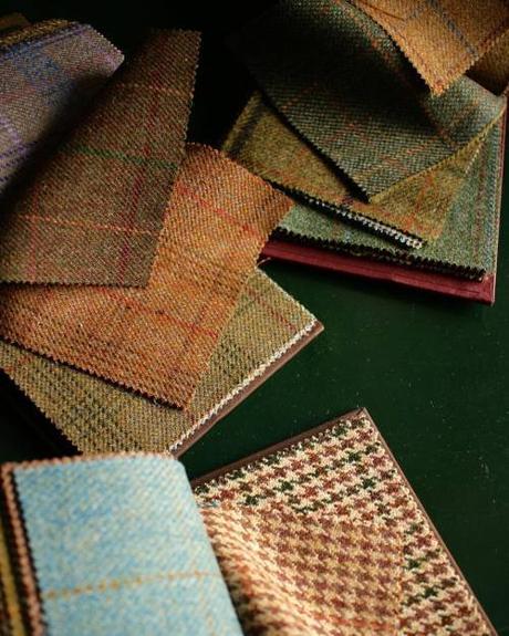
That said, like how Turin and Sanchez feel about personal chemistry and fragrances, I’m sure complexion plays a role – I just don’t think rules can be generalized. When I’m between swatches at my tailor’s, I’ll sometimes hold them against my hand, but the decisions end up being deeply personal and subjective, driven by unknowable factors. I still go back to that line I love quoting from Bruce Boyer’s Eminently Suitable: “wearing clothes is still something of an art – it has not descended to one of the sciences.” The best way to choose colors is to be sensitive to their different dimensions, which includes hue, shade, emotional value, and historical meaning. Then figure out what works on you.
