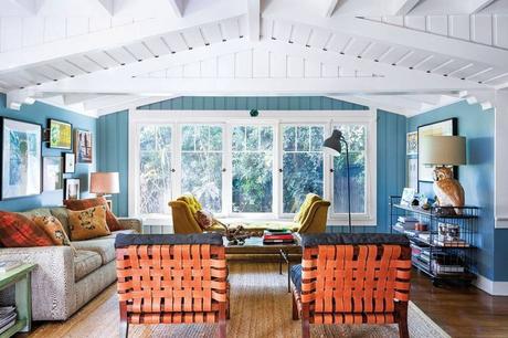
 I do find this shade of blue really soothing. The leather woven chairs and gold velvet settee add a nice warmth.
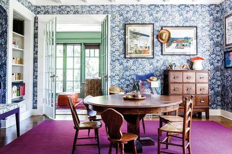
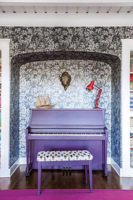 So, I'm not a fan of the purple piano. The wallpaper is pretty cool though - is it just me or does it have a black to blue gradient?
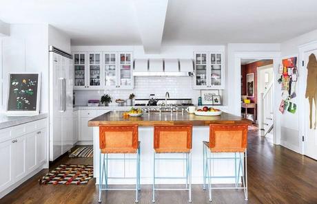 The kitchen is a breath of fresh air.
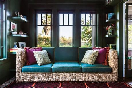 This dark green study would be nice for evening reading, but during the day I would need a brighter space to keep my energy levels up!
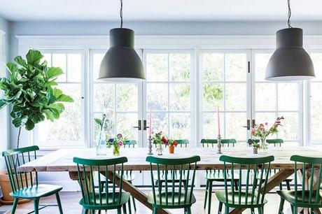 Even though the dining room is white, the vibrant green chairs call attention and echo the garden outside.
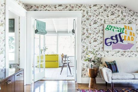
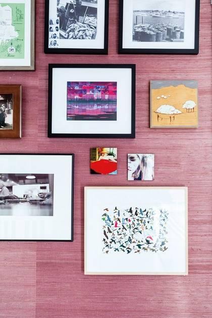 So what do you think - do you:
Love it? Can't wait to move in?
Really like it, but only to visit?
Loathe it?
see and read the whole story at Domino
