In the 80s and 90s, critical cartographers, such as J. B. Harley, reminded us that the map is not the territory. A map is always a representation, a construction, designed by humans to show certain things and to not show other things. The critique was elementary. Fifty years earlier, Borges had acknowledged much more creatively the map/territory distinction in his story “Of Exactitude in Science”:
. . . In that Empire, the craft of Cartography attained such Perfection that the Map of a Single province covered the space of an entire City, and the Map of the Empire itself an entire Province. In the course of Time, these Extensive maps were found somewhat wanting, and so the College of Cartographers evolved a Map of the Empire that was the same Scale as the Empire and that coincided with it point for point. Less attentive to the Study of Cartography, succeeding Generations came to judge a map of such Magnitude cumbersome . . .
A map that fully represents the territory is simply the territory re-created. How else would maps work without selecting certain elements of a territory (elevation countours, for instance) and deflecting everything else?
As with most things ‘critical,’ critical cartography was really not an epistemological critique but more of an ethical and political critique of mapping. It asked us to consider who and what gets ‘left off’ officially sanctioned maps, and warned us not to believe that maps provide a “view from nowhere,” to use Donna Haraway’s terminology, a god’s-eye-view that provides a totalizing and completely objective picture of a material space. What gets deflected in cartographic practice is often the economic, social, and political realities on the ground, and these are important elements of a space.
With this critique in mind, let’s turn attention to Google Maps and Google Earth. While a topographic map is obviously ‘not the territory,’ Google Earth provides real pictures of the territory from varying heights—not the territory precisely, but a lot closer to it than a topographic map. Digital maps also provide more than a static representation. While the selections (and thus deflections) of a paper map are set in stone, so to speak, Google Maps and Google Earth allow for fluid and ever-expanding selections, so that the deflections inherent in one selection can themselves be selected, and thus made visible, with the click of a mouse or a simple download. The only limit to what can be selected and visualized is the availability of data—and data abounds.
By design, paper maps leave out many elements of a material space; by design, Google Earth and Google Maps can return many elements to the map, including social, political, economic, climatological, biologic, and many other elements. Their interfaces are designed for Maximum Selection. Each selection is finite and incomplete, of course, but digital mapping interfaces allow multiple finite selections to be layered onto one another, compared, contrasted, and mined for patterns. Each selection is a partial perspective—similar to the “situated knowledge” discussed by Haraway—but by bringing together the partial perspectives with the help of a digital interface, one can move closer to an objective view of a material space, not a “view from nowhere” but a view from many different places and perspectives all at once.
The selected elements of a topographical map of a city show us many things—roads, toponyms, elevations, city and county boundaries. However, they also deflect many more things that might be interesting to visualize on a map—for example, class boundaries or concentrations of poverty.
To map something like poverty requires not only a traditional map interface, which represents territory, but also data about the socio-economic conditions within that territory. A poverty map will always, therefore, be a mashup of spatial and non-spatial data (as will any map that attempts to bring together situated knowledge of or multiple perspectives on a material space). The precise socio-economic data one uses to define poverty may or may not change the nature of the map, but the utility of digital mapping interfaces is that they allow users to deploy multiple data sets and compare them with relative quickness and ease.
This simple map shows states in different shades of red, corresponding to percentages of individuals living below the federal poverty line, supplemented with information about statewide median income and percentages of individuals lacking health insurance.
Here’s a map that shows the same thing at a more granular scale, tracking poverty percentages within state boundaries as well as between them.
And here’s a map of London socio-economic data—based on the UK’s multiple deprivation index—that also plots where riots occurred in 2011. The map shows a clear correlation (one that brings together spatial and non-spatial data) between the location of riots and the location of deprived communities.
The ways we might map poverty (or any other non-spatial data typically deflected by traditional cartography) are nearly endless. A lack of data is our only barrier, but data in the digital age is rarely in a state of lack.
Here’s another way, then, to map poverty and class boundaries—I haven’t seen anyone do this before, so it’s a good example of the endless ways to mash up data in a digital map interface.
Using Zillow, I gathered the addresses of the dozen or so most expensive homes for sale in two different cities: Los Angeles and New Orleans. Then I gathered the addresses of public housing units in both cities. Using Google Maps, I plotted all the addresses to see where they existed in proximal space. What I found were two antithetical visions of American class boundaries. The blue points are the most expensive homes; the pink points are the housing projects.
View Larger Map
View Larger Map
In New Orleans, the expensive homes stand near Tulane University and stretch in a U-shape from there along St. Charles Avenue. However, these homes are still relatively close to public housing sites. (One multimillion dollar home stands a few blocks away from a notoriously violent housing project.) Only two projects are far-flung from the expensive homes, and even then, the distances pale in comparison to the distances found on the Los Angeles map.
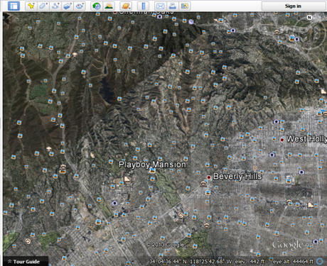
In L.A., it appears, millionaires gather in the northwest, into which the road grid does not extend, miles from the start of the urban sprawl and a good drive from the eastern and southern ends of the city, where the housing projects cluster. Bringing up Google Earth, we can zoom downward to this rich area to achieve a more topographical and thematic view . . .

Find some non-spatial data. Plot it onto a digital mapping interface. Interesting results? Rinse and repeat. Start building a theory.
For example, I think the above maps suggest two types of class boundaries, which I’ll call the Grid Boundary and the Fortress Boundary. New Orleans represents the first type: the separation of the very poor and the very rich occurs within the urban grid. Spatial distances are much smaller than distances of income and wealth. In these situations, you have ‘no-go zones,’ neighborhoods and streets where You Just Don’t Travel After Dark, and crime is a function of street rather than zip code or town. Within the Grid Boundary, poverty remains visible to the rich, and poverty’s effects will hit closer to home because, quite literally, they are closer to home (even though not felt or experienced directly).
Los Angeles, on the other hand, represents a Fortress Boundary: the separation of the very rich and the very poor occurs beyond the urban grid. Spatial distances are as large as, if not larger than, distances of income and wealth. In these situations, members of the upper class need not ever be physically near members of the lower classes. Crime is a function of zip code or town, so it never hits close to home for the rich because crime occurrs nowhere near their homes. Within the Fortress Boundary, poverty is largely invisible to the rich; they pass over it on freeways or avoid it altogether.
So where do we go from here with this nascent theory? Again, the only obstacle is a lack of data, and there’s rarely a lack of data. For one, we could use the same method (plotting public housing and most expensive homes for sale) in different American cities to see whether most correspond to a Grid Boundary or a Fortress Boundary or something else altogether. Do America’s upper classes more often gather into fortresses cut off from the worst levels of crime and poverty, or do they live in and amongst crime and poverty? We could also plot homes for sale at median levels in order to see where the middle classes fit within these boundary structures.
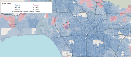
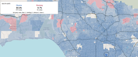
With these mashed-up maps in hand, we could start adding layers of data that we have hitherto been deflecting—for example, voting patterns among the upper classes who live in Fortress Boundaries versus those who live in Grid Boundaries. The L.A. Times, fortunately, has already provided a granular visualization of L.A. county voting patterns in the 2012 presidential election. Here are some screenshots of areas corresponding to the two housing clusters (most expensive and public) seen above:

Voting patterns in the area of most expensive homes

Voting patterns in the public housing cluster of South L.A.
The Fortress voted either for Romney or for Obama by a close margin. The areas corresponding to the cluster of public housing in South Los Angeles voted overwhelmingly—and I mean overwhelmingly—for Obama.
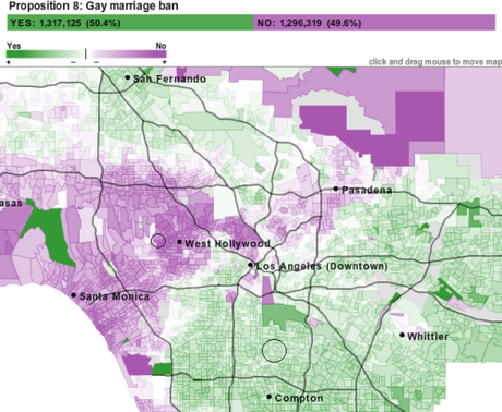
But people vote for other things besides presidents. How about adding another layer of data designed to target particular social views, such as acceptance of gay marriage. Here’s a map of voting patterns for Proposition 8, the California gay marriage ban:

An interesting reversal of what we might have expected based on the presidential vote . . .
What we’re doing here is not trying to make a political point; rather, we’re mashing up non-spatial data on digital mapping interfaces in order to bring together multiple pieces of situated knowlede about and to get diverse perspectives on a particular space. Too often, digital maps are treated like paper maps: they select one or two elements and then deflect everything else, which completely undermines the utility of these interfaces and the plethora of data available online. Mapping socio-economic factors shows us one thing; mapping presidential voting patterns shows us another; mapping proposition voting shows us something else. These just scratch the surface. Individually, digital maps are valuable, but together, they construct a much richer and more robust view of a place than they do individually.
(Here’s an excellent study that brings together data on poverty and many environmental factors—rainfall, distribution of livestock, prevalence of disease carrying flies—in order to build a more robust and predictive model of poverty in Uganda.)
