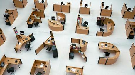
Fold Yard Font by Benoit Challand
The French designer’s new font showcases a new kind of Action Office.
Photo Courtesy of Benoit Challand
What looks like the ultimate prank on middle management is actually a quirky new font. French designer Benoit Challand created Fold Yard to turn the forms and shapes of office furniture into a new kind of typography.
“The main inspiration was the work of industrial designer Richard Sapper,” says Challand. “When I saw his work, I immediately thought of how I could make the space more fun and surprising.”
The multifaceted illustrator and designer, who’s currently working on a table, has fielded some offers to purchase the font, but he said nobody has asked him to recreate the letters in real life. It would have to be at someone else’s office, since Challand’s desk doesn’t look anything like those portrayed in Fold Yard: his Mac sits on a wooden platform, near a sketchbook, external hard drives, and the latest paper edition of “It’s Nice That."
