New England Design Works kitchen and bath designer Karen Swanson is a master at small house living. She owns this perfect little house in Manchester, Massachusetts which I wrote about for Boston Globe Sunday Magazine “Small Spaces” home issue on June 7, 2015 in an article called “Party of Three,” photographed by James R. Salomon.
Swanson lives in this cedar shingled, 1,200-square-foot home (exactly 600-square feet on the top and 600-square feet on the bottom) with her daughter and son after downsizing from a 3,300-square foot place across town last spring. Swanson bought the house from an older gentleman, and it was kind of a disaster, with racoons under the floor, which was lumpy, but Jim O’Neill of O’Neill Fine Building squared her away.
As a kitchen and bath designer, she is adept at efficiently fitting everything one needs into the available space, which came in pretty handy. Small house living is a snap for Swanson. She says, “There were absolutely no compromises.”
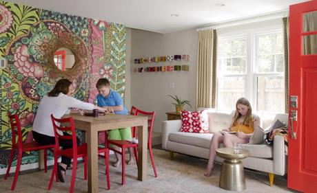
That’s not to say there weren’t challenges to laying out the small house. The front door wouldn’t have closed if the sofa was even an inch longer. She chose the Bantam sofa from DWR not just for its length, but because it isn’t too deep, but it’s still comfortable. The Martini side table in antique brass from West Elm can be moved easily where needed. One of the great things about a smaller home, she says, is that she sees her kids a lot more.
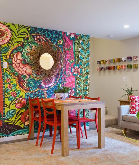
The wall with the mural is the first thing one sees upon entering, so Swanson knew she wanted to make a statement on it. She originally imagined concocting a backlit forest scene based on the one in the restaurant at MoMA, but it proved too tricky. When she spotted this Kenneth James wallpaper mural at local design shop Watters & Brown, and realized the five strips that comprise the mural was the same size as her wall, she decided it was fate. Plus, at $350 she figured she could change it if and when she tired of it.
The oak table is Ethnicraft from Boston design store Lekker and the red chairs are the Sabrina chairs by Casprini purchased from Room & Board.”Red’s my favorite color,” Swanson says, “so they were perfect.” Plus, since they’re so light (they’re actually indoor/outdoor plastic chairs), they’re not difficult to wrangle when she has extra folks for dinner and it’s necessary to move furniture around to accommodate everyone.
The ceramic work artwork is by Next Step Studio, which Swanson discovered at the AD Home Show. Wall mirror from West Elm.
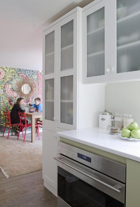
The galley kitchen is only 75-square feet but Swanson has all the storage she needs, and it looks beautiful. Despite the kitchen’s small size, it was wide enough to make the cabinets on one side 30-inches deep (vs. the standard 24-inches deep). This made all the difference, especially for bulky items such as pots and pans, which all fit in one drawer. (Scroll down for the kitchen layout.) The floor-to-ceiling pantry also houses the toaster and microwave. She opted for a full size Wolf oven knowing she’d regret it if she went with a smaller model.
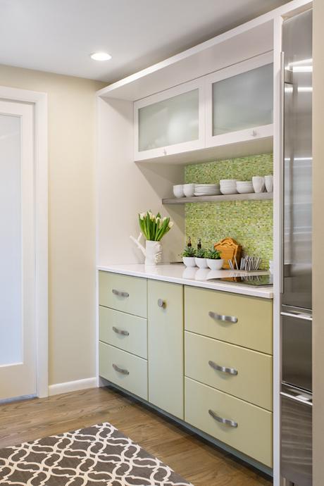
This is the kitchen wall one sees upon entering, and it’s visible from the living room, so it was important that it look good. The lift-up cabinets, which are 18-inches deep, store the food processor, stock pot, slow cooker, and such.The fridge is a 27-inch wide SubZero with two freezer drawers, which she adores. The cabinetry is painted maple and the pulls are from local hardware showroom Raybern.
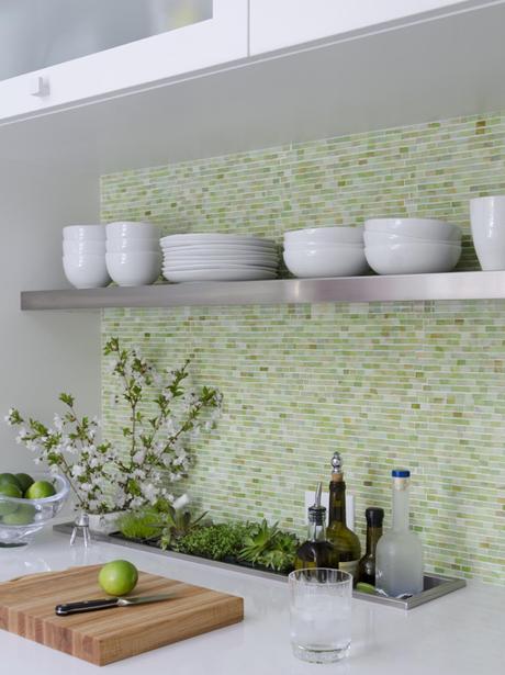
The first design element Swanson chose for the house were the Walter Zanger glass tiles from Tile Showcase for the backsplash. The countertop is white Silestone. An inset stainless steel troughs holds wine, oil, cutting boards, and sometimes plants.
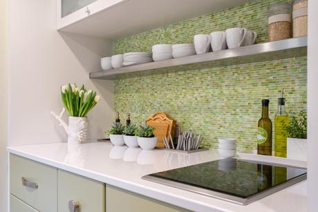
In order to ensure she’d have ample counter space in her small kitchen, Swanson decided on a two-burner induction cooktop. The stainless steel shelf holds all the everyday dishes and mugs, plus some food storage containers. Both the shelf and trough were fabricated at Weiss Sheet Metal, the same place that fabricated Julia Child’s kitchen now installed at the Smithsonian.
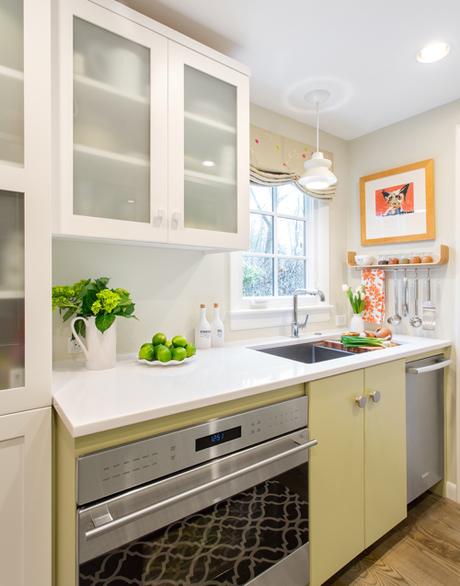
Swanson used a sink with an integrated drain board so that it could be centered on the window ,even though the sink base is not. This allowed her to squeeze an 18-inch dishwasher to the right of the sink.
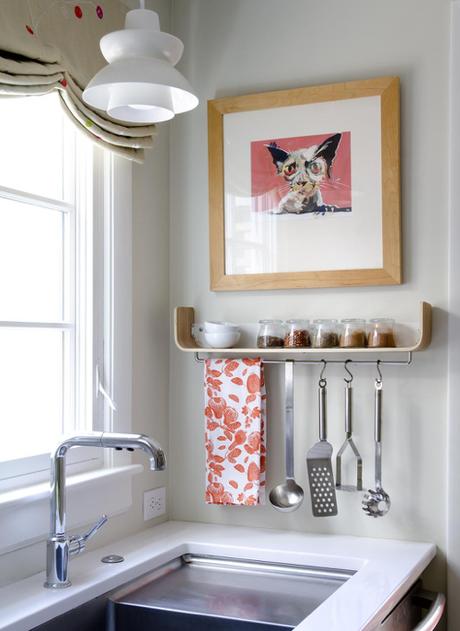
White pendant light from Rejuvenation. Shelf from West Elm. Artwork from the local Montserrat College sidewalk sale. Polka dot Roman shade made from Scion fabric purchased at The Martin Group in the Boston Design Center.
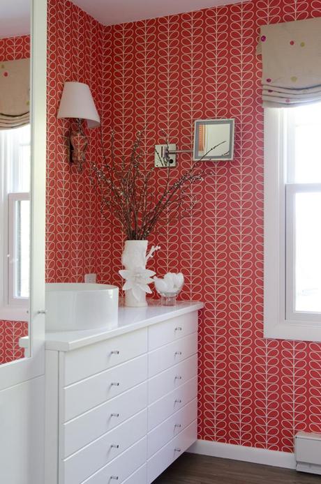
Orla Kiely wallpaper (also from The Martin Group) covers the master bathroom, which also functions as the first floor powder room. She designed the vanity for optimum storage, taking into consideration the variety of sizes of bathroom items, like soap, deodorant, and Band-Aid boxes. She placed the sink off center in order to maximize counter space.
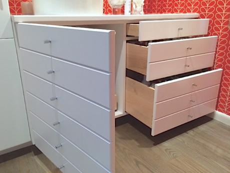
The right side houses three drawers, each a different depth and the left side is a cabinet made to look like drawers in order to match the other side for a neat, symmetrical appearance.
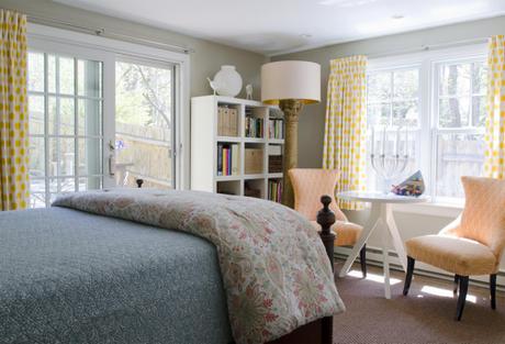
The master bedroom is on the first floor; sliders open to the deck and backyard.Playing off the citrus hue of recently reupholstered 1940s chairs from local consignment shop Stock Exchange, Swanson used inexpensive yellow polka dot fabric from Calico Corners for the draperies. The Tripod table from West Elm, was previously used in her daughter’s room as a desk. She sometimes works here if the kids are watching television in the living room.
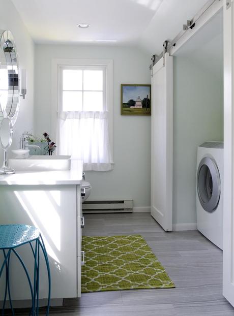
The kids bath on the second floor doubles as the laundry room. A fiberglass shower unit was originally wedged under the sloped ceiling. Swanson swapped it for a washer and dryer cleverly concealed by sliding barn-style doors. The oil painting, from local consignment shop Stock Exchange, pictures a pink house on the road to Plum Island in Newburyport, Mass.

The oil-rubbed bronze finish of the new Anderson windows works nicely with the exterior trim, painted Benjamin Moore Gropius Grey, without being an exact match. The landscaping and back deck were already in place, along with creeping hydrangea on the rock ledge. The gravel yard means no lawn to mow. The persimmon front door hints at what’s to come. Swanson says, “I love that the house is subtle on the outside but inside there’s an explosion of color.”
• • •
S H O P the P O S T
Get Karen Swanson’s look from StyleCarrot partners >


