LA Ortho & Kids Dental began its expansion into new territories understanding their branding had become dated. They engaged Mystique Brand Communications to breathe new life into their practice through a rebrand, providing them a much greater foundation for future growth. With a focus on strategy and a structured process, Mystique helped them define their personality and brand strategy, develop a positioning platform, and define brand attributes.
LA Ortho and Kids Dental had recently merged with Dr. Zee's Kids Dental in an effort to offer more complete services to a wider region.
Mystique started the brand development process with 360 degree research, talking with patients, staff, and key suppliers. This research revealed that both practices enjoyed great customer satisfaction. Keywords to describe their brand personality include:
Integrity, Trustworthy, Fun, Friendly, and Cool.
To help further differentiate their practice from competitors they agreed to focus solely on children... referring adult patients to other dentists. This positioning lent itself to a very simple rename: Kids Dental Group.
MYSTIQUE BRAND COMMUNICATIONS HELPED KIDS DENTAL DEFINE THEIR VALUE PROPOSITION:Primary Value Proposition
As a dual-specialty dental clinic, dedicated to dentistry for kids and orthodontics, Kids Dental can seamlessly treat your child from their first dental exam right through their teens - from checkups and cleanings, to fillings and braces. By building lasting and trusting relationship with our young patients from the start we alleviate much of the fear and anxiety that some children experience while at the dentist.
And with the fun environment we've created for our patients, they actually look forward to visiting us
Secondary Value Proposition
Another benefit of our dual-specialty dental clinic is the synergistic collaboration of the pediatric dentist and orthodontist. The ongoing sharing of new information between both specialties is critical, as is the coordination of pediatric dental and orthodontic treatment. The end result of this alliance is a consistently higher level of dental care for your child.
The approved logo concept illustrates the various stages of dental care for children; from their first exam right through their teens. It integrates braces in middle emoji to help drive home the point of orthodontics.
The simplistic iconic shapes of the logo are child friendly while supporting human traits of Fun, Friendly and Cool.
TAGLINE
Two specialties. One goal.
Your child's perfect smile.
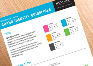

Brand Identity Guidelines
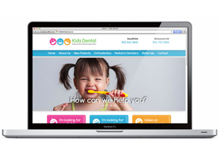
Website
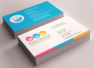
Business Cards
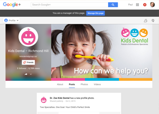
Google +
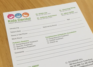
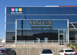
Stationery Forms
Exterior Signage

Paul Bies
President,
Mystique Brand Communications
Looking to revitalize your dental practice? Let's talk. Start the conversation by filling in the contact form in the right sidebar.
Or read more about growing your dental practice through strategic brand development and integrated marketing by clicking here.

