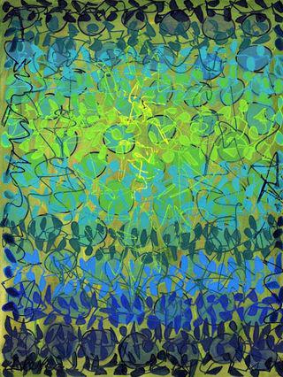
I painted the background on this new paper painting with a blend of watery colors that left little light showing through. It ended up a pale yellow-greenish-gray.
After the background dried, I drew circles in prussian blue over the whole paper in a horizontal pattern. Then I filled them in with pale shades of gray-blue to aqua, to green.
After the next stage dried, I drew patterns beginning with prussian blue on the top and bottom, then adding layers of cobalt green, brilliant blue, aqua and lime, with the lightest colors about two-thirds of the way up. The last step was to fill in the patterned shapes, but I wasn't happy with the result.
To add interest and a central focus, I drew yellow lines in the top center, and prussian blue lines around the outer edges. I also painted some of the shapes at the edges in darker shades.


