The perfect call to action is kind of a mythological creature, it’s something so rare that actually for many it may as well be extinct. But the reason for this is not that the Perfect Call To Action doesn’t exist, because it does exist, it’s that no two perfect cta’s are ever the same for two different websites.
This means to create the “perfect” CTA you need to stop copying what others do directly and use them just for inspiration. You need to look at your audiences habbits on your website, using something like ClickTale or Crazy Egg to map their visits in detail – even just a free trial view will help you. Then look at similar websites in your niche, consider if they would work for you – the answer is usually not but there is probably an aspect or two you can consider using or making better for your website.
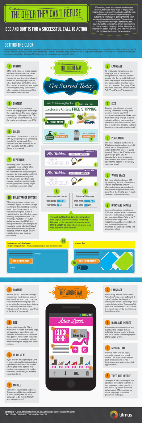
To help you form the perfect call to action I wanted to share this inforgaphic with you, its by Litmus an email testing company – so its obviously in their interest to ensure your site gets lotts of sign ups. They’re pretty well palced to tell you about a perfect CTA.
Note: this isn’t the end of the post, after the infographic is more tips for creating a call to action.
Creating Calls to Action – Infographic

There are many blog posts around about creating calls to action, at the bottom of this post i’ve linked to a few that I love. In Part 2, i will be discussing how once you’ve designed and created your call to action’s you can test them and why you should be testing them continuously.
Things to Consider for Your CTA
- Explain what a user is getting from your CTA
- If you are offering a product or service, can you do something extra?
- Have a CLEAR action and URGENT words (see action words on Pat Flynn’s post)
- Think about CTA position and persistance
- Don’t stop once the Action is complete!
Sounds simple? Good, glad you think so

What You Need To Do Now: In order to make the most of this post I want you to post me an example of your call to action, in a link from the comments below or on social media. I want you to share your own and your favourites with me, from any website you really like (p;ease keep it family friendly).
Links about creating a great call to action:
- Pat Flynn (SPI) – CTA’s for everything (and action words).
- Paul Boag (Headscape / Boagworld) - 10 Steps to for effective CTA’s
- Paul Boag (again) – What happens after an action?
- Andy Kinsey (me / seoandy) – Canva, creating call to action graphics
- Smashing Magazine (2009) – Examples of CTA’s
- Unbounce – Call to Actions that work
Update: 12noon – Paul Boag / Headscape have just released a podcast on this – check it out.
Original SEO Content by SEO Andy @ Creating the Perfect Call To Action – Part 1

