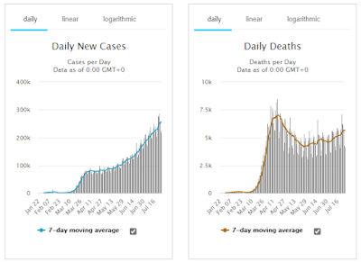
From worldometers.info:

There are lots of ways you can interpret that. I'm quite sure that some countries under-report and others over-report, but let's assume it cancels out and charts are a good guide to actual trends. There's a pessimistic and and optimistic way of interpreting anything, even something as grim as this.
1. Is the number of new cases really rising, as you would expect if R is greater than 1, or is the number of infections fairly stable, and the apparent increase is because they are testing more people?
2. Is this the start of the 'second wave' of deaths?
My slightly rosier view is to observe that the number of deaths in any week, while fairly stable, is falling as a fraction of new cases reported three weeks previously*. This might be because the virus is becoming less virulent, which is what such viruses tend to do (some faster than others); or it might be because hospitals are getting better at treating people; or it might be a bit of both. Whichever way, that's got to be A Good Thing.
* Assuming three weeks to be a typical lag between diagnosis and death.
New cases March 28 - 51,000; deaths April 18 - 7,000; death rate = 13.7%
New cases June 20 - 180,000; deaths July 27 - 5,600; death rate = 3.1%
