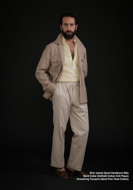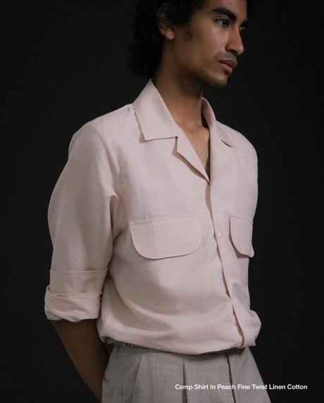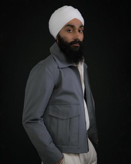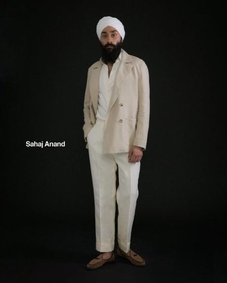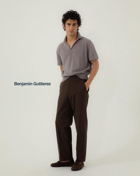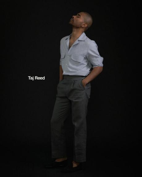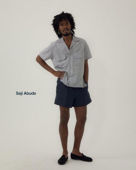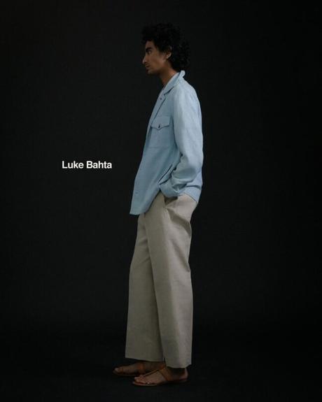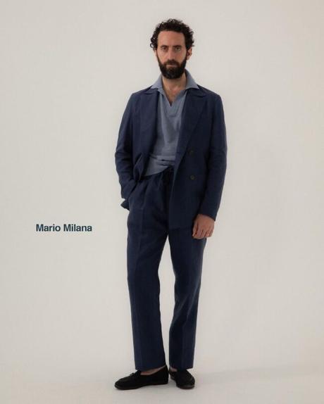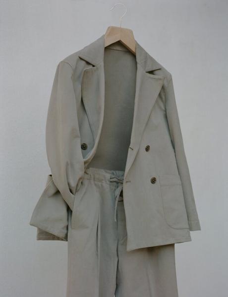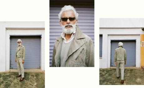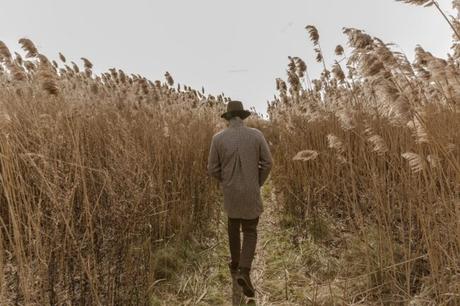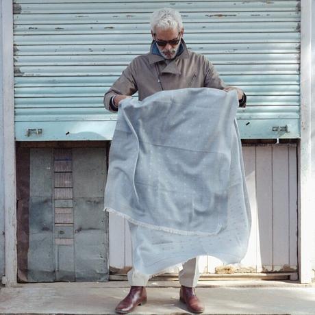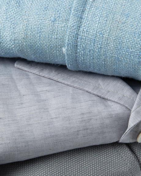
Over the summer, I thought I should buy some long-sleeved polos because I was tired of ironing my shirts. When I browsed online at some of my favorite shops, I faced a digital wall of seemingly endless options. Every shop had Italian pique cottons and soft jersey knits in a range of Pantone colors. Many of these colors were given names that sounded like bite-sized plates on an expensive Brooklyn bar menu: dark guava, dried fig, hazelnut, burnt acorn, and plum. I wanted to be more adventurous and break out of my routine of only wearing light blue and white shirts, but I wasn't sure how. These polos were expensive, and I wanted to choose the right colors.
Some of the greatest minds have written about the sources and uses of color. Aristotle believed that colors were related to the four primary elements - earth, wind, fire, and water. That theory held for more than two thousand years until Newton found that light breaks up into distinct colors when passed through a prism (this is the ROYGBIV of colors , also known as The Dark Side of the Moon ). Yet, for all the theories, we still don't have many good ideas for how to incorporate more interesting colors into a wardrobe. Much of men's dress follows a formula: jeans are blue or black, shirts are white or light blue, shoes are black or brown, etc. When building a wardrobe, it's easier to stick to colors such as navy, brown, and white because they play well together, making it easier to get dressed in the morning.
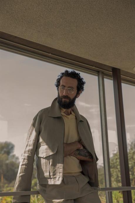
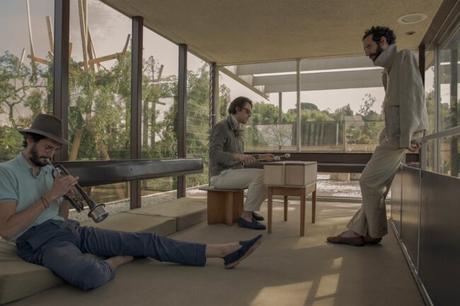
But what about the more exciting colors - mauve, celadon, or ochre? To get some ideas, I talked to my friend Agyesh Madan, co-founder of . Agyesh and his team put together some of the most beautiful online presentations I've seen from any brand, big or small. I also find their use of colors compelling: the styles are subtle and subdued, but there's always a sophisticated tweak here or there in how they vary their shades. To me, this is more interesting than just splashing purple shoes or bright orange parkas into an outfit. So I chatted with Agyesh on the phone a few weeks ago about how to use color in a wardrobe (secretly trying to ply some info for my polo purchase).
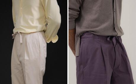
When we put together a lookbook, we try to find a common thread that can unite everything. Often, there are a few threads, and we vary just one or two dimensions. I'm not saying that this is the only way to do things, but it's how we've done things.
You can see this in art. When you look at a painting or photograph, there is often something that unites all the elements - the surface texture captured in a photo, the crackling in the oil paint, or the watercolor on canvas. Similarly, when you look at our clothing, there's either a certain crispness or dusty quality to the colors.
You can think of this in terms of color intensity. Technically, intensity means saturation. But here, I'm using it to mean a combination of saturation and brightness - how intense a color appears. So even if we use a color such as raspberry, it'll have a "middle intensity," making it easier to pair with something like a cloud blue. If we have a yellow, the yarn will have a white core. That brings the intensity down and makes it easier to wear with a color such as taupe. When everything has a similar intensity, the colors feel right with each other, even if they contrast.
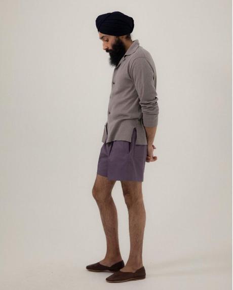
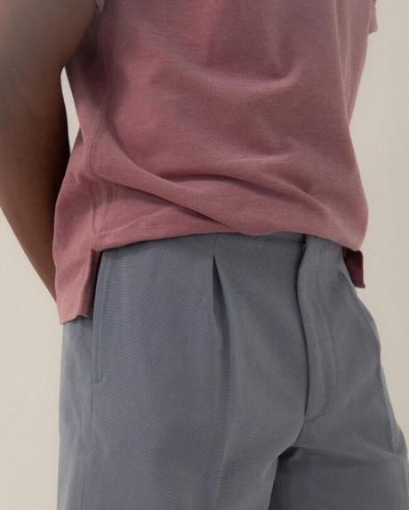
The unifying quality doesn't have to be intensity. It can be some surface quality, such as texture or sheen, or how the fabrics fall and drape. In the photo of the shorts, we paired the eggplant shorts with a grey knit. But if you look closely, the grey has a bit of red, which transitions well into the shorts. So here, we have a few things that unify the two pieces - the matte surface, the slinky quality of the fabrics, and the reddish undertone. The only contrasting element is the color, but there's otherwise harmony everywhere.
I don't think people have to follow this exact formula, but the idea here is to find ways to create harmony. Find a common thread that can pull everything together - texture, sheen, luster, how the fabric drapes, color intensity, etc. It's easier to pull in some unusual color when you can find an element that will unite these pieces.
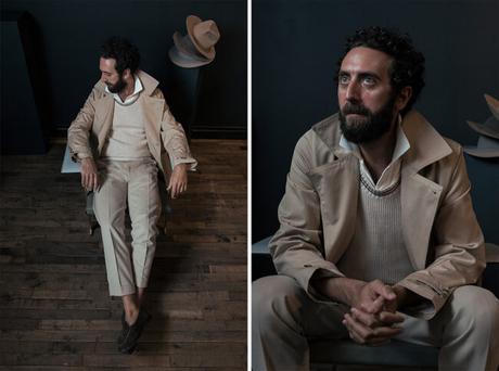
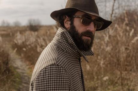
In the last few years, tonality has become a big part of how many men think about style. You often use tonal outfits in your presentations, where everything revolves around different shades or hues of a single color. It's often said that the easiest way to do this is to vary texture - get your contrast from how light reflects differently off leather versus wool, for example. Is it that simple?When creating tonal outfits, the low-hanging fruit is always: "add some texture or surface interest." But we also pay close attention to the color temperature. When I use the term "color temperature," I'm using it in the way it's used in photography. So, the temperature is the movement from candlelight (the warmest color) to blue sky (the coldest). A color can be either warm or cool depending on how much yellow or blue you add. A warm brown would be something like caramel or tobacco; a cool brown would be like the taupes we often use in our collections.
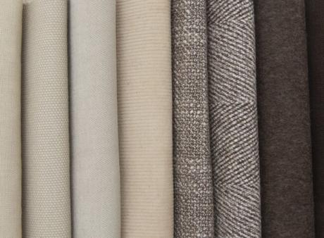
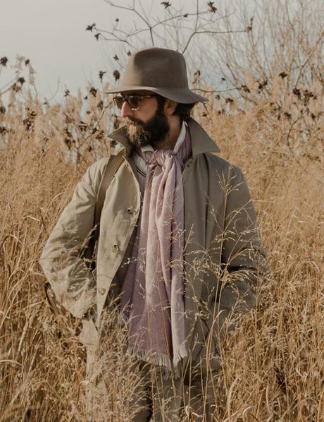
Colors transition well into each other when they have a similar temperature. So even if we move from ivory to taupe to walnut, the transition feels natural because all the colors are relatively cold. It's almost as though they blend into each other, which creates harmony. We then vary things along another dimension, such as texture or intensity.
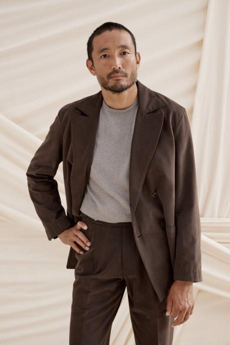
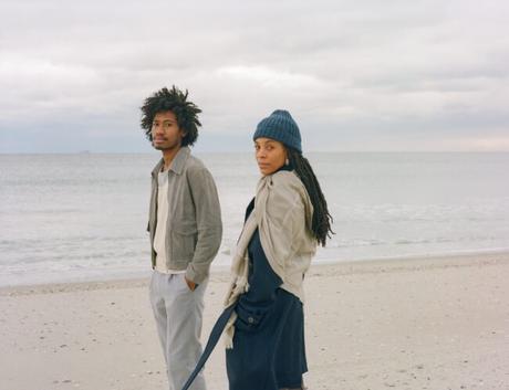
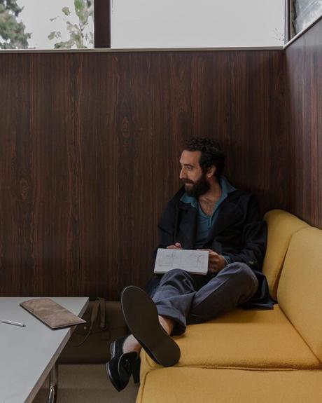
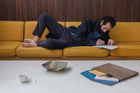
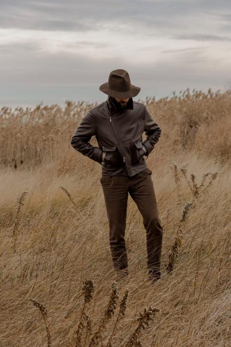
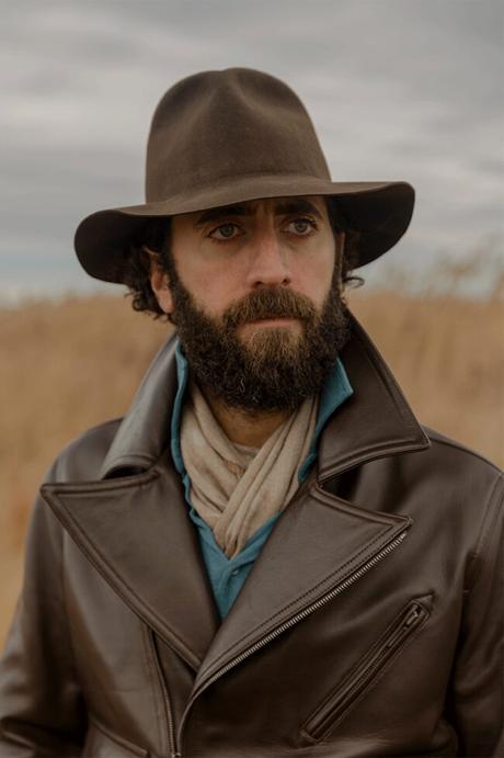
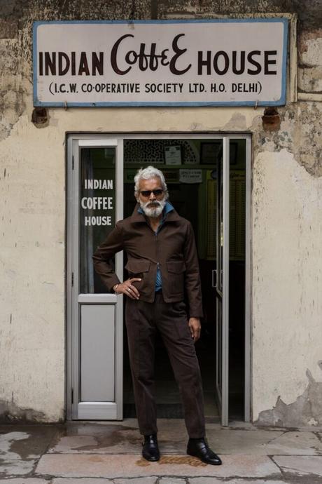
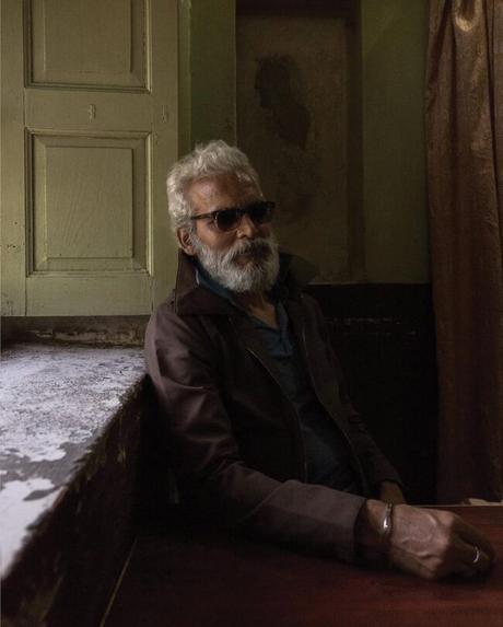
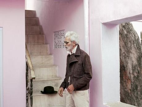
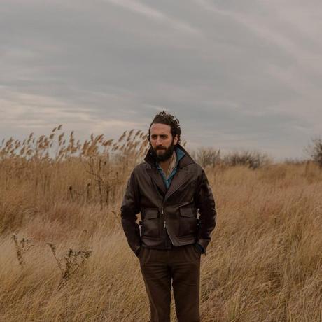
When putting together a tonal outfit, you can also create some intentional contrast. In one campaign, we put the model in a brown leather jacket and chocolate-colored pants. The pants are well-worn, so you get some contrast in the surface texture against the leather jacket. But we also added more contrast with the mid-blue polo. You can always do this with something like a knit or scarf - add something like a soft lavender sweater or terracotta-colored scarf. That will add visual interest and pull everything together.
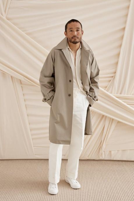
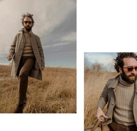
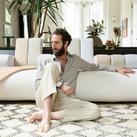
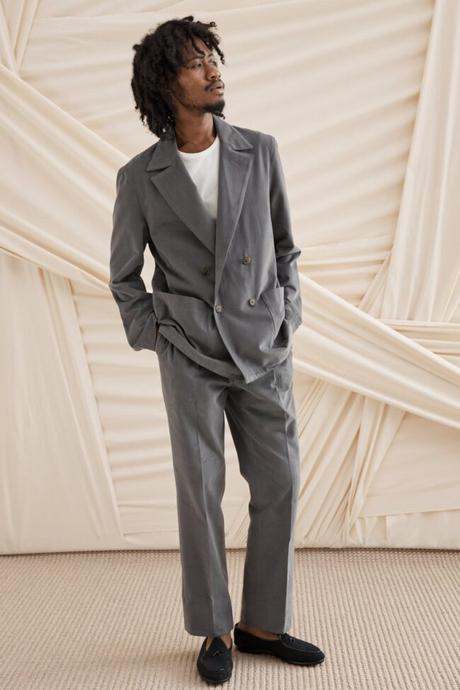
Can we run through some examples on how to create a sophisticated tonal outfit, perhaps using one of your pieces? Let's say the knitted cashmere shirts in ivory or indigo.Sure. For the ivory knit, you can wear that with similarly neutral colors. So for example, you can pair it with beige or taupe trousers and a dark chocolate jacket. In this way, all the colors are within the same color family. Alternatively, you can use the knit as your contrasting piece. Wear it with the anthracite double-breasted jacket and matching peached cotton trousers. That's look number three in our shop, but you can replace the white t-shirt with the ivory cashmere knit. It all goes together because the grey has a warm cast. The ivory knitted shirt is a warm white, not an optic white. So when paired together, the jacket stands out from the shirt, but your eyes smoothly transition from one item to the next.
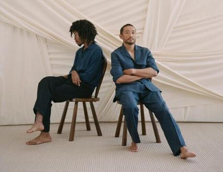
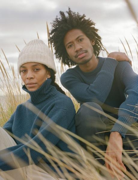
I also love the idea of wearing multiple values of blue within the same hue. So for the indigo version of that same knit, you can wear it with a navy jacket and washed blue jeans. Or you can wear it with a neutral pair of pants, such as our ivory basketweave trousers. When you first receive those pants, they have a slightly warm yellow undertone because that's the natural color of cotton. But after you wash it a few times, the warmth comes out, and you get a milky color. That surface texture will marry beautifully with the fuzziness of the cashmere knit. It's almost like the idea of wearing an old Levi's outfit, but in a cleaner, more refined way.
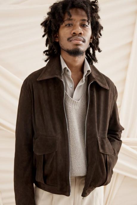
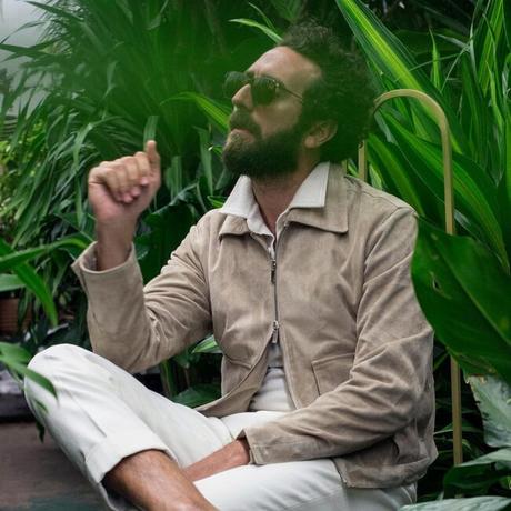
It sounds like you think that the jacket and pants should always be roughly within the same color temperature, is that correct?I've never thought about it that granularly. I think it's more important to train your eye, rather than come up with rigid rules. For example, I think tobacco suede jackets look amazing with washed blue jeans. The two look beautiful together even though they're on the opposite ends of the temperature spectrum. You often see this pairing in landscape paintings, where there's a warm, terracotta color set against a liquid turquoise paint.
When you cross the color spectrum like this, you have to be careful about navigating other things. It's not that you can't do it; you just have to find harmony in other ways. In the example earlier, the contrast will be more visible if you were wearing a crisp pair of blue pants, rather than washed blue jeans, where some of the indigo has been taken out.
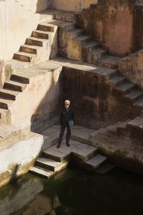
Specific color combinations also feel more natural in certain environments. In Santa Fe, you'll sometimes see someone wearing a camel-colored jacket with a brand new pair of dark blue jeans. In theory, this shouldn't work. But in the light that exists over there - which washes everything out because it's flatland and the sun is super bright - the outfit feels fine! You don't feel the contrast because the sun does something to the colors. A lot of what I'm saying about colors is probably informed by the fact that our clothes are more often worn in an urban environment. So the light there is usually grey, there's a lot of artificial light, and buildings often cast shadows on you. This is going to be a different visual experience than if you were living in the outdoors.
That's interesting. I remember an article in The New York Times, where Valerie Steele talked about why New Yorkers are so into black clothing. She said that, as a color, black has a long association with artists and creative types, which appeals to a particular crowd in NYC. But also, black works well against the stone-grey environment of the city. She feels that an all-black outfit wouldn't have the same vibe in sunny Los Angeles.Yes, exactly. This is why I don't want to come across as though I'm giving a formula. It's about training your eye and building a particular sensitivity. When you get dressed in the morning, things have to feel right. Of course, it helps to have the vocabulary - it helps to think about dimensions such as color intensity and temperature. This way, you can articulate why certain things don't look right to you and improve your understanding of this subject. But in the end, you have to put something on and see if it feels right.
Sometimes a customer will tell me that a particular color doesn't work for their skin. I'm then like, "Is this something you read in a book? Or do you really feel this way when you look in the mirror? Because I saw your face glow up when you put that jacket on." That's where I think there's a delicate balance. If you make this too much about a formula, then any personal expression gets thrown out of the window. And that's the opposite of buying and wearing things with intentionality. That's what we should be working towards - intentionality.
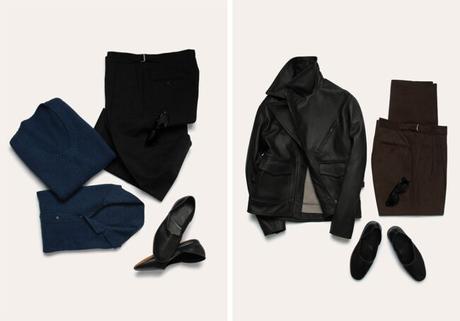
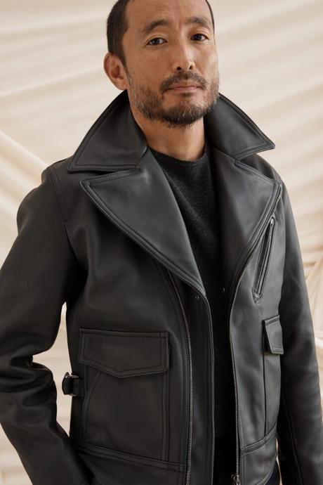
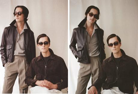
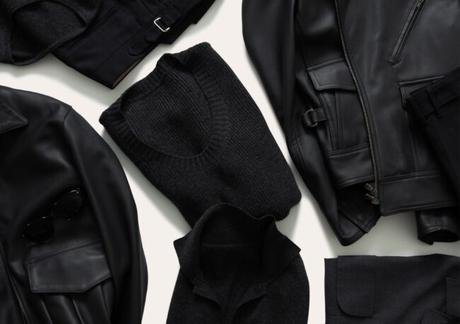
We've always loved black. If you think about it, tuxedos are in ivory and black - or midnight blue, which renders as black under artificial light. When we put together this season's collection, we wanted to use black in a way that communicated that same level of sophistication.
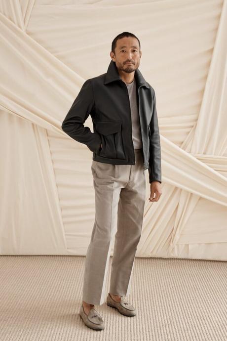
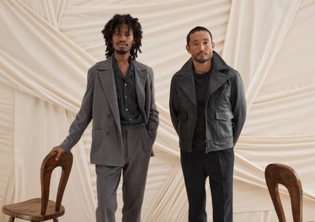
If you look at our black leather, it's not super lustrous. It has a bit more of a matte finish, which means the leather wasn't pressed too much during the finishing stage. At the same time, the leather is very moldable and pliable, so it catches the light and creates pockets of shadows when you move. But at no point is it shiny. Once we had the right leather, it was easy for us to create something that you could wear with trousers in indigo, taupe, or ivory. If I squint my eyes a bit, this jacket worn with ivory trousers almost approximates the look of black tie. I love that about it.
When you wear black, things become more about the silhouette and proportions. The details get hidden, especially in this jacket since we don't use contrasting zippers. So all the details sit back, and everything is about proportions and lines. There's a graphic quality to the whole thing. I think the color also fits our asymmetric jacket very well because the design is so elegant. It has a sculptural quality when you zip it up, not unlike the shape of a tailored jacket. Even if everything is soft, there's a quiet formality. When we put this collection together, many of our references were about old tuxedos, soft tailoring, cashmere sweaters, and urban lights. So it was easy for us to wind up here.
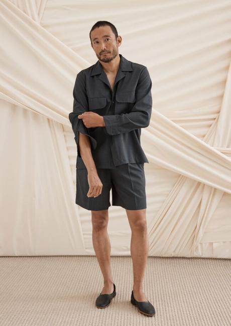
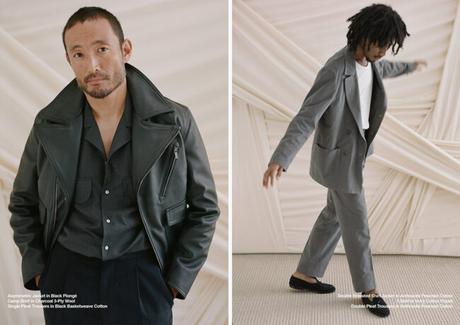
We have two pairs of trousers this season. There are single pleated, tapered trousers that I think you can wear with sport coats in navy or brown. Alternatively, you can also wear it with a sweater in mauve, burgundy, deep green, or dark gray. There's also a washable, self-belted trouser that's meant to be a bit harder wearing. When you wash it, the colors come down, and I think you can use it as an elegant substitute for your black jeans.
The charcoal camp shirt is our fall/ winter version of a summer camp shirt. You can pair it with grey trousers. Some people also wear it open and layered over a t-shirt. This fabric has a very fluid quality to it, so it looks elegant when worn. Finally, the black sweater is effortless. You can pair it with grey trousers for a tonal look. Black knitwear also works well underneath an olive field jacket, and so many guys already have that piece in their closet. Additionally, black knitwear looks really sophisticated with trousers in taupe or mushroom.
What do you recommend for people who are interested in learning more about this subject?There are two excellent sources. The first is the book Interaction of Color by Josef Albers. That book is Color Theory 101 for people who are learning about these concepts in school. Perhaps even better than the book is the iPad app, which goes by the same name. That app allows you to play around with some of these concepts in a very interactive way - warm versus warm, cool versus cool, negative space and context, and what happens when you switch certain things around.
The other book is An Atlas of Rare & Familiar Colour. My romantic partner Mia Morikawa gave me a copy, and it's really beautiful. It uses one of the largest color archives as a lens to understand the origins, impact, and role of color in our lives today. Once you dive into that book, you can use their references to explore other things, depending on what interests you.
Most of all, I think it's just about being more thoughtful when looking at things around you. I don't want it to feel like we're giving people recipes. Sometimes things can feel right, but it helps to have the language to understand and explain why. It's about cultivating a sense of intentionality. And ultimately, in the case of our discussion, it is hopefully about personal expression and what feels right to you.
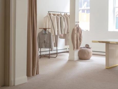
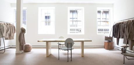
(Many thanks to Agyesh for his time. Readers interested in Stòffa can follow them on Instagram. Their autumn collection is now available at their New York City showroom until October 16, 2021, and online through their website and Mr. Porter.)