A few days ago, I wrote a tutorial on the "Colour Contrast Analyser Color Contrast Analyzer to Check Legibility and Visual Contrast", which also helped me find a more suitable and consistent WCAG(Guidelines for Web Accessibility) The standard color, in short, the foreground color and background color need to achieve a certain contrast to make reading easier, and can also meet the needs of various users. The website accessibility item rating, many of them may encounter the problem that the color contrast is not high enough, we can solve the problem through the color tool.
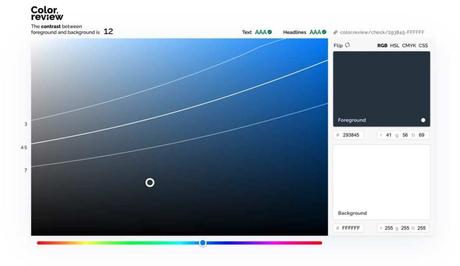
This article recommends 「Color.review" is an online tool to calculate the contrast of two colors, check compliance with WCAG 2.1 specifications, and help users find color combinations that look good and suit everyone compared to CCA, Color.review does not need to download software or applications, it can be used directly by opening it in a browser, and a corresponding sharing link is generated to provide the test results to others for reference.
Color.review uses RGB, HSL, CMYK and CSS to place colors. There is also a sample article with title, text, and images to preview color matching. In addition to showing the calculated contrast value of the two colors, you can also find out WCAG compliant colors (detailed later in the text).
use teaching
STEP 1
After opening the Color.review website, there will be preset colors, mainly to adjust the foreground and background colors from the right side, check whether the text and title displayed above have a contrast that conforms to the WCAG specification, it is best to set both values to green AAA , if not, make at least two values displayed in green (contrast ratio 4.5 or more).
There will be RGB, HSL, CMYK or CSS color formats in the upper right corner, you can choose the format you are used to.
STEP 2
For example, after I set the foreground and background colors, the contrast displayed in the upper left corner is 4.1, and then I see from the top that the text part has not passed the WCAG 2.1 specification, and it is displayed as red FAIL. In such a color matching situation, the text may not be easy. Read (but the title doesn't matter because of the larger font).
Scroll down the web page to see the effect of the foreground and background colors actually applied to an article or pattern. The left side will also display whether it conforms to WCAG 2.1 and whether it is rated as AA or AAA. You can see that only the title has this color matching. Passed, but the text part did not even reach the AA rating.
STEP 3
So how to use Color.review to adjust the contrast to meet the WCAG 2.1 specification?See that there are three lines in the palette? Corresponding to different contrast ratios, for example, the picture below is 3, 4.5 and 7 from top to bottom, as long as the color is adjusted between 4.5 - 7, the rating of the text and title can reach green pass (if you need both Achieving a AAA rating requires pulling the color down to the bottom line to have enough contrast).
After fine-tuning, the contrast ratio is increased to 4.5, which is in line with the WCAG 2.1 contrast ratio (the text is AA, the title is AAA), and it looks not far from the original color. If you want to adjust the color of the web page, it can be read smoothly by ordinary users. , In fact, it is very important to spend some time fine-tuning the color matching!
Three reasons it's worth a try:
- Online color contrast test tool to check compliance with WCAG 2.1 specification
- After setting the foreground color and background color, apply it to the sample article to view the title and text style
- Displays colors that compare 3, 4.5 and 7 to help users find a more suitable color combination
網站配色,線上工具,A11y,CSS,Google Lighthouse,WCAG,無障礙,網站工具,網站開發,網頁工具,網頁易讀性,網頁檢測,網頁測試,網頁親和力,網頁設計,網頁開發,色彩分析,色彩工具,設計,調色盤,選色器,選色工具,配色,顏色,顏色工具
#Color #review #check #color #web #page #conforms #WCAG #specification
❤ XOXO ❤

