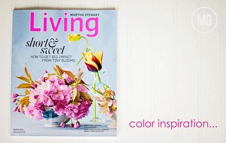
Seriously gorgeous, right?
So I sat down and pulled out some of my supplies and got to work...or, rather...play.
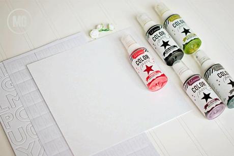
These are the supplies I grabbed...

I wanted to keep it simple and just let the cover guide me, so, after I chose my photo, I grabbed a sheet of 8x8 Color Magic Paper, Color Magic Chipboard Alphas, Color Magic Letterbox Alphas, a couple of Color Magic Paper Roses and the bottles of Color Shine I thought would work well...Amethyst, Primrose, Chartreuse, Tinsel & Black Velvet.
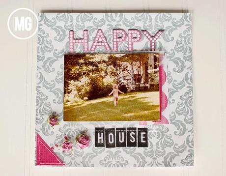
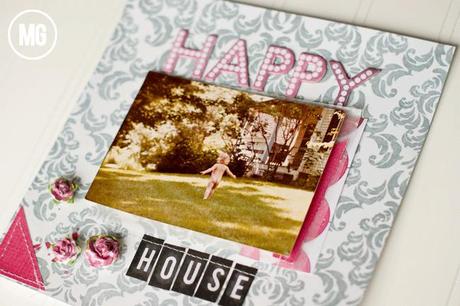
Then it was all of about 45 minutes of work (including the time it took to color everything with the Color Shine) and I had this...

To get the colors of the Color Magic Chipboard Alphas as close to the colors on the cover as I could, I mixed a bit of Amethyst Color Shine with the Primrose and applied it with a Q-Tip to each letter...I did the same on the little flowers.

What I love about taking inspiration from the things around me is that, more often than not, I see a color combination I may not have thought of on my own...for example, including Chartreuse with hot pink, black & silver...but it's lovely.
I challenge you to do this today...find something that inspires you...an ad, a magazine cover, anything...and use it to create. I would love to see what you do! Tag me on IG! @MidwesternGirl5 with your creations...
And just a little fyi...Happy House was what we called my Great Grandmother's vacation home in Vermont...and that's my little nay-nay bottom in the photo, circa 1974...(smile).
