 Today we keep on talking about good illustration and rendering scenarios to give a real dramatic effect to our works or drawings using simple rules just like I explained few days ago on my post "Car Rendering by Mike Kim"
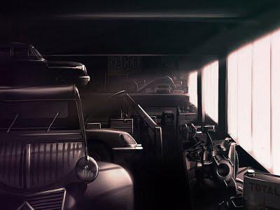
Antoine Chassagne, a 2CV Citroen lover, made this beautiful rendering about an old garage environment with a 2cv Citroen on wich he concentrated his focal point. It is about a nostalgic story and this is touching our hearts, the color choice is about "sepia tones" perfect for a nostalgic environment (like old photos techniques).
The background is really supporting the subject and the right windows have the same effect of Kim's tunnel in the F1 race tunnel rendering. The windows are reinforcing the forced perspective to give energy to the all illustration.
No tilted plane, in this case no need for it, however great detailing to make us believe we are in that garage!
Visit please Antoine Chassagne website clicking: Antoine Chassage portfolio.

