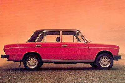
There is one horizontal line which forms the top of the bonnet and boot and the bottom edge of the windows. That gives you nice big windows all round.
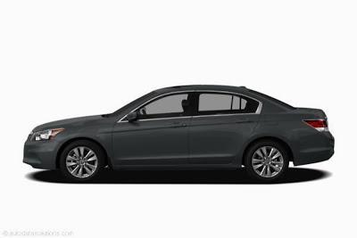
For some reason, a few years ago, car designers decided that a horizontal line isn't good enough any more and they make it a little bit steeper every year.
This is what saloon cars look like now:
 .
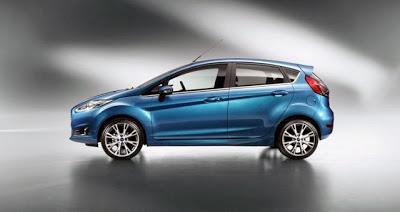
.It's even worse with hatchbacks:

Now this may look awfully cutting edge and cool etc, but it's still shit design because the people sitting in the back can hardly see out and rear vision is down to about a tenth of what it should be.
So please stop it, car designers. It's shit.
