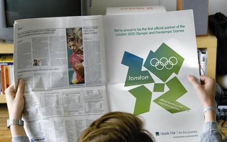
With the London 2012 olympics officially coming to a close today, I've come to realize that I don't feel as repulsed by the London olympics branding as I did when they first unveiled their identiy – in fact I think I'm actually starting to warm to it.
I think once I got a chance to see the brand across different platforms and mediums, be it television broadcasts graphics, printed materials and signage – it really started to fall together. Don't get me wrong, the 2012 portion of the logo is still quite hideous but now it seems more fun than anything. They custom typeface they developed has also grown on me too, it's just quirky and fun – perfectly suited for the atmosphere of olympic games.
Now I think, with a little openness, consistency and time and space to show the true breadth its communications, a brand can thrive and succeed, even if it is quite hideous at first sight.
With that regard, here are some rebrands that I was initially rather disappointed with but I'm really starting to warm up to because they are finding their way. Click on the logos to check out underconsiderations 'Brand New' blog posts to see how these brands have been applied.

Rene Tan
Graphic Designer
Mystique Creative

