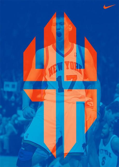
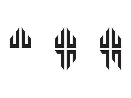
I immediately thought that this was one of the better athlete brands out there (even thought it was only a personal branding exercise), because it was quite a versatile mark and it held meaning in so many layers. Not only was AJ able to marry Jeremy's initials with his number, he was able to add a final touch by adding a cross using the composition's negative space. Genius, considering Jeremy Lin has been very open about his faith.
Other well designed athlete brands:

Lebron James
I've mentioned Jame's brand in a previous post and I still think it's one of my favorite athlete brands around – especially with regard to the intelligent rebranding after dropping the 23 in honor of Michael Jordan. Click here to view my last post regarding this equally effective change.
Roger Federer
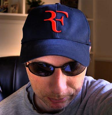
Not only is he one of the greatest to ever play the game, he's always been known as one of the classiest tennis players playing today. From the way he carries himself on and off the courts to his fashionable taste on and off the court, this mark is a well designed, simplistic and articulated mark that's highly representative of Roger.

Chris Paul
To be honest, I didn't even realize Chris Paul had his own brand but it makes total sense considering he's a key part of the Jordan brand. I'm a big fan of this mark because of its simplicity and how well it integrated CP with his number 3 with a smart use of negative space.

Vince Carter
For very similar reasons as the previous mark, I love the way VC has been incorporated with his number 15, this time to create a very abstracted and unified mark. Oh Vince, if only you had stayed in Toronto – your career could've taken a completely different turn. In any case, you put our city on the map and you will forever be remembered for your contributions.
Derek Rose
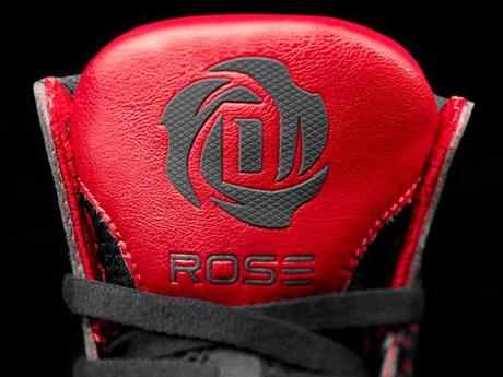
Simple and straightforward. This logo plays on Derek's nickname D.Rose by incorporating the D into the petals of well … a rose. It's always great when a designer is presented with a name that lends itself easily to a nice visual.
These ones garnered some well deserved headshakes:
I don't want to get into any detail with any of these – just look at them and you'll understand.

Carmelo Anthony
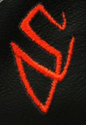
Steve Nash
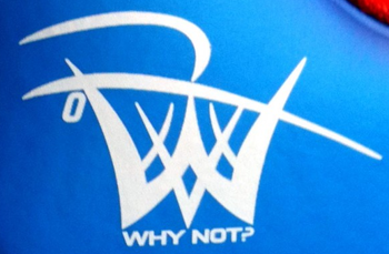
Russell Westbrook
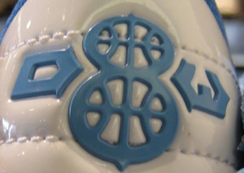
Deron Williams

Rene Tan
Graphic Designer
Mystique Creative

