Visuals are an incredibly important part of your WordPress landing page – they add to the story you are trying to tell, deepen your message, and provide additional details about your services or products.
Your visuals are literally the first thing that will catch your visitors’ eye. They can impact the way someone feels about your brand in less than a couple of seconds, so choosing suitable ones is paramount.
Let’s explore some common concepts to consider.
Show the Product
 Source: filecamp.com
When your landing pages feature products, it’s easy to make a sensible choice: you want to show your product(s) from as many angles as possible, you want the images to be high-quality, and you want them to be true representations of your product.
When your product is not a 3D item, you may find yourself at a bit more of a loss. However, the same principle still applies: show the product.
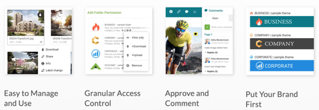
If you are using WordPress to host your SaaS sales pages, show the tool in action. Use plenty of screenshots, do a demo video, show all kinds of stills that illustrate the points you are making about the product.
Filecamp does this really well – their landing page is filled with screenshots that pertain to the specific aspects of the solution that they are discussing, making it easier to imagine how the tool can help you out.
Also Read: How Adding Videos Can Make Your Blog Stand Out
Use Real People
 Source: khanacademy.org
Images of people will help you convey even deeper messages. If you can show someone using your product or service and how it makes them feel (smiling, relaxed, and so on), you’ll be adding another layer to your marketing.
You can also show the happy faces of your customers. Gyms, for example, like to post images of their clients – fit and smiling, clearly satisfied with their membership.
Khan Academy also uses real people on their landing page. These are images of their actual students, and they are meant to show the impact the non-profit has on children across the globe.
Make Your Data Easy to Digest
 Source: medicalalertbuyersguide.org
If your landing page offers plenty of information and does not need to have too many visuals, you can use the visuals to make your data easier to digest.
By adding a smaller image, a colorful CTA, and some color to your page, you will break up the flow of text and make it easier to skim and understand, as opposed to large chunks of writing that need to be read line by line.
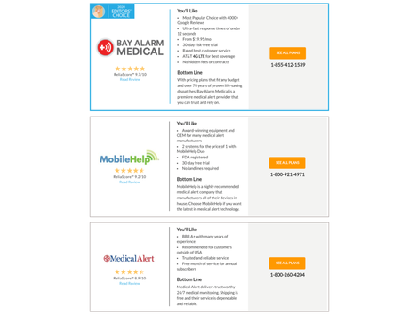
A good example is this page by Medical Alert Buyer’s Guide – the site features a neat little logo for each section, as well as an orange CTA on the right.
Furthermore, they also have very handy tables further down the page that sum up all the most important information about each item, saving you the time and effort to read the entire review.
Make it as easy as possible for your visitors to get to the key information they are looking for – charts and tables can be your best friends in this mission.
Also Read: 5 Ways to Improve Your Marketing with Graphic Design
Use Video Only Where It Makes Sense
 Source: leadpages.com
Video is often hailed as the next great content format. And while it is certainly getting more and more popular each month, using videos on landing pages can sometimes be a poor choice.
Consider where your audience is likely to come across your landing page. Are they skimming it on their phones during rush hour? Are they sitting down at their desktop at home? Do they have the time to watch an entire video, or will they appreciate the ability to read through some information and get to the gist of things faster?
The thing about video is that there is no skimming – you either watch it or don’t, but you can’t tell what’s inside unless you watch.
Only add videos to landing pages where you can reasonably expect visitors to watch them – like we’ve said, demos are a great video format to have, but they should be complemented by plenty of text as well. How-tos and other educational videos are also a great option, provided that your audience is interested in them.
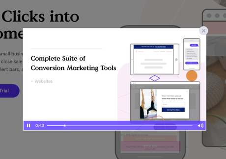
LeadPages has a great explainer video on their landing page – you can watch it or not watch it, and it will certainly add to your understanding of the product. But even if you choose to skip it, the page itself is dynamic and informative enough to help you make a purchasing decision.
Final Thoughts
 Source: depositphotos.com
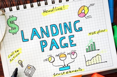
Consider your landing page visuals very carefully – you want them to help you tell your story better and evoke certain emotions in your audience. You also want them to be of high quality and to work well across all devices and screen sizes.
But before you select your visuals, think your message through, and always make decisions with your target audience in mind. After all, a visual you personally like may not be one that would appeal to them.
Interesting Reads:
Free Landing Page WordPress Themes
Top WordPress Management Tools to Manage Multiple WordPress Sites
Benefits of WordPress Online Business Directories
