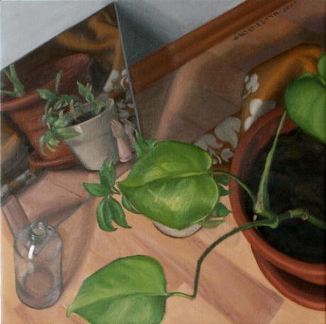
The mirror (c) 2017 Samantha Groenestyn (oil on linen)
The connection between color and geometry demands some attention. Richard Heinrich (2014: 41) argues that ‘there is always a tension between … color space and the geometry of colour,’ that conceptualising color in terms of space is not as simple as unearthing the underlying geometric principles that will take care of everything. He is, of course, correct in this. There are many rich and nuanced ways of conceiving of color spatially, from Aristotle’s delightfully plain string of colours, which Newton (1672) eventually closed into a circle, which has been expanded both theoretically and experimentally into various three-dimensional schema that are as idealised or roughly-hewn as their methods dictate (Briggs, 2017). A geometric conception of color space, like that of Philipp Otto Runge (1810), approaches color from a purely theoretical side, permitting us the sharp analytical divisions of conceptual midpoints and the elegant polish of a sphere as the theoretical limit. The reality of colour, both for the physicist and the painter, is much rougher at the edges, much more irregular, much grittier. But this does not mean that some abstracted principles, deliberately divorced from the messy realities of light and pigment, cannot be united with the practice in an instructive way. Indeed, such conceptual clarity can help the practicing colourist organize her approach to colour, while still allowing the flexibility to adapt those principles to experience.
But this is not really the disjunction that Heinrich is getting at. Rather, he is concerned that a geometric model for color tries to explain both our perceptual experience and our concept of colour, and that this uneasy compromise tends to destroy our concept of color (Heinrich, 2014: 41-42). We establish a working web of relations, but relations between possibly infinite coordinates of hue-value-chroma, none of which bear any greater significance over any other such that they attract the familiar and seemingly meaningful titles of ‘red’ or ‘yellow.’ This is true, but it points to the greater underlying problem that our concept of color is desperately flawed. That we conceive of color so misguidedly despite our firmer scientific grasp on it has only negative implications for painters. Most pressingly, there is a pervasive and false belief that color cannot really be taught, which lends it a certain mysticism both in philosophy and in art schools. This mysticism is only compounded by the fact that color is persistently mistaught on the basis of our flawed conception of it. We need to reconfigure our concept of color or, if that is too extreme, to at least separate out a working theory of color that practitioners–painters–can rely on from a more experiential understanding of it. This, I think, is not so outlandish: physicists operate with a different set of primary colours without threatening our habitual perceptual ideas about color. What needs to be teased out is the psychological conception of colour, dearly-held but quite unrelated to the models most useful to artists and physicists.
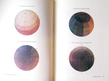
From Runge, 1810: Farbenkugel
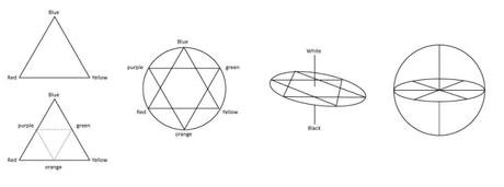
The primary colours are a good place to start, especially given Heinrich’s justified criticism of Runge’s development of the color sphere (Farbenkugel). Runge moves deftly from a triangle (picking out red, yellow and blue) to a star which incorporates orange, green and purple, smooths them into a familiar colour-wheel and fleshes the whole thing out into a ball. The dubious move (which Heinrich (2014: 38) does not let him get away with) is that he begins with certain geometric parameters but quietly dissolves them along the way. The triangle is made of points, marking out the primary colours, which are connected by lines, which signify the gradations between them. The triangle says that conceptually, we grasp the idea of a ‘pure’ red–it tends neither towards yellow nor blue, it is not in the least orange or purple, it holds a privileged status as a color (hue) that every orangish red and purplish red does not. It says that while there are many oranges, there is only one pure red.
We can, however, conceive of a middle-orange, one that appears equally red and yellow, and a green that is no more yellow than it is blue, and likewise a perfectly balanced purple. Runge (1810) thus bisects each line and places each of these so-called secondary colours at the midpoints, forming a small inverted triangle. Perhaps what starts to go awry here is that the lines from green to orange, from orange to purple, from purple to green, do not really signify anything–just a gradation of muddy browns. Runge expands this second triangle without explanation, presenting us with two triangles which we could not, on geometric terms, distinguish, though they represent vastly different ideas: the hierarchy is dissolved. To gloss over this fact, Runge removes the points altogether, and it is this that Heinrich (2014: 40) particularly objects to. The model abandons its initial claims about the significance of some colours above others and drops into a fluid mass of relations.
Runge’s Farbenkugel development
Runge’s move is questionable, but the result is perhaps not so catastrophic. This is not only because in practice, one can navigate color more nimbly and efficiently when one thinks only in terms of relations rather than absolutes (for example, recognising that this mix should be bluer than that mix, rather than trying to match a particular fixed shade on a color chip). But also because our attachment to the primary colours might be unjustified. Runge’s initial choice of red, yellow and blue–even as conceptual ideals–could be as arbitrary as his model ultimately suggests.
As David Briggs (2017) describes, the concept of a primary colour is itself somewhat muddy. We generally bring to it the idea of an ‘unmixed,’ ‘pure,’ or ‘primitive’ color. But these intuitions bring various assumptions, mostly derived from paint, which are simply nonsensical when we describe color in terms of light. In light, common colours compound the reflectance: green does not ‘defile’ red, but their shared components yield yellow and their differing components cleanly cancel out. Another enduring sense of ‘primary colour’ is a color from which all others can be derived. This would already force us to branch color into two separate realms, one of paint and one of light, which revolve around different base colours: subtractive and additive primaries, respectively. Briggs (2017) assiduously notes that this formulation brings conceptual dangers of its own, particularly that ‘it is a small and slippery step from the observation that all hues can be made from three primary colours, to the assumption that all hues are made of those three colours,’ which would be another paint-oriented bias.
To further complicate the idea of a primary colour, Briggs (2017) rightly points out that in fact we cannot derive all colours from just three. For the painter, purple is notoriously elusive because red pigment is still too yellow, thus the mixture of red and blue tends to result in an unsavoury brown. Painters resort to other pigments such as a rose (suspiciously magenta-like) or to outright purple pigments. Perhaps even more shatteringly, the additive primaries are no more certain, they do not correspond to any specific red or green or blue wavelengths; rather, Briggs describes them as optimal ranges of wavelengths. Defining primary colours at all turns out to be a hazardous and imprecise enterprise; at the very least this should cause us to question what reason we have to insist on points in our geometric model of color.
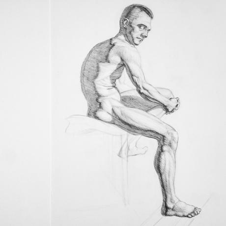
Copy after Mestrovic
That reason might have something to do with our perception. Ewald Hering (1878) describes another set of primaries: the four psychological primary colours of red, yellow, green and blue. These four colours are privileged for having a ‘mentally unmixed’ status, while all other colours seem, to our minds, to be gradations between adjacent colours. This is why an orange can satisfactorily be described as a yellowish red, but we feel uncomfortable to describe a green as a yellowish blue. This seems to be the unrelinquishable ‘grammar of colour’ that Heinrich (2014: 41) particularly wants to hold onto: the sense, based in our experience of colour, that these colours are distinct and in this way primitive. This stance seems as arbitrary and as defensible as any: green is rigid and present in our experience in a way that orange is not. Or as Heinrich (2014: 41) puts it, ‘we will have to admit that green lies between blue and yellow in a fundamentally different sense as orange between yellow and red.’ But for the painter, green remains a mixture of yellow and blue, just as red may be a mixture of rose and yellow, depending on her pigments. And for the physicist, green is the absence of blue and red, while orange is a more complex array of light. Our mental divisions–what we project onto the world and how we break it down–do not correspond to the ‘input into our visual system’ and the stimulation of our rods and cones (Briggs, 2017); nor do they correspond to the pigments that happen to be available to painters. And that might be just fine.
What I propose is to keep these three types of color systems distinct, while acknowledging their intersections. Runge’s color sphere perfectly captures the fluid conceptual relations between hues and their values and chroma for the painter. Since it is advantageous to think relationally rather than in absolutes when trying to establish a harmonious color context in a painting, an idealised, geometric model of three-dimensional color space proves a useful tool for the painter. Such a tool, being relatively simple, yet rich and adaptable to any situation, empowers the painter both to organize her observations and translate them into paint, and to teach a coherent and systematic approach to color to her students.
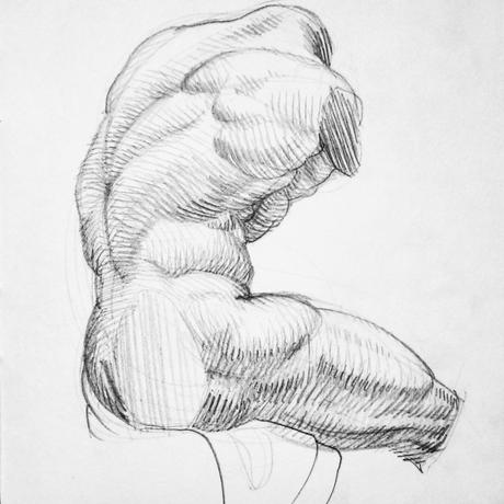
Copy after Belvedere Apollo cast
Physicists, meanwhile, may continue to measure wavelengths, discuss energy, and optimise their additive primaries of red, green and blue. Since the physicist is concerned with describing what light information enters the eye, his measurements do not undermine or contradict the relational model of the painter’s pigments. Rather, the two conceptions intersect unexpectedly beautifully: the complementaries of the additive primaries (red, green and blue) are cyan, magenta and yellow. These last three are used in printing to achieve the maximum range of mixed colours, and can be shown to yield a broader gamut of colours in paint than red, yellow and blue. This elegant inversion, identified by Helmholtz (1852a), perhaps gives us a firmer reason to fix cyan, magenta and yellow as the optimal subtractive primaries, if indeed we would rather retain points in our geometric model of color space. At the very least, we might revise our pedagogical practices and stop teaching painters color theory based on the psychological primaries rather than on the actual properties of light and pigments.
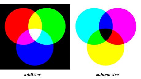
A painter does not need to understand the physics of light in order to manipulate paint. The systems remain conceptually distinct. But I think it would be correct to say that not only is the painter’s system inversely related to the physicist’s; it is also subordinate to it in the sense that after the pigments are applied, a painting, too, is simply an object reflecting wavelengths of various frequencies into the rods and cones in our eyes. In this sense, as Briggs (2017) argues, the painter works with light. He offers a particularly nice example that bridges the two systems in the practice of painting. A painter can drag paint roughly over dry paint of another color such that the color underneath sparkles through the gaps, or lay small strokes of different colours next to each other as the Impressionists did. The eye mixes these physically unmixed colours in an additive manner. Scientifically, it would be called ‘additive averaging mixing;’ painters call it ‘optical mixing’ and use it knowledgeably to great effect. Briggs (2017) further argues that the painter works with perception, and that what the spectator perceives remains largely geared around the four psychological colours, by which he makes sense of the painting.
And so we return to the ‘concept of colour’ that Heinrich is reluctant to dissolve into the more sophisticated systems. Drawing on Ludwig Wittgenstein, he relates it to a ‘grammar of colour,’ which modestly and openly captures something but not all of our experience of color (Heinrich, 2014: 41). This is the key: none of the systems of color we have discussed capture everything of our experience of colour; each operates in its realm without excluding or invalidating the others. An artist might comfortably talk of a ‘blueish yellow’: her vivid cadmium yellow paint is redder than the mental ideal of yellow; she can physically add blue to it to make it more yellow. But for the spectator, who now sees an ideal yellow in the painting, no feat of mental dexterity seems to allow him to imagine a blueish yellow. The slightest introduction of blue slides the color irrevocably into the lush spectrum of greens. That is simply the mental category of green. And since, mentally, green is opposed to red, our brains cannot grasp a red that leans towards green, or a green that leans towards red. The curious thing is that yellow and blue, though they complement as strikingly as red and green, merge effortlessly into a pleasing color. This says very little about how light or pigments operate, but it says a great deal about what we project onto what we see. Perhaps a phenomenology of color would treat of questions like these.
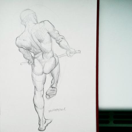
Copy after Mihanovic
In any case, as spectators with firm mental categories for colour, the are things we can say about colour, and things that we cannot. Wittgenstein (LWL, 8) is not so facetious to suggest that certain models of colour–such as his favoured color octahedron–are ‘really a part of grammar… It tells us what we can do: we can speak of a greenish blue but not of a greenish red etc. … Grammar is not entirely a matter of arbitrary choice.’ Grammar has its role, and need not be threatened by geometrical schema designed to help the painter navigate color space, any more than it should be threatened by physics. A grammar of color seems to attempt to describe our intuitions about color based on how we perceive it, just as the grammar of a natural language attempts to explain how we structure our expressions, even though it may consist more in explaining exceptions than syntactic regularities (Chomsky, 1965: 5). Perhaps the intersection between a geometric color space and a grammar grounded in a phenomenology of color would reveal yet more rewarding insights, perhaps as beautifully connected as light and paint have proved to be.
Briggs, David. 2017. The Dimensions of Colour: Modern Colour Theory for Traditional and Digital Painting Media. Accessed November 2017, <www.huevaluechroma.com>.
Chomsky, Noam. 1965. Aspects of the Theory of Syntax. Cambridge, Mass.: MIT.
Heinrich, Richard. 2014. ‘Green and Orange – Colour and Space in Wittgenstein.’ In: Frederik Gierlinger, Stefan Riegelnik (Eds), Wittgenstein on Colour. Berlin, Boston: De Gruyter.
Helmholtz, H. 1852a. ‘On the Theory of Compound Colours’. Philosophical Magazine, Fourth Series, 4(4): 519-34.
Hering, Ewald. 1878. Zur Lehre Vom Lichtsinne. Wien: Gerolds Sohn.
Newton, Isaac. 1672. A Letter of Mr Isaac Newton, Professor of the Mathematicks in the University of Cambridge; Containing His New Theory about Light and Colours: Sent by the Author to the Publisher from Cambridge, Febr. 6. 1671/72; In Order to Be Communicated to the R. Society. Philosophical Transactions of the Royal Society, 6, 3075,8.
Runge, Philipp Otto. 1810. Farbenkugel: Konstruktion Des Verhältnisses Aller Mischungen Der Farben Zueinander Und Ihrer Vollständigen Affinität. Köln: Tropen.
Wittgenstein, Ludwig. 1980. (LWL) Wittgenstein’s Lectures, Cambridge, 1930-32, from the Notes of John King and Desmond Lee. Lee, Desmond (Ed.). Oxford: Blackwell.

