Your menu is one of the first impressions people will get of your restaurant. You don't want them thinking it's a hippie joint if it's a fine dining Italian restaurant! Picking the right restaurant menu fonts helps give your customers the right perspective of what to expect. The menu is one of the first judgments they'll make of your atmosphere and food. Here are some free restaurant menu fonts and menu tips to help you stay on the right track:
Professional Photos
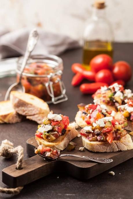
Photos can be a great way to let people feast with their eyes. Your restaurant will come off as a Denny's though if you don't have proper photography of your food. It is better to use no photos at all until you can splurge for a professional. Only use photos oncethey make your food look as good as it tastes!
Eye Scanning Pattern Awareness
Its been a common misconception that the top-right corner is the "sweet spot" for your higher priced menu item but research has shown that people prefer to read menus like a book from the top-left scanning right.
Menu Sections
Try to think like a customer would and put foods in groups to help guide them through the flow of your menu. Nothing is worse than finding out the steak you ordered was something different because it was too close to the vegan options! Make the layout clearly organized with detailed descriptions of what they can expect to get.
Using boxes could be a great idea as well. Boxes draw attention to a group of menu items and are often used by restaurants to promote dishes with the highest profit margins, like pasta and other carb-based items. Use boxes or some sort of detail to draw your customers' eyes to specific areas.
Illustrations Usage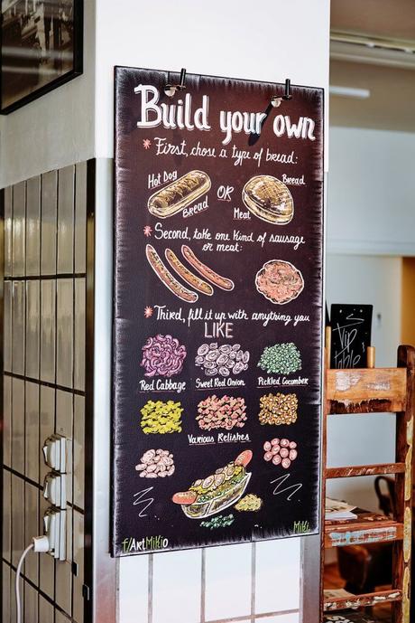

Especially if you are in an area that has multiple languages commonly used or a tourist area, consider using illustrations of your food. It will get the point across, add some character, and is a great alternative if you do not have professional photos of your food.
Avoid Currency Signs
Studies show that people will spend more if that big fat $ isn't staring them in the face.
Picking Colors
Select colors based on your target audience and the theme of the restaurant. Different colors have different psychological effects on a viewer, so your color scheme will help to set the mood of a restaurant as well as draws attention to certain food items. It would not be the best idea to have all black and white when you are selling vibrant smoothies.
Red and yellow are shown to make people feel hungry (hello, McDonald's), but if those don't fit your atmosphere then you should pick something that does.
Your menu colors should also tie into your logo and overall branding. Learn more about branding your restaurant here:
Typography
And last but definitely not least... typography! Effective typography will communicate a restaurant's brand and result in a legible menu. Try using no more than 2-3 fonts on your menu to keep it clear but still exciting to look at. Here is a list of free restaurant menu fonts you can take advantage of:
For more free fonts to use for your restaurant, check out our list of free commercial use fonts here:
For more restaurant tips, check out our other posts:
