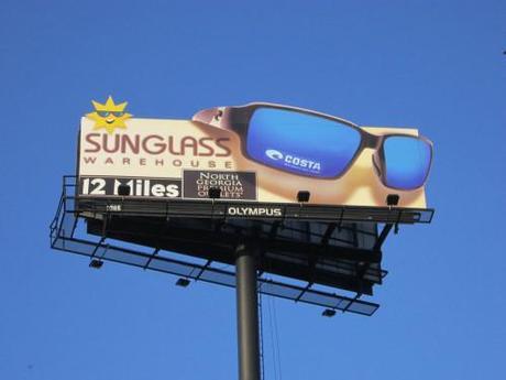
I’m not going to bury the lead here. The ad you see above is pretty awful. I understand its job is to provide direction to a retail store, but it’s not terribly interesting. And all those logos crammed into a space is what I like to call “logo soup.” No one benefits from this many logos on a billboard. Unfortunately, this was provided to Olympus Media to post. Here’s where art director Eddy Herty says it starts to get interesting:
Client called for one board, they sent a jpeg of what they wanted (above). Erica Breazeale (Market Manager) talked to the client, discovered there was no co-op being paid for putting all the logos on there. So she asked them if we could give it a stab.
The Olympus creative team designed the ad you see (below). The client showed the designs to Costa, and they loved it so much that they had a photo shoot for a brand new, never-been-released pair of shades and paid to have the extensions put up on not one board, but three boards… plus, Sunglass Warehouse decided to buy a digital location.

There’s no big concept to this ad because it’s still simply directional in nature. But at least the content is trimmed down, the design is cleaner and there’s something eye-catching about it. The lesson to be learned here is when a client provides you creative that just isn’t conducive to outdoor, provide them another option. The first step in getting better creative on the streets is putting better creative in front of the clients. Will it lead to a sales increase? Maybe. In the case of Sunglass Warehouse, their sales doubled over the first two days the billboards were up. And at the very least, you’re preventing visual pollution on the highway.
