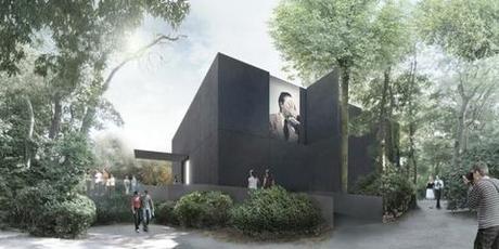
Denton, Corker, and Marshall have moved the pavilion’s main entrance from the less accessible canal side in order to link it more easily to the natural flow of visitors to the Giardini. A bridge will connect it to a busy footpath. Image courtesy Denton, Corker, and Marshall.
Many architects talk about simplicity. John Denton radiates it. He and I are standing in the dense shade cast by the trees of the Giardini della Biennale. We look across a quiet canal to a surprisingly neat construction, where the Australian Pavilion of the Venice Architecture Biennale is starting to take shape. Designed by Denton, Corker, and Marshall, it will replace Philip Cox’s temporary pavilion with an uncannily simple white cube gallery space sheathed in black granite.
Given director Rem Koolhaas’s desire to look critically at Modernism during this year’s the 2014 Biennale of Architecture, the dismantling of an older, quirkier structure to make way for a monolithic black box seems especially resonant. The serene Denton seems to take Koolhaas’s seering admonishments about a moribund profession with a grain of salt. In fact, he seems already to have found his own way forward.
“We were trained as Modernists and like so many architects we experienced a lot of confusion when post-modernism was layered in,” Denton tells me. “Now I think we are in a post-postmodern world where we can enjoy the forms and ideas of modernism while also embracing the freedoms that post-modernism allows. We are always trying to make our work simpler and simpler, but also we want to deliver visual interest.”
To that end, the black granite skin of the Australian Pavilion is meant to create a compelling tactile surface, while also generating curiosity about what lies behind its enigmatic surface. A particularly interesting innovation: Some of the granite panels can be flipped open in order to display art, and in fact incorporate it temporarily into the façade.
