Jen Bekman took great risks, looked like a fool, and is now on Forbes’ top ten female entrepreneurs to watch.
With a passion for art, and more specifically, art for everyone, Jen Bekman launched a first in the modern art world: an art gallery that supplies limited edition artwork at low prices, and strategically uses the power of the internet to provide art for everyone.
Founded in 2007, last year, 20×200 had expected revenues of over $7 million.
How could such an obscure concept with limited, niche market potential have such success?
In this article, we will show you what can you learn for your retail business.
6 digital marketing tactics to learn from 20×200:
- Syndicate coupons to popular websites to drive new traffic
- Use contests to promote new and popular products
- Create personal interactions on Facebook between your customers and CEO
- Create boards to attract users across all of your target markets
- Make product posts interesting and directly linked to your website sales funnel
- Categorize your products by price to make your online store user friendly
1. Syndicate coupons to popular websites to drive new traffic
Coupons are in keeping with the vision of 20×200 to bring art to the masses.
And to reach everyone, 20×200 coupons can be found on about every coupon site out there.
From Retail Me Not, Ulitmate Coupons, Coupon Follow, Savings.com, Coupons.webcrawler.com, Deal Catcher, Discounted Code Stores, and more: you will find 20×200 with coupons galore.
The coupons are accessible with deals and coupons for a limited number of their limited editions, for a limited time.
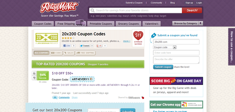
20×200 markets to consumers looking for a deal. By including every deal and coupon site, 20×200 hits their reach to every prospective consumer in this niche.
What can retailers learn from this?
- Coupon lovers are on coupon sites. Get your discount products to your market. Get on coupon sites.
- Post coupons frequently, with a quick call to action, a limited number and limited time frame.
- Use a coupon syndication site, such as Nextgenshopping.
- By the way, Wishpond has created easy to use group offers to entice users to claim a coupon or special offer on a brand’s products and services. The app can run on a brand’s Facebook Pages, website, and on mobile. All you have to do is add your branded marketing smarts!
2. Use contests to promote new and popular products
20×200 runs a variety of contests which they promote through many of their social sites.
On Tumblr, for example, they run contests, and actively promote them through Pinterest, Twitter and Facebook.
The contests they run are engaging, ranging from captioning artwork, short essay contests about the artwork, to sweepstakes for amazing giveaways.
Brilliantly, 20×200 showcase their current products for sale, and offer 20×200 products as the prize.
A recent contest, in which they showcased artwork with the caption “Why Can’t You Just Be Nice” garnered over 2,300 notes and shares on Tumblr alone.

The contest perfectly showcased their artwork, and engaged their customer by asking contestants for their views on why can’t you be nice, in 10 words or less.
The prize? The print, framed.
Entries could be submitted through Tumblr, or Twitter, using the #BNice hashtag.
They shared not just the winning caption, but also the top ten runner-ups.
What can retailers learn from this?
- Use your products as the prize. When showcased well, contests generate excitement for your product.
- Promote your contest on multiple social platforms. Use one hashtag, to create a clear community for your contest across all platforms.
- Keep it engaging. Ask your customer for their opinions. Show you value your customers’ views.
- Did we mention: Wishpond has created many easy to use contest apps, such as photo caption contests, photo contests and sweepstakes. All you have to do is add your branded marketing smarts!
3. Create personal interactions on Facebook between your customers and CEO
The 20×200 Facebook Page has just shy of 28,000 likes. But it is an active community, with likes, comments and shares on every post.
20×200 uses their Facebook Page to connect with their consumer on a more personal level, and to create more options for touch points with their fans.
Keeping it personal, Jen Bekman does what many old-school CEO’s would never do.
On the embedded how-to YouTube video, Jen Bekman herself shows how personal and relatable she is. Jen describes step-by-step how to frame your art, how to do it inexpensively, and relates that this is how she frames for her home too.
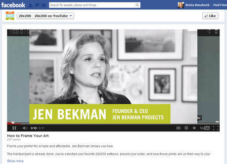
Additionally, 20×200 makes brilliant use of tabs.
By making it easy to sign up for enewsletters, for example, 20×200 creates additional personalized touchpoints with their customer.
The more a consumer feels uniquely connected to 20×200, and the more a fan sees 20×200 and its products, the more likely that consumer will buy from 20×200.
What can retailers learn from this?
- Social media sites like Facebook are about connecting with friends. Show your company with a personality, and let your fans feel like they are your friends.
- Create multiple touchpoints. The more options you have for your customer to choose to connect with you, the better.
- Make signing up for your newsletters easy.
4. Create boards to attract users across all of your target markets
Pinterest is a very visual site. For an art gallery, Pinterest is an ideal locale.
The 20×200 Pinterest page has nearly 5,000 followers, and 63 Boards.
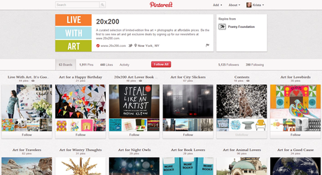
True to its vision, 20×200 caters to everyone, and every niche, within the market for art.
Boards include categories such as “Live With Art. It’s Good For You”, “Art for Night Owls”, “Art for Geeks”, “Contests”, “Art for Lovebirds”, and even “Art for Baseball Fans” (how’s that for a niche?).
Every Pin has the price of the item, and a short description of the artwork.
Every Pin of their product links back to the 20×200 online store, on the landing page for purchasing that particular item. The interested consumer is well within the sales funnel, with just a few simple clicks to finalize the sale.
What can retailers learn from this?
- Pinterest is a visual site. Use the best pictures of your product to showcase them in the best light, to obtain the most likes and repins.
- Create multiple boards. Categorize your products. Make it easy for your niche customer to find the niche product they want.
- Link your pictures to specific landing pages on your website with clear call to actions.This works particularly well for online shopping stores. Your potential customer is interested in your product when they click on the picture – make it easy for them to get it!
- You could even connect the picture to your Facebook social store, to increase traffic to your Facebook Page.
5. Make product posts interesting and directly linked to your website sales funnel
Tumblr demographics generally skew to those under 30. For sellers of inexpensive art, this is a perfect demographic to reach. Students and young professionals want to decorate their rooms and dorm rooms. Cheap art does the trick.
Like Pinterest, Tumblr is very visual. Artwork shares well on such a site.
Tumblr is very successful for 20×200, with most posts getting at least 100 notes and shares.
Each post is of their product.
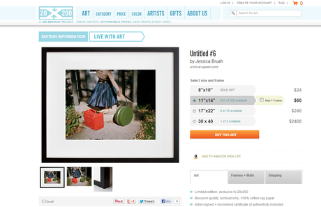
The product has the price, and a description written in a friendly, inclusive tone.
Strategically making their artwork accessible, 20×200 makes purchasing their products easy too.
Every post on Tumblr links back to the online store, with a few simple clicks for the interested customer to purchase the artwork.
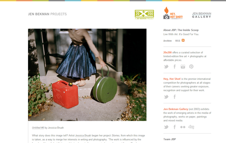
When a customer clicks on the Tumblr picture, above, it leads directly to the 20×200 online store, below.
What can retailers learn from this?
- Make your product visually appealing.
- Describe your product to give your customers information, and to get them intrigued by what you have to offer.
- Link your product pictures to specific landing pages on your website with clear call to actions. When a customer is interested enough to click on your product – this is the time to lead them to a quick, and easy purchase.
6. Categorize your products by price to make your online store user friendly
Jen Bekman’s store is her website.
The 20×200 online browsing system is remarkably user friendly. And true to being the provider of art for the masses, the website store cleanly compartmentalizes art pieces by price.
If a customer is looking for a $24 piece, they simply click on “$24”, and they are able to feast their eyes on over 300 works of art.
If a customer is looking for high-end art, they could peruse through the over 100 pieces in the “$1200+” category.
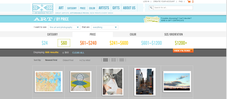
The website store is also very user friendly to search by category of content, and even by color.
What can retailers learn from this?
- Make the online shopping experience easy.
- If your focus is on price conscious consumers, show your prices, and organize your online store to make your price conscious items simple to find.
- Just as would in a bricks and mortar store, make the buying experience a good one, and keep your customers returning for more.
If you have a niche product, you will find a buyer for it somewhere online. Seek out as many of the relevant sites, and be a part of them.
Wishpond has many products that can help you to be the best marketer you can be. We have easy to use apps for contests, group offers, social stores and more. And prices start at just $29/month.
