Part 1
Yesterday I'd written about how visually presenting timeless truths from the Bible is nothing new. Infographics (visual theology) as old as the 1600s were published and circulating. I'd noted that the Bible's format has also morphed over the centuries, changing as new technology made reading it and production of it, easier.
A new trend has come to the fore, a meshing of three streams: our generation's emphasis on visuals, the Kinfolk Aesthetic movement, and a small startup grown huge called Alabaster Co. These three trends have birthed a new format of the Bible, which Alabaster Co. has named the Bible Beautiful.
In 2017 I wrote on my other blog about the influential Kinfolk Aesthetic movement. It's the vaguely Scandinavian, minimalist, Instagram-worthy photos of cunningly crafted foamy coffee from above, the pop of color of a lone bike against a wall, a moody dock stretching into infinity over a glassy lake. I'd asked, Kinfolk Aesthetic: Hipster overkill? Bland Monotony? Pure Genius?
I like the Kinfolk aesthetic, being drawn to minimalism myself. I'm not sure how I like that it's become so ubiquitous. But I like it.
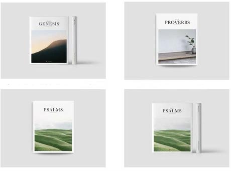
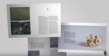
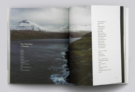
Nevertheless, the movement has settled in and embedded into photography, graphic design, interior design, and publishing. It is this last one I'd like to bring up. A new series of the Bible is being printed by the Alabaster Co. Each book of the Bible is printed as a separate book. There are visuals equal to the print. The series is definitely in Kinfolk style, spare minimalism on each page, moody photography, and incidentally, the Bible's words. Here are a few examples of Alabaster Co.'s Bible Beautiful:


The series was begun by two friends improbably named the same thing, Brian Chung and Bryan Ye-Chung, who got together and founded Alabaster Co.
Beauty matters in our understanding of who God is. We live in a visual culture. Everyone makes images and we are shaped by what we see. We value bringing this visual reality to a faith-based context.OK, that's similar to the above examples I'd given for Visual Theology, Visual Exegesis, Bunyan's Oder & Causes, and even as you'll see below, Paul David Tripp's new devotional book. Alabaster Co. continues,
The Bible Beautiful: We integrate visual imagery and thoughtful design into different texts of the Bible. We're interested in how imagery changes the way you experience the text.But do we want to change the way we experience the text?
First, Jesus IS the Word. God intended us to experience the text through text, and knowing that language changes over time, included lots of text-based symbolism and imagery. Do we need to add to that imagery with photographs equal to the text?
Also, the Spirit guides us in the text, it is through Him that we experience it. Do we want to change that to experiencing the text based on someone else's idea of what visuals should be presented?
The examples of visuals in posters, infographics, animations, or pictures as representing theology aren't the actual Bible. Alabaster has set out to re-format the Word itself as we have come to use it and know it as one BOOK. There are no verse numbers or addresses as far as I could see. There are no cross references lining the message of the Bible, which IS one compiled book, to other messages in other parts of the Bible. It's presented as a book like any other, not God's word.
Is this a good thing, or a bad thing? Would someone of the millennial generation be more likely to read this book than the traditional Bible we all know and love, and then hunger for more and pick up the real Bible at some point? Or would over-reliance on visuals prevent him or her from ever picking up the actual Bible?
These aren't irrelevant questions. Alabaster was started two-and-a-half years ago. This article tells us why-
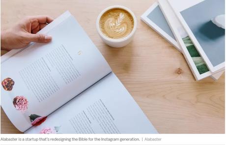
Will Bibles designed for the Instagram generation get millennials into religion?
The Christian startup Alabaster expects to sell nearly $1 million worth of religious books this year.

That's a lot of books. It's not just Bibles, either, but also devotional books, journals, and other religious material.
If a new, young convert reads the Bible that's in a format he or she is used to, or is attracted to it in the first place because of the format, isn't that a good thing? After all, Paul David Tripp's new devotional book My Heart Cries Out: Gospel Meditations for Everyday Life that came out in September looks similar to Alabaster's Bible books. It's the new aesthetic whether we like it or not. The Alabaster books are selling like hotcakes, it's a fact, despite what our opinion of its look might be:

Paul David Tripp's new devotional book
As for the content of the Alabaster Bible books, I haven't read it. I know that the translation is the New Living Translation. Now, before you go running off screaming, here is Todd Friel on the potential usefulness of the NLT. It might have its place. Might.
I don't have an opinion yet on this new unhitching each book from the canon and reformatting it into a new presentation. I'm tending toward no, but I'm still thinking. This blog essay is just musing. One side of my mind says that this has occurred before, and I don't want to be a 'Get off my lawn' cranky old lady decrying something new. The Bible has gone through iterations as new technology has allowed it to coalesce into the final product we use now, one book, words, not pictures. The Bible was individual books for the first 500 years before the canon was settled and the letters were put into one tome.
On the other hand, it seems dangerous to reformat the actual Bible in dramatically different ways (as individual books, as a primarily visual experience and not a word-driven ) and could well lead to a watering down of the entire word.
What do you think of the Alabaster Co.'s books?
Part 1
