Color theory is a dense topic. Over the millennia, artists have used color in seemingly any and all possible ways. While most are aware of the general color spectrum and we’ve all seen a color wheel, it’s a safe bet that many aren’t aware of the most effective ways to use color in graphic design. Like with all artistic “rules” they should be seen as more of a guideline than a set list of standards. While some applications are more appropriate than others, there’s no one way to use colors in graphic design.
For the purpose of designing your own sign, color theory is massively important. For us, the primary objective is to create something that’s interesting, easy to view and easy to see from a distance. In order to understand the best way to use colors, you must first understand basic color theory. In this article, Stickerz.com will outline some basic concepts in color theory and how they apply to sign design.
Primary Colors

This may take you back to grade school. For most of us, primary colors were our first introduction to colors as children. They’re easily recognizable because they’re the basic components of all colors. The three primary colors are red, blue and yellow. From these primary colors, all other colors (besides white and black) can be formed. While white and black are technically colors from a design standpoint, they have other implications in the color spectrum. For our purposes, they serve primarily to augment primary colors into shades and tints, which we’ll discuss later.
Primary colors are incredibly popular for signs, especially for one color designs. While yellow is tough to see on a white background, blue and red are very easy to see on a white background. They’re instantly recognizable and they tend to stand out well. For basic, no frills signage, you can’t ever go wrong using red or blue. When primary colors are mixed with each other, or with black and white, you begin to get new colors and your color spectrum grows.
Secondary Colors

When you begin combining any two of the primary colors in equal amounts, you create secondary colors. Alongside primary colors, secondary colors generally form the second set of three colors you learn as a child. The three secondary colors are orange, green and violet. With the introduction of secondary colors, you’re color palette gains new features such as the ability to use complimentary colors and analogous colors. We’ll discuss later the benefits of these two concepts.
Secondary colors are also very popular for signs because, again, they’re easily recognizable. All three secondary colors are fantastic choices for a sign as they can be easily seen against a white backdrop.
Tertiary Colors

Now that our color wheel is becoming more robust, there’s one more basic combination to discuss. Tertiary colors form when mixing a secondary color with a primary color. You get combinations like blue-green, yellow-green, yellow-orange, red-orange, red-violet and blue-violet. They’re interesting colors because they tend to be a little more adventuresome than the primary and secondary colors.
Tertiary colors are sometimes used in one color designs because they stand out a little. Many people chose tertiary colors for their favorite color because they’re a little different than the standard colors and have a unique feel to them.
There’s an infinite combination of colors. As you begin mixing primary, secondary and tertiary colors, you’ll open a color palette all to your self. For simplicity’s sake, and to ensure the highest quality printing, our website has limited your color palette to only colors we know print well on our printers and printing materials. However, a general knowledge of some other color theory concepts will definitely help as you design your own signs.
Analogous Colors
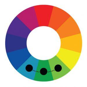
Now that we’ve completed a basic 12 color wheel, we need to understand color’s relationships to each other. Analogous colors are neighbors. They’re colors the sit next to each other on a color wheel like red, red-orange and orange. If two colors touch on this wheel, they are analogous.
In sign design, analogous colors can be used to add dimension to a design. They can be difficult to use properly because when you’re designing your sign you want it to be simple and not include overly-complex features. Using analogous colors in fonts as a drop shadow or to delineate subordinate text on a sign can be useful, though you should probably focus more time on creating a good sign concept than getting to carried away with analogous colors for this project.
Complimentary Colors
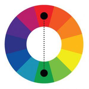
Unlike analogous colors, complimentary colors can be very useful for sign design. It makes sense, right? The term “complimentary” is right there in the name. These colors are opposites and sit directly across from each other on the color wheel. Examples are yellow and purple, red and green and so on. These colors actually do compliment each other and when designing a sign, they can be immensely helpful!
Complimentary color’s utility is in their ability to make each other stand out. When orange and blue are side-by-side, they contrast each other in a way similar to black on white. The human brain sees these colors as polar opposites and, therefore, they’re easily recognizable.
Complimentary colors come into play excellently when using one as a background and the other in design elements. They also work great for text and drop shadows or making clipart stand out. If you’re wanting to make an impact, complimentary colors are your go-to.
Tints and Shades
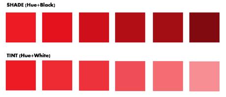
The last way to modify your color palette is by using tints and shades. These colors are attained by adding white or black to any color in your palette. They create lighter or darker versions of any color on the color wheel. Adding white creates a tint, which is a lighter color and adding black creates a shade which makes a darker color.
In sign design, this could be used to add a slow around text or a drop shadow of types, but in our designer we have limited access to tints and shades.
Warm & Cool Colors
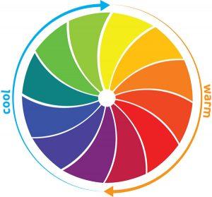
Colors all have a temperature. Based on the feeling you’re looking to convey, different color temperature can help you achieve that. Sometimes using one temperature of colors across a design can have a cool effect.
Warm colors tend to create a sense of urgency. They’re popular for fast food restaurants and marketing color schemes that want people to stop there now. These colors include red, yellow, orange and their tertiary colors. They can add warmth to a design and make it more inviting.
Cool colors are the opposite of warm colors. They create a calming, relaxing atmosphere. Cool colors include green, blue, violet and their tertiary colors. Companies love these colors for a sense of holiness. They can create a cold, clean feeling.
Utilizing the right color temperatures can help you illustrate your business to passersby. Depending on if you choose a warm or cool color scheme, you can convey different messages. Either way you go, using only colors within the warm or cool spectrum, you’ll make a solid statement.
Utilizing This Knowledge
This basic understanding of color theory should get you further in your design process. Utilizing colors in different ways will make a noticeable impact on your final design and color can’t be overlooked. Regardless if you’re using a one color design or multiple colors, knowing what works and what doesn’t is important.
Beyond basic color theory are advanced color theory and using color in marketing which we will cover later on in the Blog.
