There seems to be a tile removal epidemic... as if it's not bad enough painting over tiles as per here and here and here, at least the paint can one day be removed to reveal the fired ceramics beneath.
But in many places I am seeing lovely old tiles on old butcher shops, bakeries and dairies completely removed and replaced, as here in Notting Hill where a lovely shop front for a branch of Express Dairies that used to look like this....
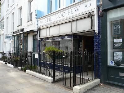
... now looks like this (1st August 2024):
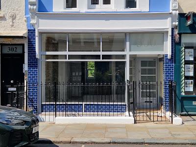
I discovered this latest bit of blandification yesterday whilst leading my Notting Hill Ghostsigns guided walk, this shop being one of the places I talk about along the route. It has for the past year it so been standing empty, waiting for a new occupant. Its intact exterior was unusual as I have not seen the like elsewhere in London, so I was stunned to see that so much of the shop's century-old façade hade been revamped. I say 'revamped' because, if you look closely, you'll see that they (whoever they is/are) have removed all the original features, excluding the tiles on the wall to the right, and replaced them with modern versions of the same proportion. I cannot believe that these alterations have been achieved by anyone who lives locally or has a link to the area, especially as there are other restored shops and businesses in this are such as the green tiles at Mary’s Living and Giving and the Electric Cinema. The bizarre fakery installed here echoes the shape and size of the window frames and the door, and includes panels of blue tiles which I assume have been affixed directly on top of the old ones. Compare and contrast 2022 with 2024 here:
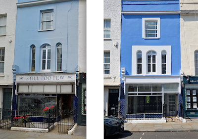
I mean, what's the point?! It's not even a decent pastiche! Perhaps this is all down to Health and Safety – I have been told in the past, when other shops of a similar style have been gutted or over-panelled, that cracked tiles are unhygienic. If so, this tells us that this will be a food outlet of some kind. But this is the exterior, not the interior. These next pics contrast the depth, color and variation within the old artisan/hand-made deep blue tiles on the left, with the flat blue panels installed in 2024, right:
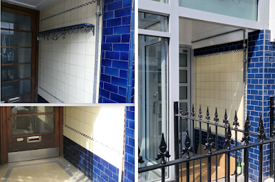
These pics better highlight how the shape and style of the original front door has been echoed in its modern replacement. It's a wonder that they didn't also include a little plastic 'beware of the dog' badge as per the old one. I am hoping that the terrazzo threshold still remains under that sheet of cardboard.
But, if like-for-like was the brief or intention here, why not use modern products that better resemble the 1920's originals? There are many companies today making very good brushed aluminum frames, and joiners who can produce good quality bespoke wooden doors. Why use such bland products that will not last ten years, let alone a century? Because it's cheaper, but only in the short term.
This next group of pics shows how good the shop looked a few years ago. Note the mechanism for the retractable sun blind/awning which ran across the whole front of the shop (also removed as part of the revamp), the ED logo in white and gold within glass panels and the Jazz Age geometrics of the ventilation grille at low level.
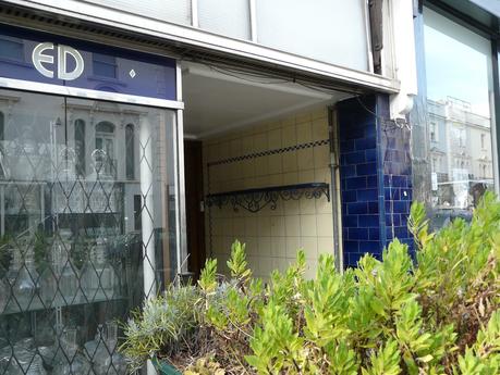
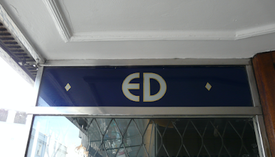
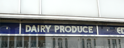
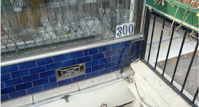
This, to me, is such a great loss as I am unaware of any other Express Dairy shops that still retain their original logos and tiles – please do let me know if you have any further information.
