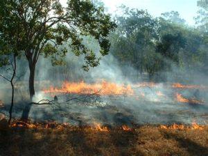
Flinders University Global Ecology postdoc, Dr Farzin Shabani, recently created this astonishing video not only about the results of his models predicting vegetation change in northern Australia as a function of long-term (tens of thousands of years) climate change, but also on the research journey itself!
He provides a brief background to how and why he took up the challenge:

Science would be a lot harder to digest without succinct and meaningful images, graphs, and tables. So, being able to visualise both inputs and outputs of scientific models to cut through the fog of data is an essential element of all science writing and communication. Diagrams help us understand trends and patterns much more quickly than do raw data, and they assist with making comparisons.
During my academic career, I have studied many different topics, including natural hazards (susceptibility & vulnerability risks), GIS-based ensemble modelling, climate-change impacts, environmental modelling at different temporal and spatial scales, species-distribution modelling, and time-series analysis. I use a wide range of graphs, charts, plots, maps and tables to transfer the key messages.
For my latest project, however, I was given the opportunity to make a short animation and visualise my results and the journey itself. I think that my animation inspires a sense of wonder, which is among the most important goals of science education. I also think that my animation draws connections to real-life problems (e.g., ecosystem changes as a product of climate change), and also develops an appreciation of the scientific process itself.
Take a look at let me know what you think!
The animation shows how have used a dynamic vegetation model (LPJ-GUESS) to simulate ecosystem changes in northern Australia over the last 100,000 years. I show that this model works based on spatial and temporal data of precipitation, temperature, atmospheric CO2 concentration, and solar radiation.
I initially assessed the simulated ratio of woody to grass biomass (net primary production) against the ratio inferred from pollen data collected at Girraween Lagoon in the Northern Territory of Australia over the last 13,000 years. The results of the vegetation model were consistent with an overall increasing trend in the woody-taxa fraction and the concomitant decreasing trend in the proportion of grass taxa observed in the pollen data over the last thirteen millennia. Extending our model simulations back to 100,000 years ago showed a reverse trend to more grass cover and a concomitant reduction in woody taxa.
Any change in the monsoon regime associated with increasing human activities (e.g., human-driven fire, landscape clearance, invasive species, etc.) might therefore alter these expectations. Including the above-mentioned factors in the model could potentially improve the realism of projections.
In summary, I showed that the use of global dynamic vegetation models can reveal the impacts of palaeoclimate change on surviving vegetation over the last 100,000 years. This is an important step for understanding how Australia’s endemic biota responds and adapts to periods of prolonged climatic stress. This approach is also a good lesson that will help trace likely vegetation changes into the future.
I think that the production of a short, informative animation of such complex modelling is important and will hopefully encourage more people to think about the main results and their implications.
Farzin Shabani

