Bordeaux Métropole is made up of 28 separate municipalities, all of which boast their own mayors, town halls, websites and, yes, logos. Invisible Bordeaux thought it might be interesting to head out on an armchair tour of those 28 logos. To make the journey as painless as possible, they have been grouped together in a series of totally arbitrarily-chosen categories, the first of which is...
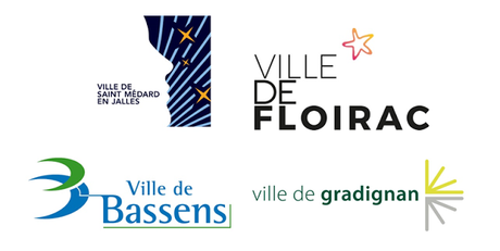
The most evocativeThis first selection of logos is heavy on symbols: Saint-Médard's recently-revamped logo attempts to merge elements of a human being with lines representing the Earth, and stars that, well, represent stars, in reference to the town's contribution to space exploration through local industry and research players. A star also features in Floirac's logo, possibly a nod towards the former observatory located on the town's hilltops. Bassens offers a reinterpretation of the Bordeaux crescent symbol, in keeping with its location at a bend in the river Garonne, the color blue no doubt symbolising its credentials as a maritime port. The Gradignan logo clearly highlights the town's position on the Santiago de Compostela pilgrimage route.
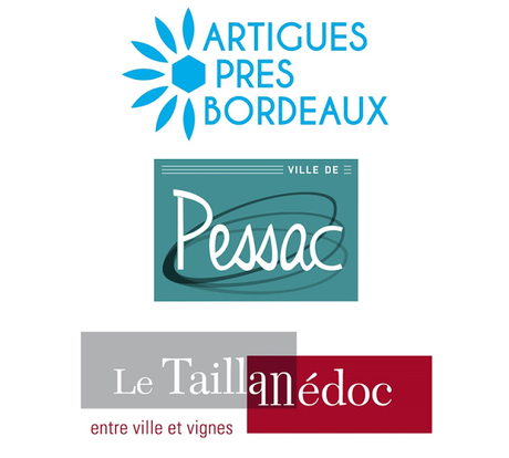
 The most elegantSerious graphic designers were obviously brought in to work on the following set, featuring Artigues and its flower petals (is the hexagon a reference to France?), Pessac and its enigmatic falling hula-hoop, and Le Taillan's wine label-like visual identity. Note the way the "a" and "n" of the word "Taillan" also form the "M" of "Médoc", in a square where the urban gray meets the red which is reminiscent of Bordeaux wine. Le Taillan's is also the first of our logos to include a slogan.
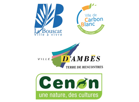
 The ones with slogans For yes, there are other logos with slogans. Le Bouscat promises a "ville à vivre" (a town to live in but also to be experienced to the full?). Carbon-Blanc's slightly abstract logo, the initial design of which was the work of local school-children, features a series of verbs in the infinitive: "dream, share, innovate". Ambès's multicoloured offering promises a territory, er, where you meet people. Whereas Cenon, whose logo appears to have been borrowed from some organic food packaging, name-checks "nature" and "culture".
 The ones with skylines Saint-Aubin-de-Médoc combines its own slogan with a single-line evocation of the town's skyline, comprising a couple of trees, the parish church and what could either be the roof of a very low house or else a submarine, I'm not sure. Bouliac has also gone for the skyline option, with big, colourful Scrabble letter-like blocks. Surprisingly, the most recognisable landmark on the logo is Bouliac's church rather than its 250-metre-high radio mast, which can be seen from most points in central Bordeaux and beyond! It is surprising to think it must have been rejected! :-)
 The most minimalist Mérignac's logo uses triangles to form an "M" shape, the three colours reportedly representing aerospace (blue), economic development (red) and nature (green). Le Haillan recently unveiled its H-themed logo in a color scheme that wouldn't look out of place in a chemist's. Ambarès and Villenave d'Ornon have opted for two-colour squiggly shapes that possibly represent their names. They probably look good on municipal newsletters anyway.
  The ones that need revising Hmmm. Talence, what's with the roller-coaster loop-the-loop motif that appears in the middle of your logo? Is there some kind of funfair theme in there? Parempuyre currently employs a cartoon bird and a bunch of grapes as its visual identity. Lormont is another flower petal municipality, the multicoloured petals linking up with a lowercase letter L, the blue of which possibly cross-checks back to the blue of the Garonne river, which is of course brown in real life. Eysines' giant E on a red rectangle can surely be enhanced. As for Metropolitan newcomer Martignas-sur-Jalle, the current makeshift logo is just a bunch of curly writing combined with the town's historic crest.
 The most timelessThe first of these two is possibly Invisible Bordeaux's favorite Métropole logo: Bruges has retained its historic crest, inserted it in a circle and combined it with a modern, no-frills version of its name, the end-product being delivered in a single shade of light blue. The city of Bordeaux's logo, meanwhile, is a familiar sight to locals and visitors alike. It has already been covered at length on the blog as part of an article about the city's historic coat of arms.
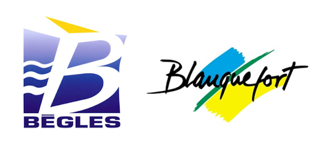
  The ones that need a makeoverThere's nothing especially wrong about the next two, but you do sense that they could do with a bit of a millennial makeover. Bègles has opted for an in-your-face "B", with more of that mystifying blue Garonne water (brown, it's brown, see above!) and a sandy triangle that possibly points the way to the beach (maybe even Bègles plage). As for Blanquefort's sand-grass-sky semi-handwritten logo, well, you can imagine it on a white t-shirt or beach towel, but perhaps the time has come for something a bit more formal.
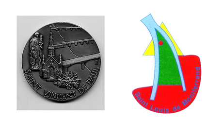
  The most oddball And then there are the Métropole's two smallest communes, Saint-Vincent-de-Paul (population: 1,021) appears to make do with the medallion pictured below, featuring the village church, its bridges, bunches of grapes and, presumably, the original Saint Vincent de Paul. The medallion is reproduced as-is on official literature. Similarly, Saint-Louis-de-Montferrand (population: 2,175), has yet to invest heavily in a logo. The bizarre wishbone-like Miró-esque visual below (which in fact depicts the village's geographic position at the point where the Dordogne meets the Garonne) is pretty much all is available for now.
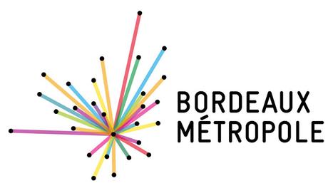
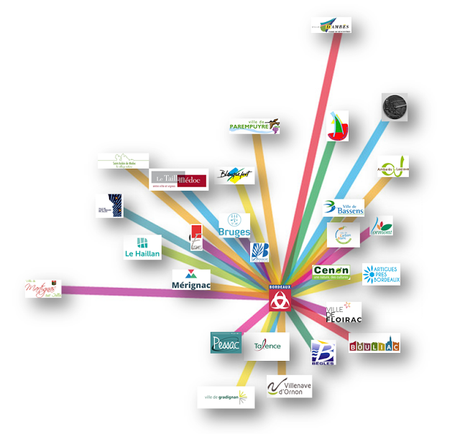
 Then there's Bordeaux Métropole itself...When the Communauté Urbaine de Bordeaux was re-booted and re-branded as Bordeaux Métropole in January 2015, a brand new logo was launched. The intriguing design which, at first glance, was a little like a colourful fireworks display, was in fact constructed around 28 dots, each dot representing the geographical location of the associated municipality. In the mother logo, Bordeaux is the focal point and each line connects the city with a Métropole counterpart. But the Métropole also delivered a variant for each town, each version featuring a different color scheme and the lines departing from the relevant starting point. Although the individual towns have been encouraged to use their personalized versions, in practice they have not really warmed to the concept.
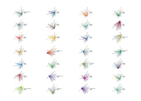
Above: the variants conceived for each of the Métropole's individual municipalities.
To finish off (if you are still reading), my colleague Edgar suggested I should layer the 28 logos on a map to enable you, dear reader, to easily locate each Métropole municipality! So here goes: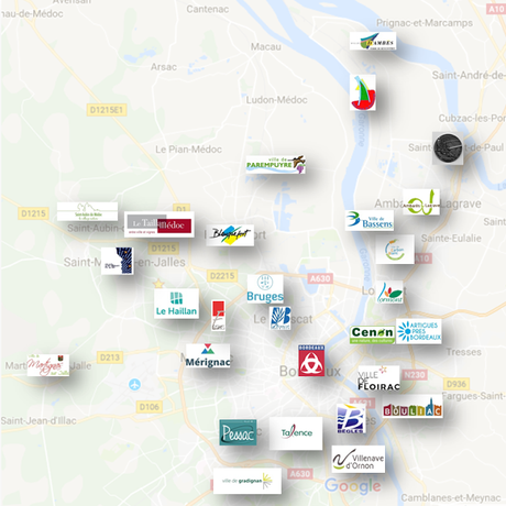
And, as it's a slow news week, here are the same logos pasted onto the relevant dots of the Bordeaux Métropole logo!
> Ce dossier est également disponible en français !
